No products in the cart.

In a world saturated with typefaces, standing out is everything. Whether you are a seasoned graphic designer, a branding professional, or a creative entrepreneur, the fonts you choose tell the story of your work before a single word is even read. That is exactly why Golden Vogue was created — a bold, expressive, and deeply characterful tropical display font that brings raw energy and unmistakable personality to any design it touches.
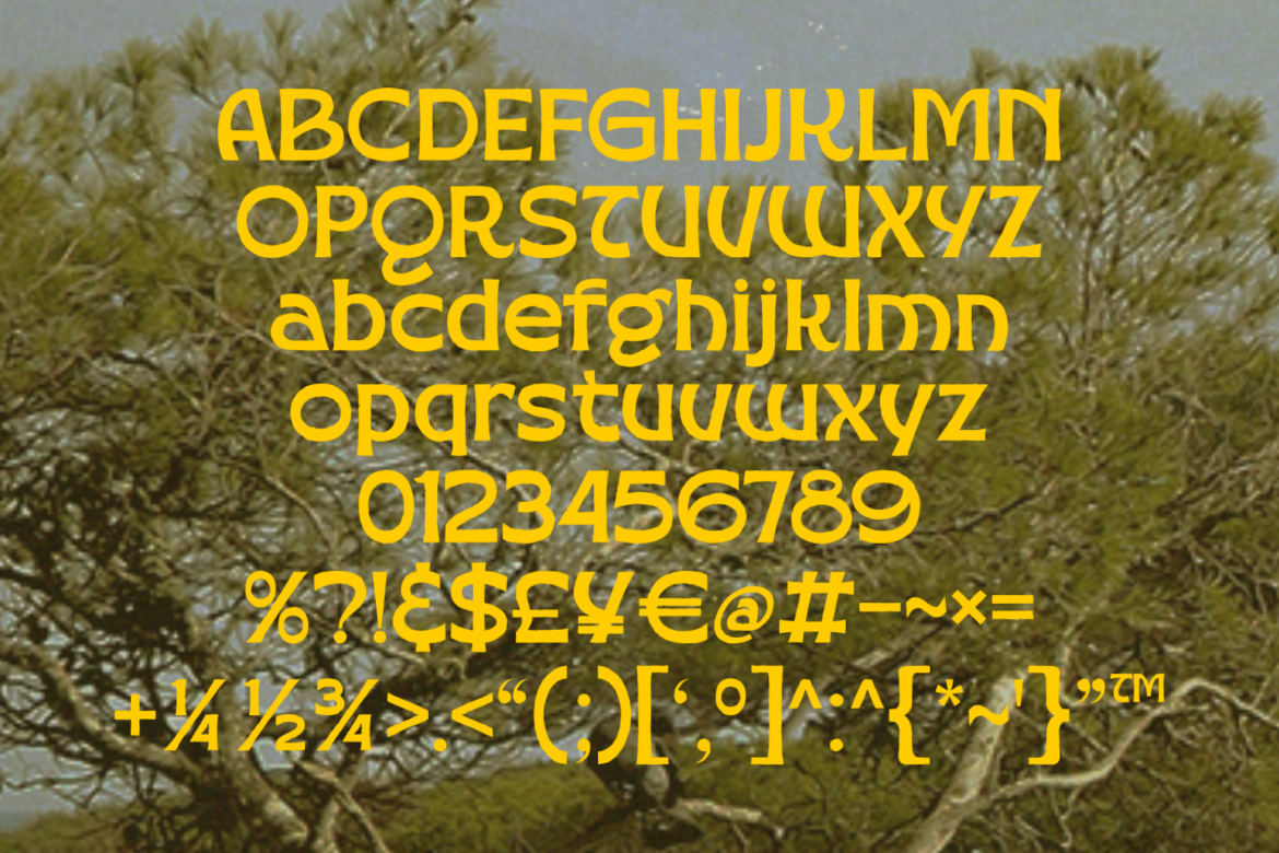
Golden Vogue is a new tropical display font designed and crafted by masantocreative. It merges the boldness of retro typography with the organic, free-spirited energy of tropical design culture. The result is a typeface that feels simultaneously nostalgic and fresh — equally at home on a 1970s-inspired festival poster and a cutting-edge streetwear brand campaign.
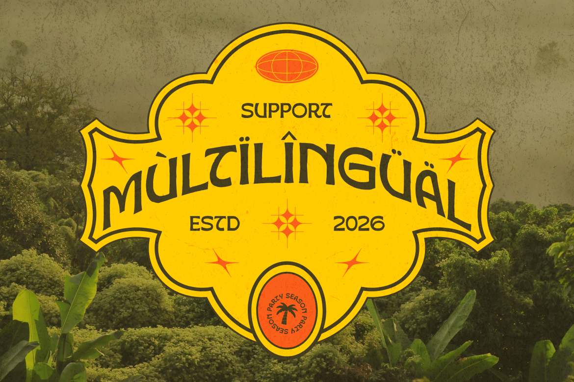
The font ships in two weights — Regular and Bold — giving designers the flexibility to create visual hierarchy, contrast, and depth within a single cohesive typographic system. Both weights carry the same signature DNA: rounded forms, expressive curves, and a hand-crafted texture that feels intentional rather than mechanical.
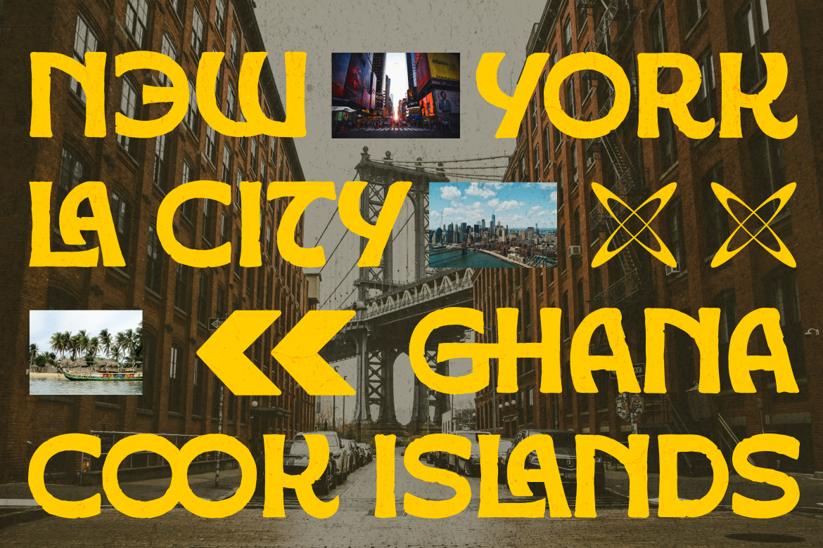
Every great typeface has a story, and Golden Vogue is no exception. The design draws inspiration from the intersection of tropical visual culture, retro-modern aesthetics, and global pop art. Letters are constructed with thick, confident strokes that command attention, while subtle organic irregularities give the font a handmade warmth that purely digital typefaces often lack.
The circular letterforms — particularly in characters like O, G, C, and D — are a defining signature of Golden Vogue. These shapes create visual rhythm across headlines and short copy, making text feel dynamic even when set in all capitals. The font rewards designers who use it at large sizes, where every detail in its construction becomes visible and intentional.
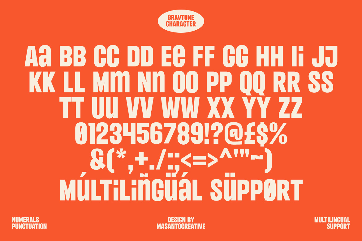
Golden Vogue is not just a pretty face — it is a fully functional, professional-grade typeface built with the practical needs of designers in mind. The complete character set includes full uppercase and lowercase letters, numerals 0 through 9, and an extensive range of punctuation marks, symbols, and currency signs covering dollar, pound, yen, and euro.
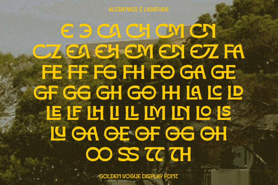
One of the most powerful features of Golden Vogue is its extensive collection of ligatures and alternate characters. With dozens of unique letter combinations — from CA, CH, and CM through to TH, SS, and OO — designers have access to a rich library of stylistic options that make every layout feel custom and considered. These OpenType features allow the same font to behave differently across different projects, giving Golden Vogue a versatility that far exceeds its single-family presentation.
Multilingual support is another area where Golden Vogue delivers beyond expectations. The font covers an extensive range of Latin-based languages with full diacritic support — including accented characters for French, German, Spanish, Portuguese, and many other European languages. This makes Golden Vogue a genuinely global typeface, suitable for international campaigns, multilingual branding, and culturally diverse creative projects.
The versatility of Golden Vogue makes it an ideal choice across a broad spectrum of design disciplines. Here are just some of the areas where this font truly excels:
Festival & Event Posters: The bold weight and high visual impact of Golden Vogue make it perfect for music festivals, cultural events, and nightlife promotions where energy and personality need to jump off the page.
Streetwear & Fashion Branding: The font’s retro-tropical edge aligns naturally with contemporary streetwear aesthetics, making it a go-to choice for labels, lookbooks, hang tags, and brand identity work in the fashion space.
Product Packaging: From artisanal food and beverage brands to cosmetics and lifestyle products, Golden Vogue delivers premium shelf presence with its distinctive character and confident letterforms.
Social Media & Digital Content: In an era where thumb-stopping visuals are currency, Golden Vogue gives content creators and social media designers an immediate visual advantage. It reads clearly at small sizes while commanding full attention at large display sizes.
Logo Design & Brand Identity: The strong letterforms and distinctive alternate characters make Golden Vogue an excellent starting point for custom logo treatments, wordmarks, and brand identity systems.
Why Designers Choose Golden Vogue
Beyond its visual appeal, Golden Vogue represents a thoughtful investment for any designer’s font library. It is delivered in both OTF and TTF formats, ensuring compatibility across all major design applications including Adobe Illustrator, Photoshop, InDesign, Figma, Canva Pro, and Procreate. The inclusion of both Regular and Bold weights means that a single purchase unlocks a complete typographic system rather than a single tool.
The OpenType features — ligatures, contextual alternates, and stylistic sets — mean that the more you use Golden Vogue, the more of its personality you will discover. It is a font designed to reward exploration and creative experimentation.
Ready to Elevate Your Creative Work?
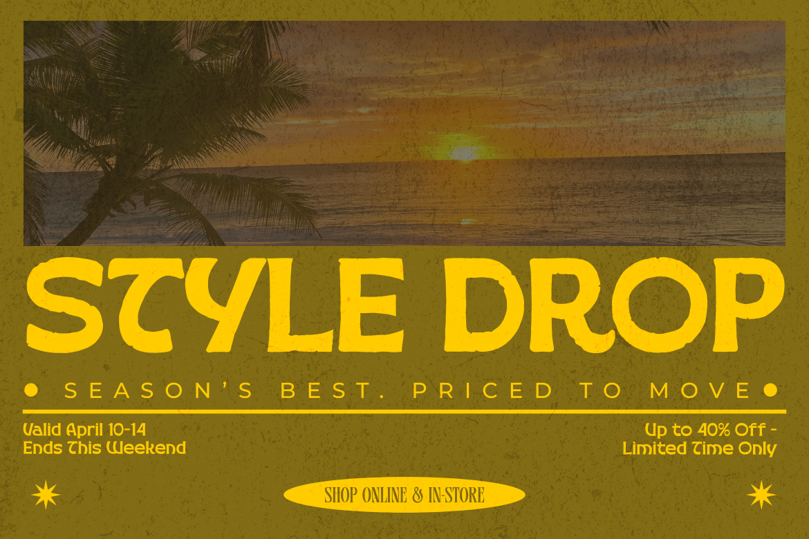
Golden Vogue is more than a font — it is a creative statement. It carries the warmth of tropical culture, the confidence of bold design, and the versatility of a professional typeface built for real-world application. Whether you are designing your next festival poster, launching a new brand, or simply looking for a typeface that makes people stop and look twice, Golden Vogue delivers.
Add Golden Vogue to your design toolkit today and discover what it means to design with true personality.
If you’re looking for clean, modern, and highly readable typefaces, the Sans Serif fonts collection on Kangfont.com is a perfect destination for designers, brands, and creatives. Sans serif fonts are known for their simple strokes without decorative serifs, making them ideal for digital interfaces, branding, editorial work, UI/UX projects, and more.
In this article, we’ll explore what makes these sans fonts unique, popular use cases, design tips, and how you can best use them across your creative work.
A sans serif font is a typeface category characterized by absence of serif details — the small strokes at the end of letterforms. This creates a modern, clean, and minimalist look that enhances readability, especially on digital screens.
Unlike serif fonts, which are traditionally used in print like books and magazines, sans serif fonts offer a more open and contemporary aesthetic that works well for a wide range of purposes — from web interfaces to bold branding.
The Sans category on Kangfont features a curated selection of sans serif fonts suitable for multiple design needs. Here you can find both display sans fonts and more neutral modern sans typefaces that balance style and functionality.
From sleek professional sans fonts to expressive geometric styles, this collection lets designers choose fonts that elevate their visual communication.
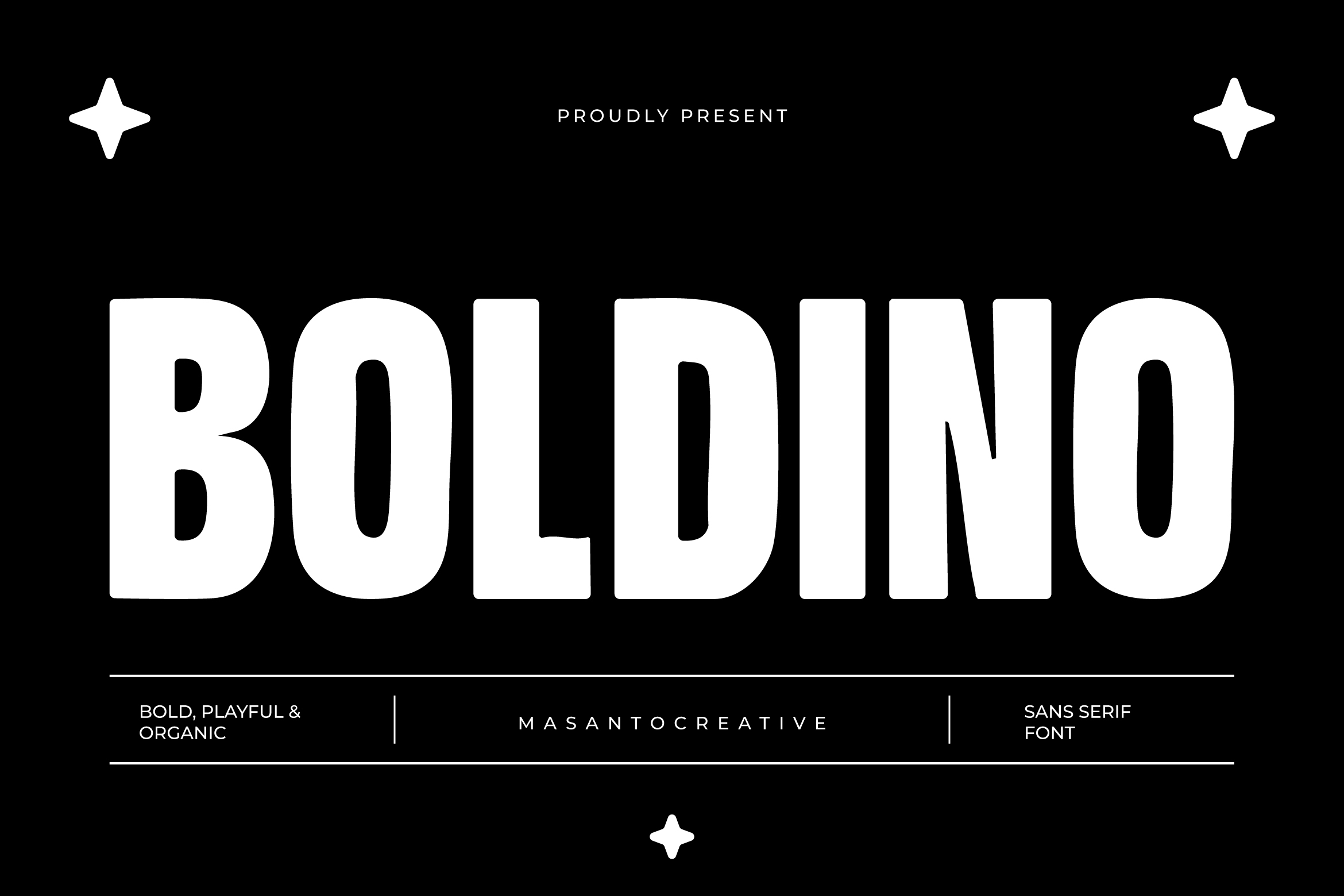
Here are some examples of sans fonts available on Kangfont:
You can explore all sans font products directly here: Kangfont Sans Fonts Collection.
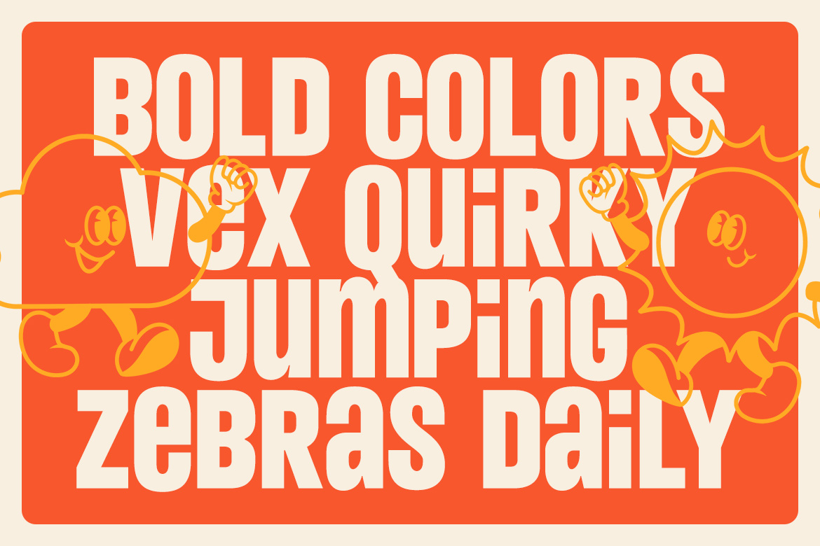
Sans serif fonts are free from ornamental features, which makes them appear clean, versatile, and modern. This simplicity gives designers flexibility — whether you’re crafting a tech brand or a minimalist editorial layout.
This is especially true in digital design, where sans fonts deliver crisp readability even at small sizes.
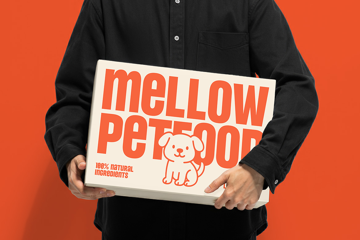
Studies and design standards show that sans serif fonts often provide superior legibility on screens. Their straightforward geometry makes them ideal for user interfaces, mobile apps, and responsive websites.
Because of this, many mobile and tech brands use sans serif fonts as a key part of their typography systems.
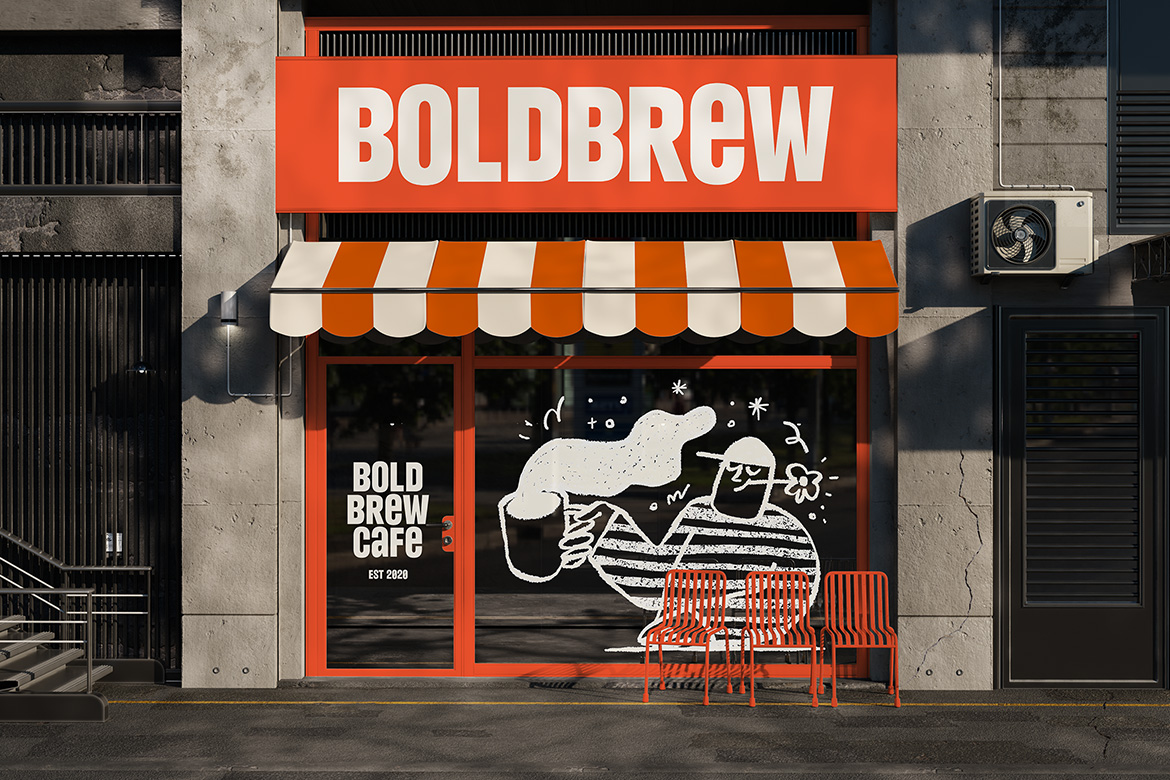
Whether you’re designing a logo, business card, or website interface, sans serif fonts are a designer’s go-to choice for neutral but confident typography. They pair beautifully with accent serif fonts too, like in our article on serif typography. (See: Serif Fonts on Kangfont)
In modern web and mobile designs, sans serif fonts such as those on Kangfont help deliver clean, responsive user experiences. Their legibility makes them ideal for body text, UI navigation, and interface labels.
Sans fonts like Boldino or Nebro bring an energetic or sleek tone — perfect for crafting memorable logos and brand systems with strong identity.
Because they maintain clarity even at large sizes, sans serif fonts are often used in editorial layouts, posters, and event materials, especially when paired with expressive serif or script fonts.
Choosing the right sans font depends on your design goals:
Pairing sans serif fonts with serif fonts or script fonts is one of the most effective typography strategies in modern design. For example:
Combine with our tips from Typography Tips for Designers to create more engaging typographic hierarchy.
Here are practical tips when using sans fonts:
Sans serif fonts remain a cornerstone of modern design because they:
And with the selection available at Kangfont’s Sans category, you have a curated range of quality typefaces ready for creative projects of all kinds.
📌 Want to expand your type design skills? Check out our guide on Font Pairing Techniques and make your next typography even more striking!
The Bront Olo font is one of the standout typefaces available on Kangfont.com, a platform known for providing high-quality, creative, and modern fonts for designers around the world. Bront Olo delivers a strong visual personality, making it an excellent choice for branding, headlines, logos, product packaging, posters, apparel design, and various digital or print projects. If you’re looking for a typeface that brings power, clarity, and uniqueness to your design work, Bront Olo deserves a place in your creative toolkit.
Typography plays a crucial role in shaping how audiences perceive a message. A font is more than just letters—it is a visual voice that communicates emotion, style, and intention. The Bront Olo font embraces this concept by offering a striking look that instantly enhances any layout and helps your design stand out in a competitive visual landscape.

The Bront Olo font is a modern display typeface crafted with strong lines, confident shapes, and a bold character. While designed to attract attention, it maintains great readability, making it suitable for large-scale typography such as logos, headers, promotional titles, and graphic-heavy compositions.
As part of the Kangfont.com library, Bront Olo is built with professional detailing and a contemporary aesthetic. Designers who need a unique and expressive typeface will find this font especially appealing for modern branding and visual storytelling.

Bront Olo carries a bold and confident style, making it ideal for designs that need visual impact. Its letterforms are crafted to look sharp, modern, and stylish, ensuring that the font captures attention immediately—whether on packaging, posters, or digital banners.

As a display typeface, Bront Olo is optimized for large sizes. It excels when used in:
Its distinctive shape gives brands a memorable identity while maintaining clean readability.

The font combines geometric balance with modern stylistic touches—perfect for designers who need a clean yet expressive typeface. The construction of each character helps maintain consistency throughout your project, boosting the overall professionalism of your visual composition.

Bront Olo works well in a wide range of creative contexts, such as:
Its flexibility makes it a strong asset for designers building cohesive brand systems.
Typography shapes the identity of a design. A well-selected font improves readability, strengthens the emotional tone, and reinforces a brand’s personality. Modern brands increasingly rely on bold display fonts like Bront Olo to:
Designers who understand the importance of font selection can use Bront Olo to elevate their creative projects and deliver strong visual communication.

Because of its bold structure and unique characteristics, Bront Olo shines as a logo font. It offers a strong visual imprint, making it easier for brands to express personality and establish brand presence. Whether you’re building a modern tech brand or a lifestyle product line, this font provides an instant visual impact.
The increasing competition in packaging design demands typefaces that stand out while remaining clean and readable. Bront Olo’s sculpted geometry and modern look make it ideal for packaging categories like coffee products, skincare, drinks, apparel, and premium lifestyle goods.
When used in large-scale promotional materials, the font creates excellent visual attraction. Its sharp and confident letters help highlight important information, making your design look more polished and professional.
For digital creatives, the Bront Olo font brings clarity and style to landing pages, hero sections, and highlighted UI text. It sets the tone of the brand instantly and enhances user experience with striking readability.
Bront Olo’s unique character makes it a favorite choice for apparel graphics. Designers creating modern, urban, or stylish streetwear will find the font particularly attractive for lettering, badges, and bold typographic layouts.

Because Bront Olo has a strong visual identity, pair it with a clean sans-serif or neutral serif font for paragraphs or body text. This ensures a balanced and readable layout.
As a display font, Bront Olo shines most in titles, logos, and prominent graphics. Its details are designed to be appreciated in larger formats.
To build a strong branding system, use Bront Olo consistently across:
Consistency builds brand recognition.
The Bront Olo font is a powerful modern display typeface that brings boldness, clarity, and professional character to any creative project. Its strong shapes and contemporary design make it an ideal choice for branding, logos, posters, packaging, merchandise, and digital layouts. Whether you’re a graphic designer, brand strategist, or business owner looking for a unique visual identity, Bront Olo offers exceptional value and performance.
Available exclusively at Kangfont.com, this font is ready to support your next design project with style, confidence, and modern flair. Bront Olo is not just a typeface—it’s a visual statement