No products in the cart.
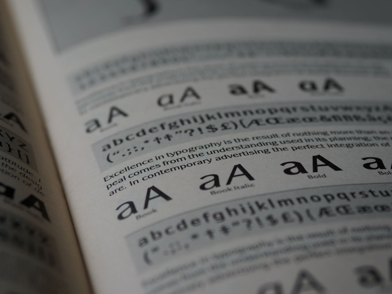
Clients decide whether to trust a law firm or consulting brand before they’ve read a single sentence of your website or proposal. Typography is doing that work silently, in the background, every single time someone looks at your logo, letterhead, or pitch deck.
In an industry built on credibility, the wrong font can undercut months of relationship-building. Here’s what’s actually working for law firm and consultant branding in 2026.
What Makes a Font “Trustworthy” in Professional Services
Trust-building typography tends to share a few traits, regardless of exact style:
- Restraint ” no excessive flourishes or overly decorative letterforms
- Consistency ” even stroke weights and predictable letter shapes
- Legibility at small sizes ” because most people will read it on a phone screen or a printed contract, not a billboard
- A sense of permanence ” fonts that don’t look trendy or tied to a specific year
Serif Fonts: Still the Default for a Reason
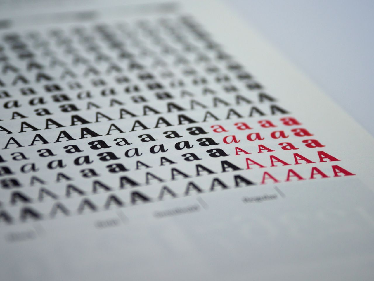
Serif typefaces remain the strongest choice for law firms specifically. The small strokes at the end of each letter (serifs) carry strong associations with tradition, print heritage, and institutional authority ” think newspapers, legal documents, and academic publishing.
Best used for:
- Firm name and logo
- Headlines on the website homepage
- Printed materials like letterhead and business cards
Sans-Serif Fonts: Better for Modern Consultants and Digital-First Firms
Consulting firms ” especially those positioning themselves as modern, agile, or tech-adjacent ” often lean toward clean sans-serif typefaces. These read as more approachable and digital-native, without sacrificing professionalism.
Best used for:
- Website body text and navigation
- Pitch decks and slide presentations
- Email signatures and digital proposals
Pairing Strategy for Legal and Consulting Brands
A common and effective approach: a confident serif for the firm name and major headlines, paired with a highly legible sans-serif for body text, forms, and UI elements. This combination signals “established, but not outdated ” which is exactly the balance most firms in this space are trying to strike.
Avoid:
- Script or handwritten fonts (reads as informal, occasionally even untrustworthy in a legal context)
- Overly condensed fonts for body text (hurts readability in dense contracts or reports)
- More than two typefaces across your brand system
Where Font Choice Shows Up Most for Law Firms and Consultants
- Website headers and navigation
- Proposal and contract templates
- LinkedIn and social media graphics
- Business cards and printed letterhead
- Pitch decks used in client meetings
Each of these needs to look consistent, which means the font you choose has to hold up across print, screen, and presentation formats equally well.
Choosing a Font That’s Actually Cleared for Business Use
Once you’ve settled on a style direction, the next step is making sure the specific font file is properly licensed for business branding ” not just downloaded from a free font site with unclear terms.
Browse fonts built for professional branding in our curated category for law firms and consultants ” explore the collection here, including free options you can test in your own mockups before committing to a full brand license.