No products in the cart.
Bold fonts in branding and typography
Bold fonts have always been a go-to choice for designers who want visuals that feel strong and confident. They are easy to spot from far away. For logos, posters, product packaging, social media headlines, or merchandise, heavy, thick letter-forms grab attention. There are eight popular bold fonts on KangFont worth adding to your collection.
1. Boldino
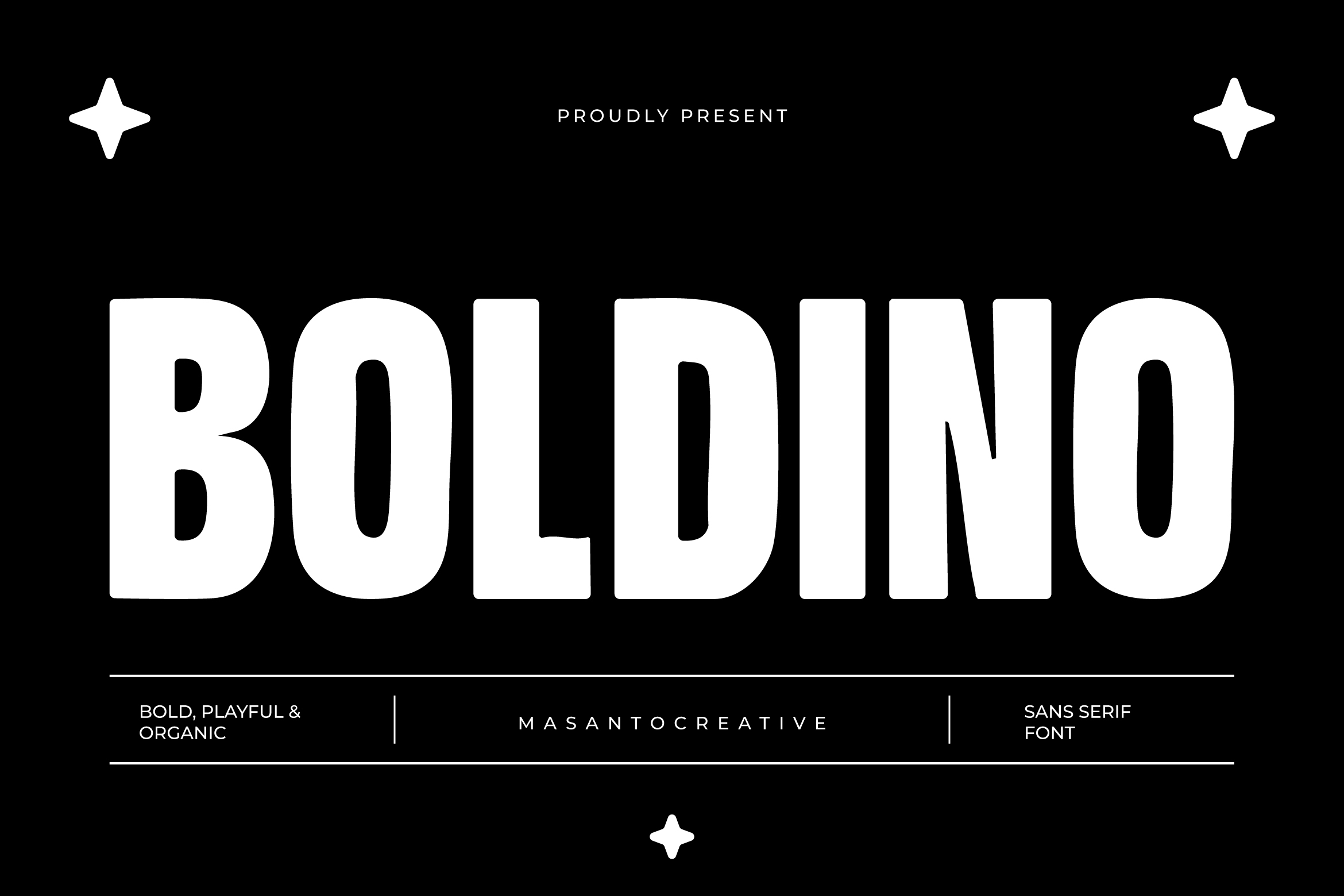
Boldino is one of KangFont’s standout bold display fonts. The name alone hints at its main character: thick, solid, and confident. Fonts like this are typically best suited for large headlines, brand logos, or front-page titles. The heavy strokes keep the text legible even at small sizes, making it flexible for both digital and print use.
2. Molem
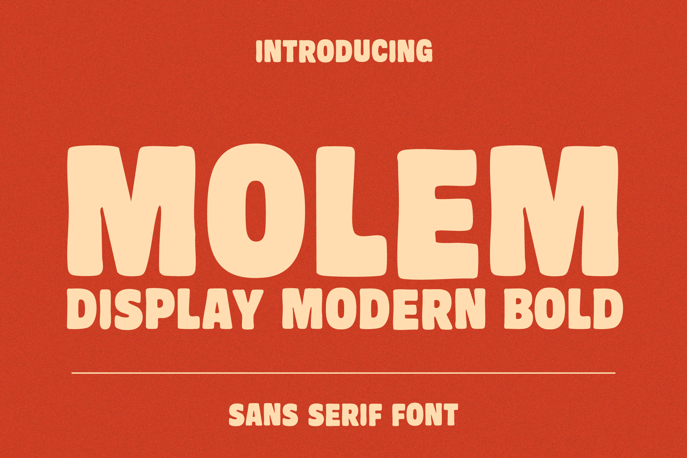
Molem offers a bold style with a slightly more relaxed feel compared to typical display fonts. Its letter-forms tend to carry a playful touch while still maintaining strong visual weight. This type of font is often chosen for designs that want to feel assertive without being overly formal — think promotional content, youth-oriented product packaging, or t-shirt designs.
3. Mooney
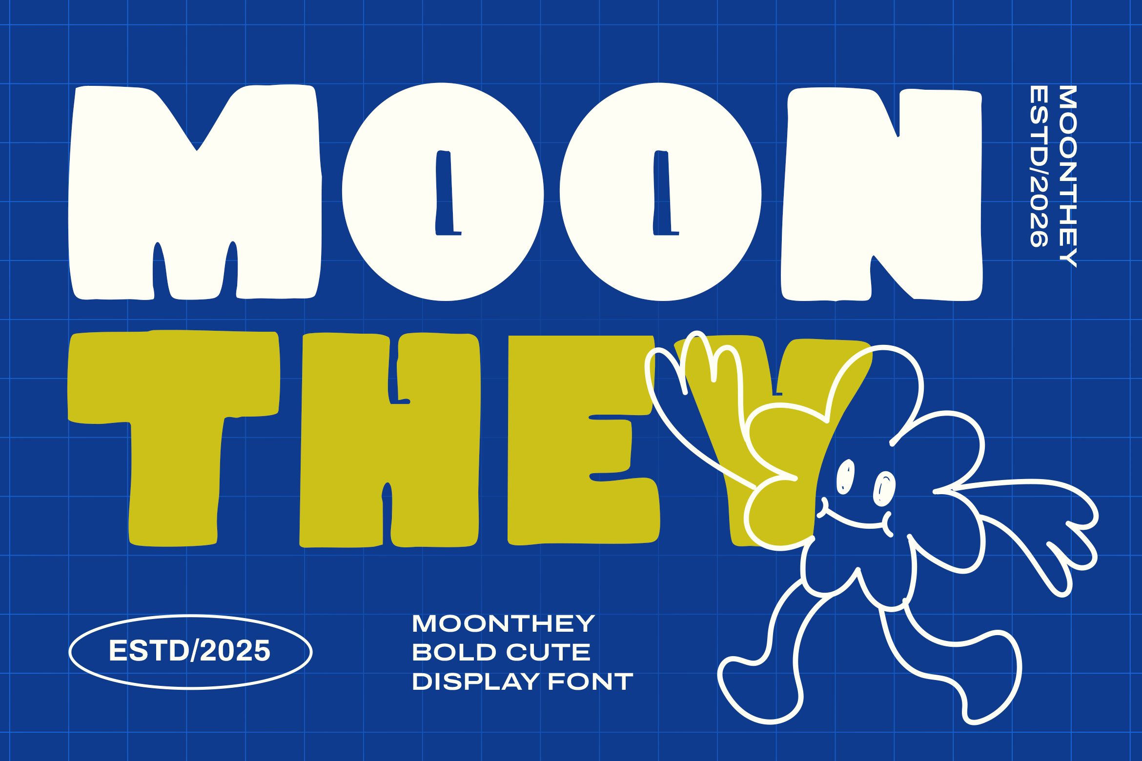
Mooney is an appealing choice for designers looking for a bold font with a modern aesthetic touch. Fonts with names like this usually carry a contemporary display style, blending heavy letter-forms with unique curves or details on certain characters, giving it a more artistic look than a classic bold font. It’s well suited for branding that wants to stand out from the competition.
4. Baseness
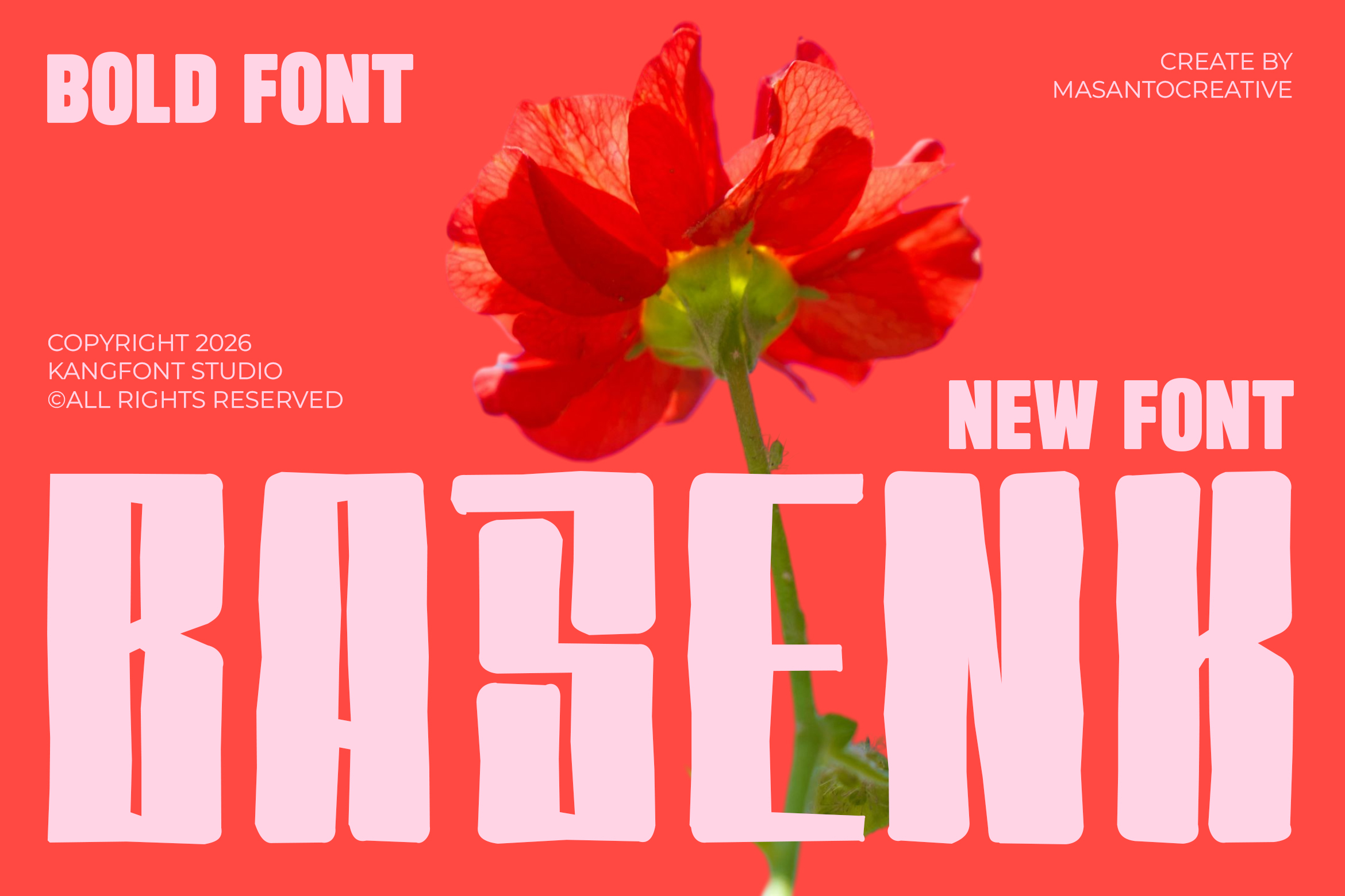
Baseness carries a strong urban, energetic vibe. Bold fonts with this kind of character are commonly used for designs targeting younger audiences — event posters, street-style content, or creative community branding. The heavy strokes keep the type eye-catching even within busy design compositions.
5. Kumba Display Serif Font
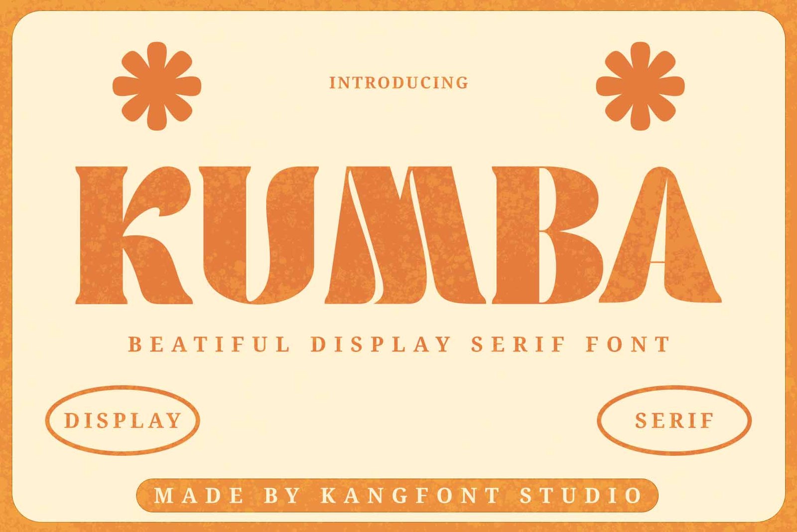
Unlike most bold sans-serif fonts, Kumba brings a bold, elegant serif style to the table. The combination of classic serif details with heavy letter weight creates a luxurious, premium, slightly vintage feel. This kind of font works especially well for fashion branding, cosmetics, editorial magazines, or upscale packaging designs that want to emphasize exclusivity.
6. Foobiesans
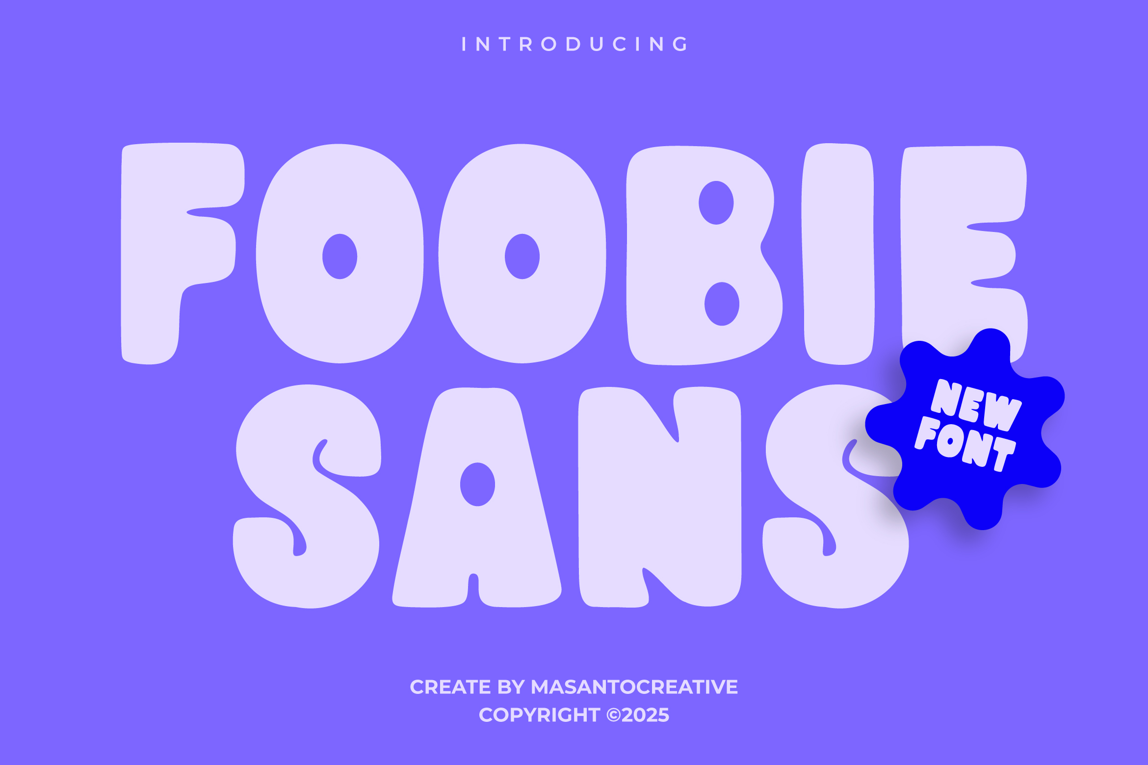
Foobiesans is a bold sans-serif font designed with modern branding needs in mind. Bold sans-serif styles like this tend to be highly versatile, pairing easily with a variety of other visual elements. It’s a solid fit for startup logos, UI/UX app design, or business presentation materials that want a clean look with strong character.
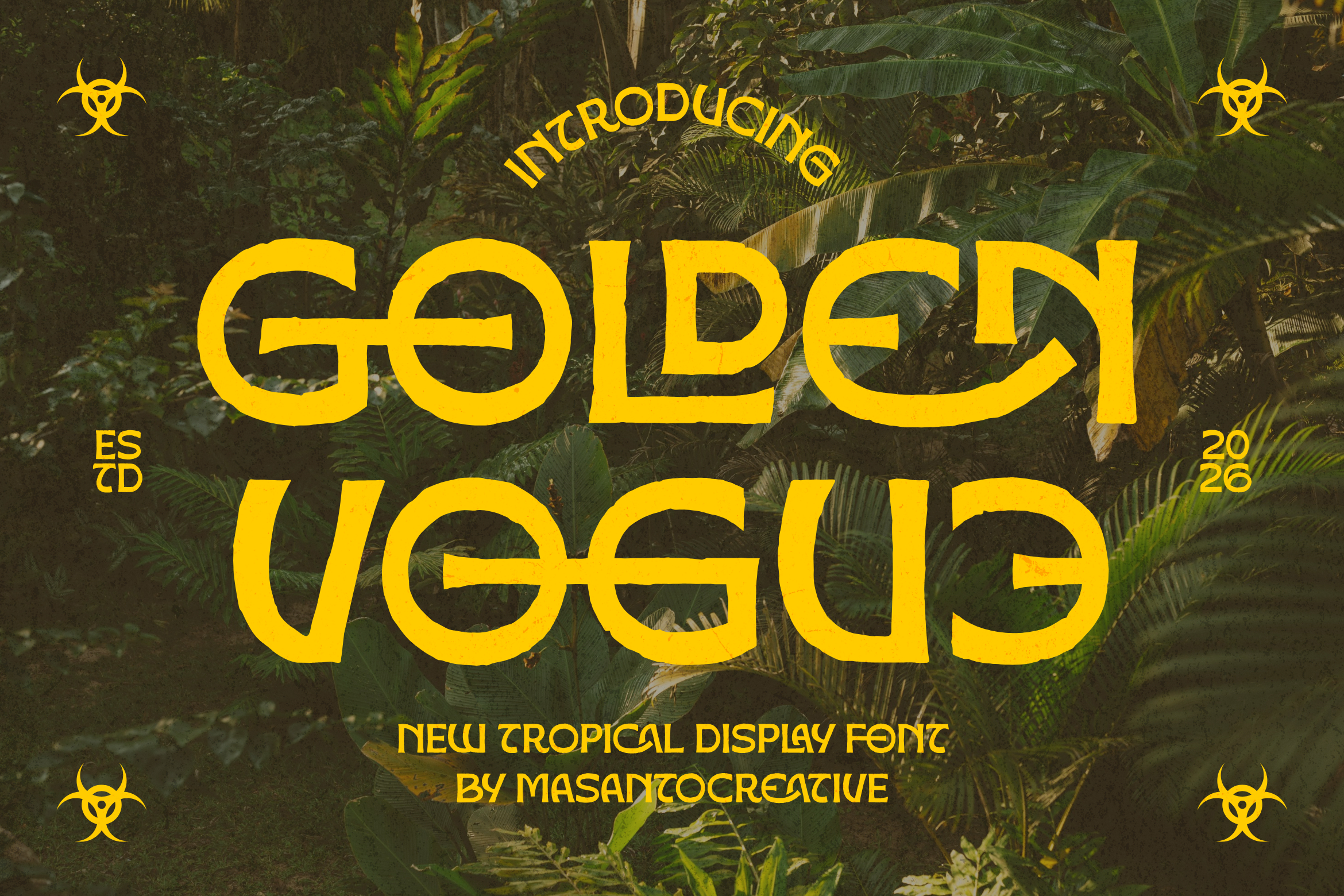
7. Golden Vogue
True to its name, Golden Vogue leans into a bold, glamorous, stylish look. Display fonts with a “vogue” feel are usually associated with fashion, beauty, and premium lifestyle branding. The luxurious impression of its letter-forms makes this font a great choice for elegant invitation designs, perfume labels, or fashion brand social media content.
8. Mc Verona
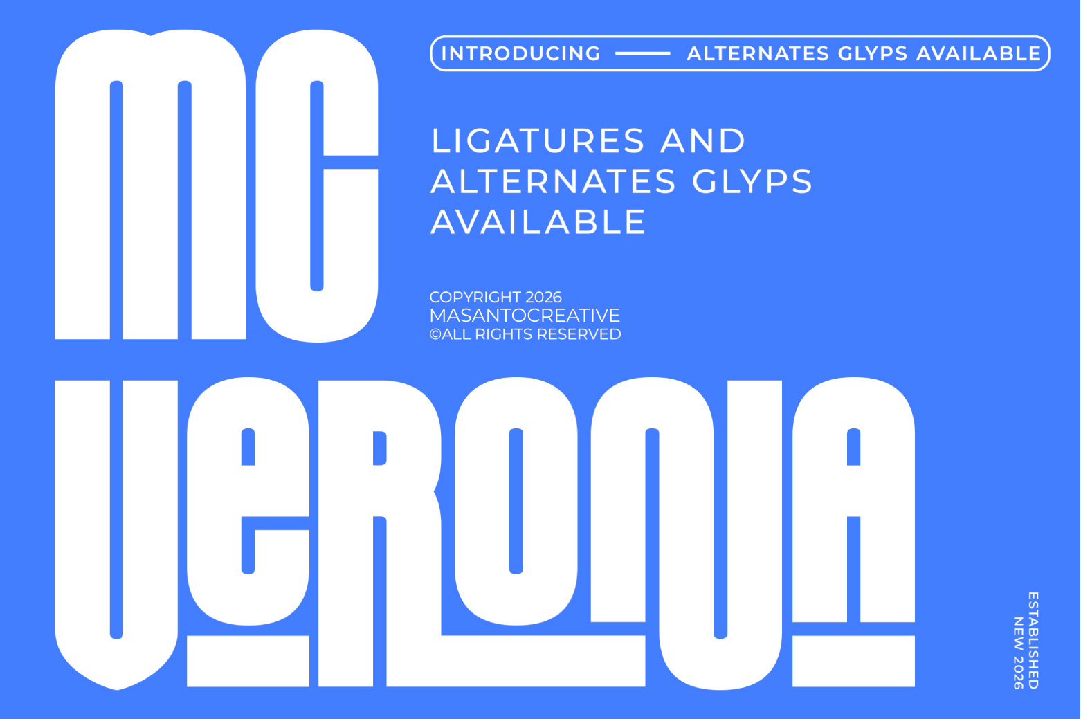
Mc Verona rounds out the list with a bold style that feels classic yet visually strong. Fonts with European-sounding names like this are often used for designs aiming for an elegant, timeless impression — perfect for restaurant or cafe logos, or heritage brands that want to emphasize a refined identity.
Why Bold Fonts Matter in Design
Bold fonts aren’t just about thick strokes — they play a key role in building visual hierarchy within a design. A bold headline immediately draws the reader’s eye before moving on to lighter, supporting text. Bold fonts also improve legibility on smaller media, such as social media thumbnails or compact digital banners.
In branding, choosing the right bold font can significantly strengthen a brand’s visual identity. Modern bold fonts like Foobiesans or Boldino suit brands that want to feel assertive and contemporary, while serif-style bold fonts like Kumba or Golden Vogue are better suited for brands emphasizing luxury and elegance.
How to Choose the Right Bold Font
Before deciding which font to use, here are a few things worth considering:
- Match it to your brand’s character – does your brand want to feel playful, elegant, or bold and assertive?
- Check legibility – make sure the font stays clear and readable at different sizes, especially for digital use.
- Review the license – make sure any font purchased from KangFont has a license that fits your intended commercial or personal use.
- Pair it with a supporting font – bold fonts are usually more effective when paired with a lighter secondary font for body text.
Final Thoughts
These eight fonts — Boldino, Molem, Mooney, Baseness, Kumba, Foobiesans, Golden Vogue, and Mc Verona — show just how diverse bold font styles on KangFont can be. From urban and playful to elegant and luxurious, there’s an option to fit nearly any design project. Check out each font’s product page on KangFont for full details, usage examples, and licensing options before making a purchase.