No products in the cart.
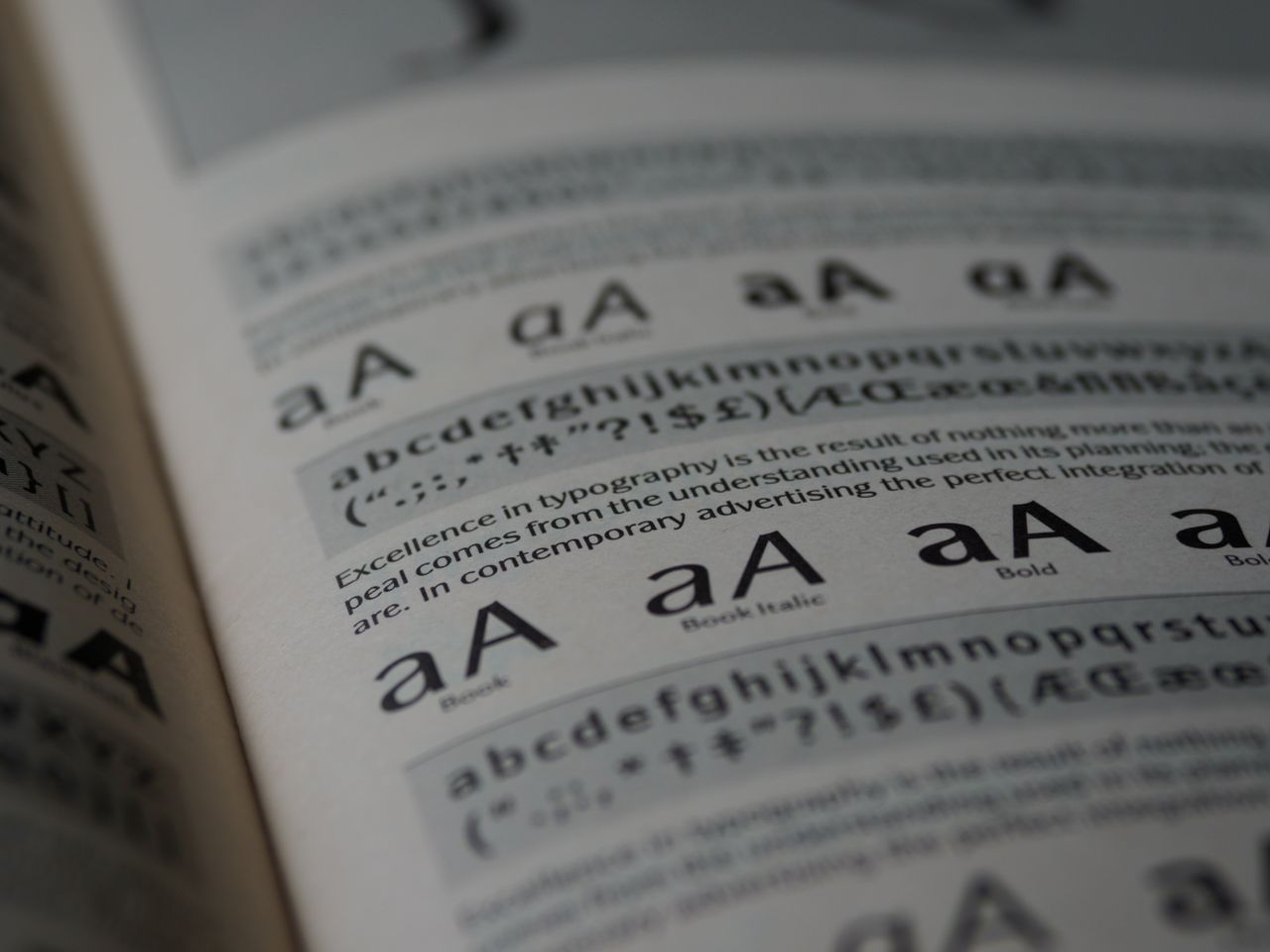
Pick the wrong font pairing and even the best website design falls apart. Pick the right one, and your site suddenly looks more polished, more trustworthy, and easier to read ” without changing a single line of layout code.
Font pairing isn’t about picking two fonts you personally like. It’s about creating contrast and hierarchy so visitors instantly know what to read first. Here’s how to do it well.
Why Font Pairing Matters More Than People Think
Most visitors decide whether a website looks “professional” within seconds, often before they’ve read a single word. Typography plays a huge role in that first impression. Two fonts that clash ” similar weights, competing styles, mismatched moods ” create visual noise that makes a site feel amateurish, even if the content is excellent.
Good pairing does three things at once:
- Creates a clear hierarchy between headings and body text
- Reinforces your brand’s tone (playful, corporate, minimal, editorial)
- Keeps text easy to scan on both desktop and mobile
Rule 1: Pair Contrast, Not Similarity
Two fonts that look almost identical create tension without purpose. The eye can’t tell if the difference is intentional. Instead, pair fonts that are clearly different in structure:
- A serif heading with a sans-serif body (classic and reliable)
- A bold display font for headlines with a neutral, highly readable font for body copy
- A geometric sans for headings with a humanist sans for paragraphs
Rule 2: Limit Yourself to Two, Maybe Three Fonts
One font for headings, one for body text, and ” if absolutely necessary ” one accent font for buttons or small UI labels. Beyond that, a site starts to look like a ransom note. Most high-performing websites run on just two typefaces.
Rule 3: Match the Mood to the Brand
A law firm and a children’s toy brand should never share a font pairing strategy. Before choosing fonts, ask what the site needs to communicate:
- Trust and authority ’ serif headings, clean sans-serif body
- Modern and minimal ’ geometric sans-serif throughout, differentiated by weight
- Friendly and approachable ’ rounded sans-serif headings with a simple, readable body font
- Editorial and content-heavy ’ a distinctive serif for both, differentiated by size and weight
Rule 4: Check Readability at Body Size, Not Just in the Headline
A font can look stunning at 60px and become nearly unreadable at 16px. Always test your body font pairing in an actual paragraph, on an actual screen, before finalizing anything. Look for consistent letter spacing, an open x-height, and clear distinction between characters like “I”, “l”, and “1”.
A Few Pairings That Consistently Work
- Serif heading + neutral sans-serif body (timeless, works for almost any industry)
- Bold geometric sans heading + humanist sans body (modern, tech-friendly)
- Condensed sans heading + classic serif body (editorial, magazine-style)
Where to Find Fonts Worth Pairing
The pairing rules above only matter if you’re starting with quality typefaces. A font with poor spacing, limited weights, or missing italics will fight against your layout no matter how well you pair it.
Browse our font library by category to find pairing-ready typefaces sorted by style, weight, and use case ” explore the collection here. And if you’re just getting started, check out our free font picks to test pairings before committing to a full license.