No products in the cart.
In the world of graphic design, typography is often underestimated — yet it plays one of the most important roles in visual communication. The font you choose can completely change how your design feels and how your audience perceives it.
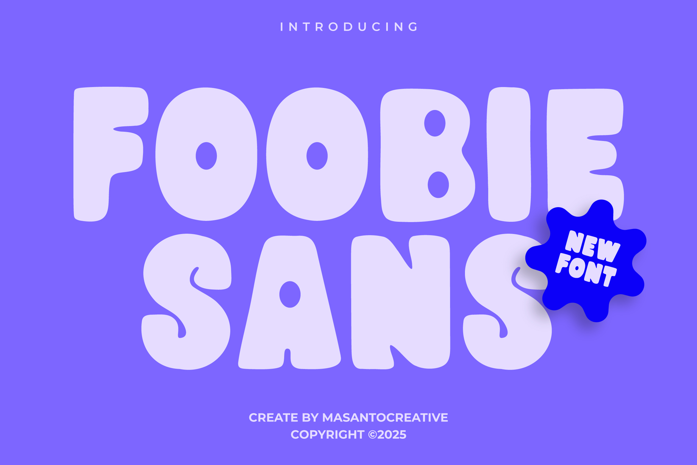
If you’re looking for a clean, modern, and versatile sans serif, there’s one that deserves your attention: Foobie Sans, a typeface designed by Kangfont Studio.
This typeface is made for designers who love simplicity, clarity, and a touch of elegance — a perfect mix between minimalism and professionalism.
What Is Foobie Sans?
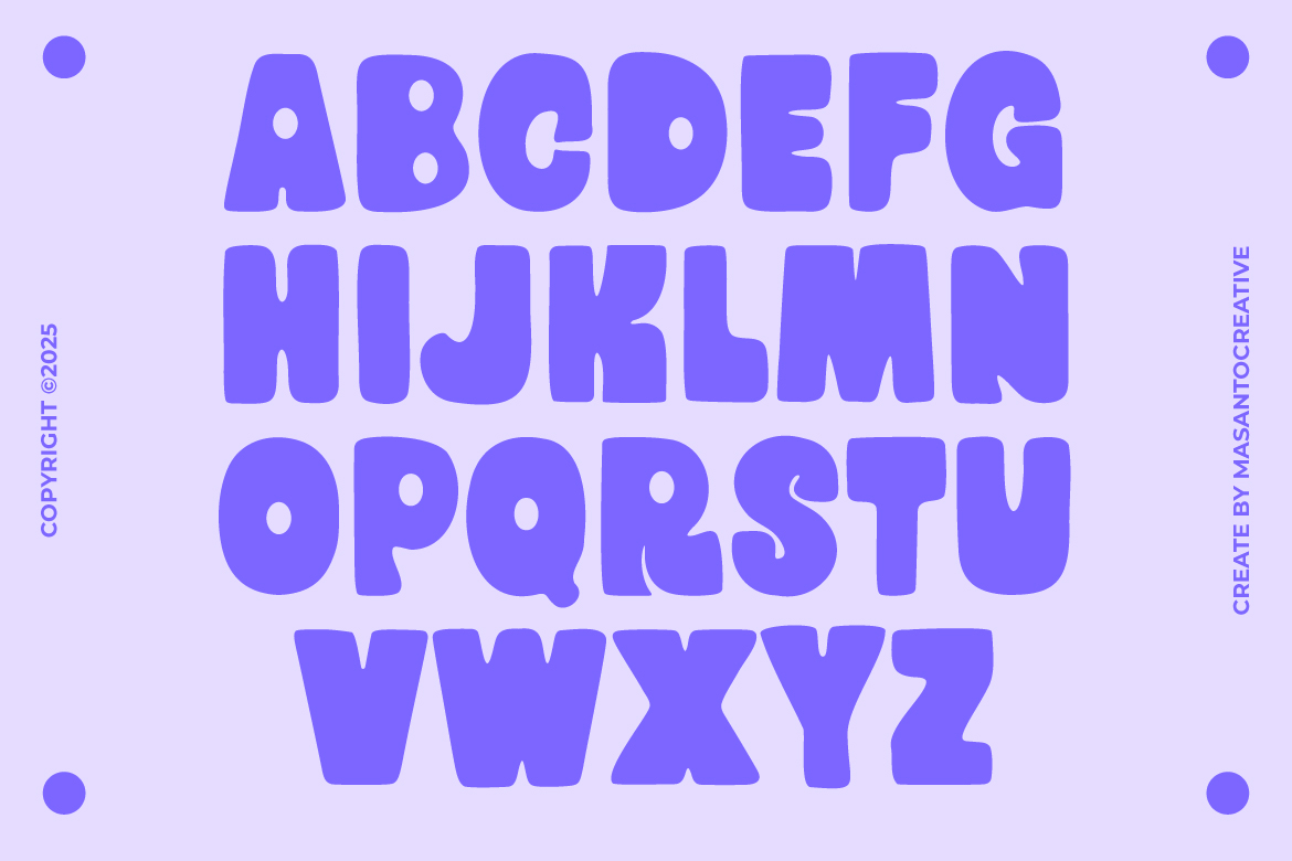
Foobie Sans is a modern sans serif typeface featuring clean lines, balanced proportions, and excellent legibility across print and digital media.
It’s not just another “plain” sans serif font — Foobie Sans brings a sense of clarity, confidence, and sophistication, making it ideal for a wide range of design projects.
Imagine using it on a tech startup logo, a sleek website, or minimalist product packaging — Foobie Sans instantly adds a sense of order and style.
Simple, Yet Never Boring
The charm of Foobie Sans lies in its simplicity.
Every curve and stroke feels intentional — not too rigid, not too decorative. The result is a font that looks professional yet friendly.
Its smooth shapes and consistent spacing make it perfect for both large titles and body text. It’s the kind of typeface that blends into your layout naturally, giving your design a balanced, polished look.
Whether you’re creating posters, brand visuals, or UI elements, Foobie Sans can adapt effortlessly.
Complete Formats and Ready to Use
Foobie Sans comes in multiple file formats — OTF, TTF, and WOFF — making it compatible with all major platforms and design software.
For web designers, the inclusion of the WOFF format means you can easily embed the font into websites without extra conversion steps. It’s truly a ready-to-use solution for both print and digital projects.
Where to Use Foobie Sans
Because of its versatility and readability, Foobie Sans works beautifully in various design contexts. Here are some ideas:
- Branding and Visual Identity
Foobie Sans delivers a modern, professional look for logos, business cards, and corporate materials. It’s great for startups, agencies, or brands that value clean design. - Web & App Design
The clear, lightweight forms make it ideal for UI and UX projects. Text remains sharp and readable on all screen sizes. - Editorial and Magazine Layouts
Perfect for headlines, subheadings, and even long-form text — maintaining both clarity and aesthetic appeal. - Product Packaging
Minimalist brands will love how Foobie Sans elevates packaging with an understated, premium look. - Social Media & Advertising
For digital content, Foobie Sans ensures that your message stands out clearly and elegantly.
Why Foobie Sans Stands Out
Here’s what makes Foobie Sans special among modern sans serif fonts:
- Minimalist but distinctive
Unlike overly generic sans serifs like Arial or Helvetica, Foobie Sans adds subtle personality to its shapes while keeping things clean. - Easy to pair
It works beautifully alongside serif fonts (for editorial work) or script fonts (for a creative twist). - Highly readable
Every letterform is optimized for clarity, ensuring perfect readability even in small text sizes.
Licensing and Usage Notes
Before using Foobie Sans in a commercial project, make sure to review its license terms on the official product page.
Kangfont Studio provides both personal and commercial licenses, allowing flexibility for individual designers, freelancers, and agencies.
If you’re working on international projects, it’s also worth checking the font’s language support — Foobie Sans currently covers full Latin characters and essential symbols for modern use.
Final Thoughts: A Simple Font That Elevates Your Design
If you’re searching for a typeface that embodies clarity, modernity, and balance, Foobie Sans is a great choice.
It doesn’t shout for attention — instead, it brings a quiet confidence to any layout.
From branding to web design, Foobie Sans can make your project look effortlessly polished and professional.
Sometimes, the most minimal typefaces are the ones that leave the strongest impression.
💡 Try it now at kangfont.com/foobiesans
Experience how a simple, modern typeface can instantly make your design feel cleaner, smarter, and more contemporary.