No products in the cart.
Fonts play a crucial role in shaping design identity. In 2025, font trends highlight readability, accessibility, and clean aesthetics across web and print. Here are 10 real and trending fonts widely used by designers worldwide — all free and available from trusted sources like Google Fonts.
1. Inter
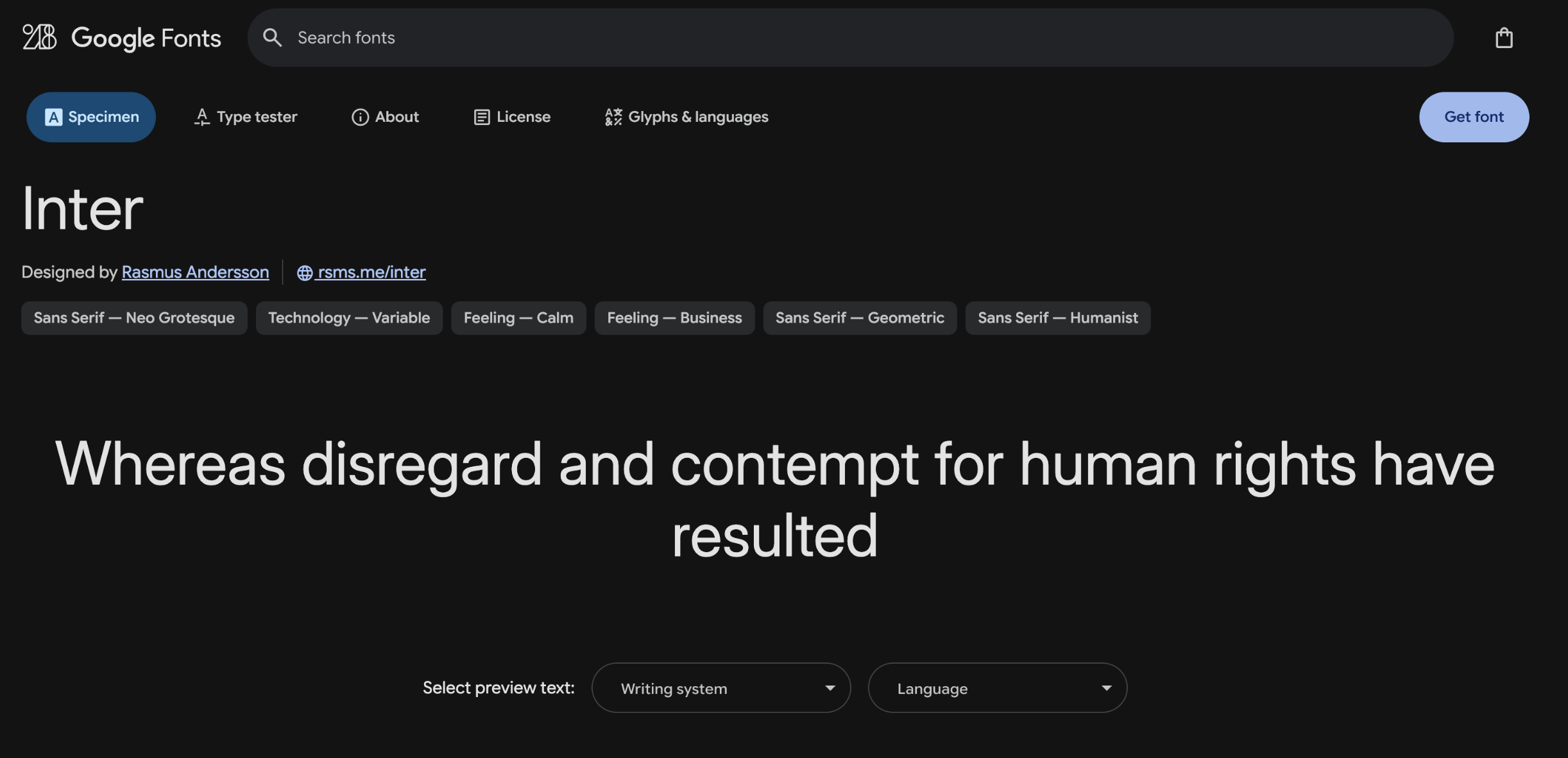
A modern sans-serif font by Rasmus Andersson, optimized for digital screens. With high x-height and variable support, Inter is a top choice for UI/UX tools like Figma and Notion.
2. Roboto
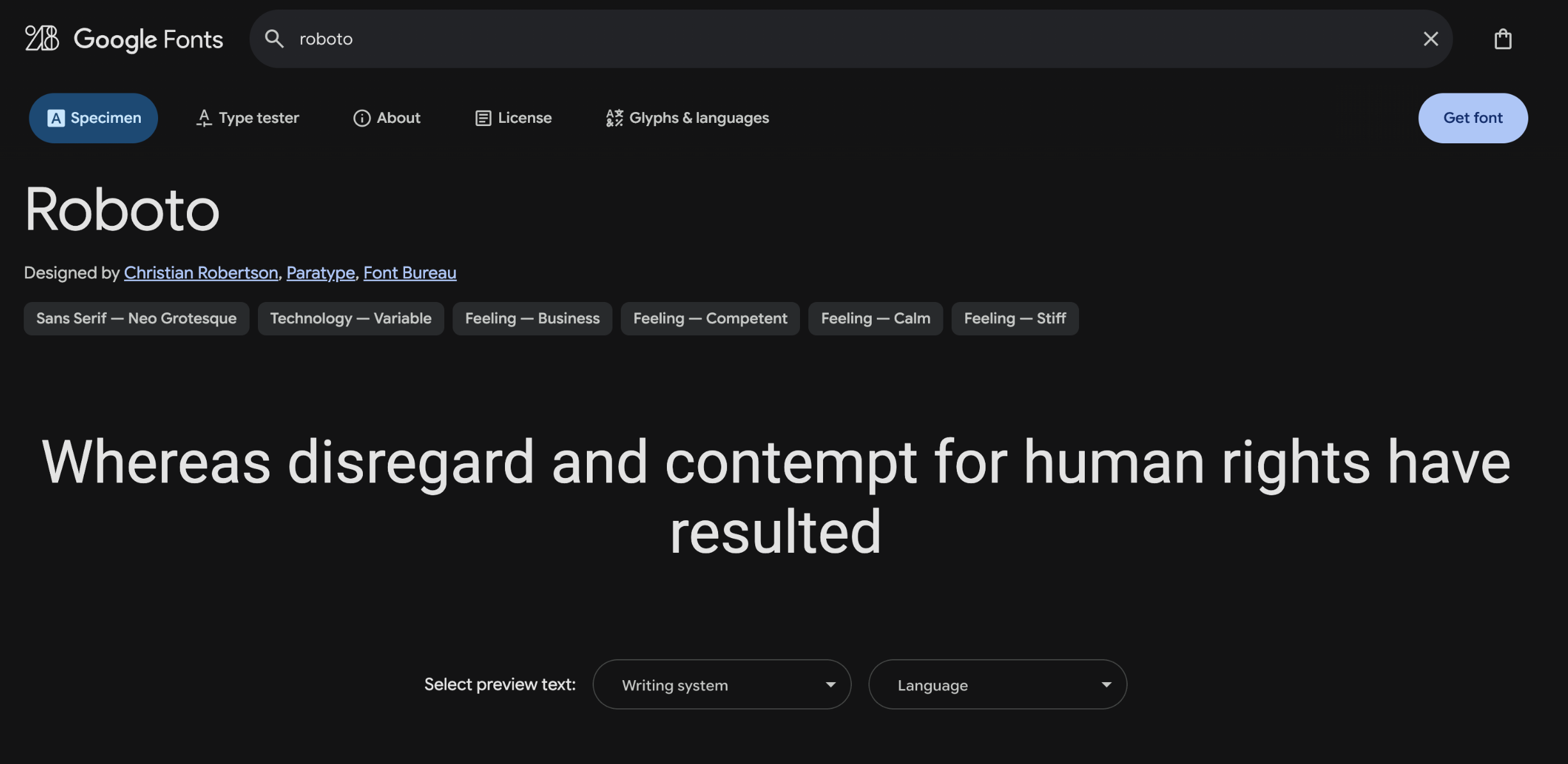
Developed by Google, Roboto is a geometric yet friendly sans-serif font. Its versatility makes it perfect for mobile apps, websites, and even print media.
3. Montserrat
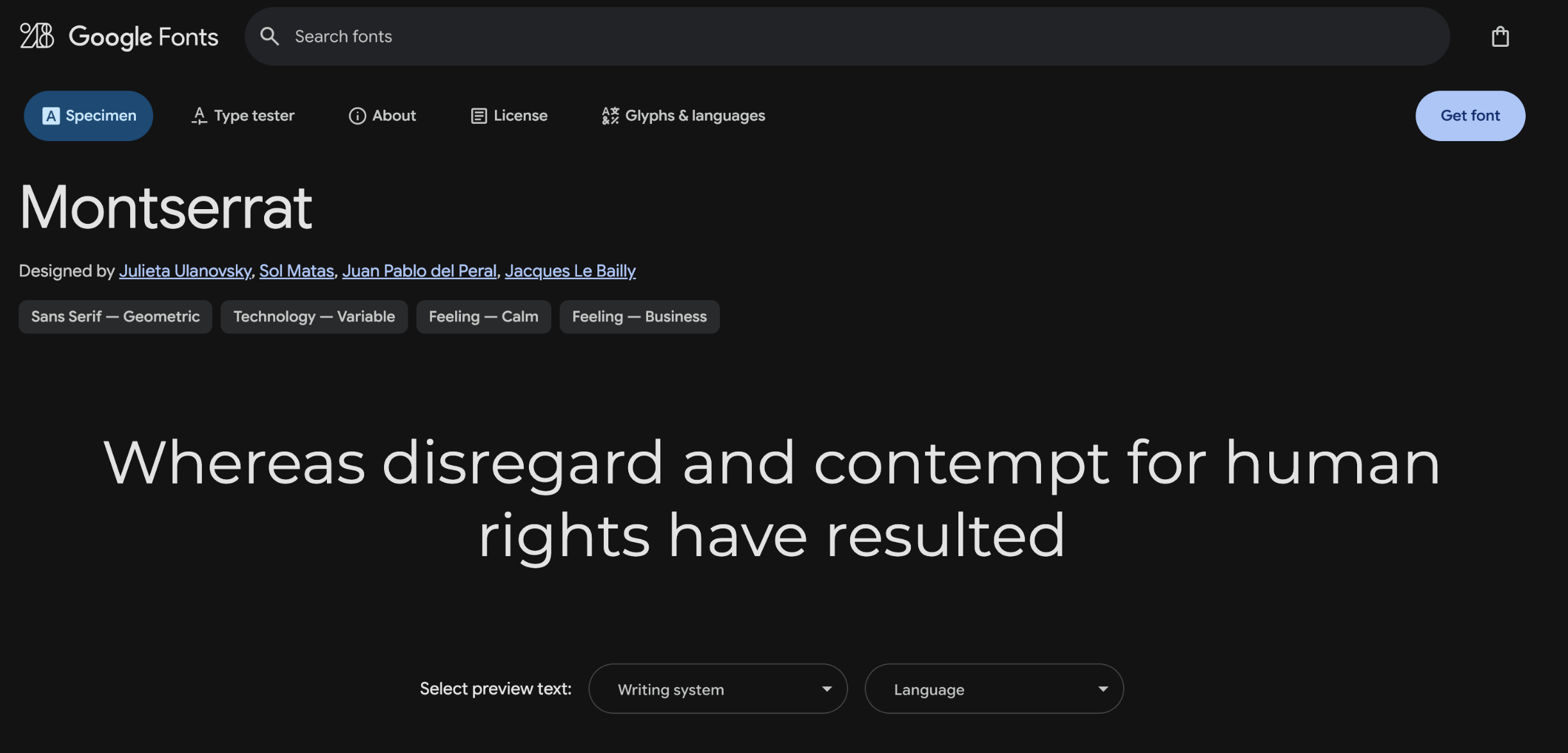
Inspired by old signage in Buenos Aires, this geometric sans-serif by Julieta Ulanovsky is sleek, modern, and excellent for branding and bold headlines.
4. DM Sans
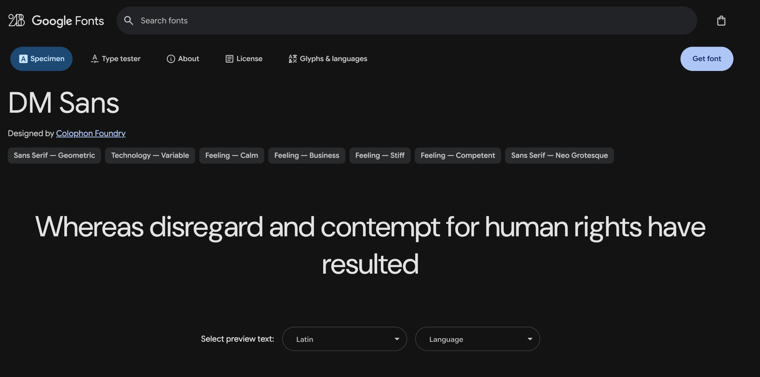
A clean, neutral sans-serif font designed for simplicity and readability. DM Sans works beautifully in both editorial layouts and minimalist web interfaces.
5. Fira Sans

Originally designed for Mozilla Firefox OS, Fira Sans offers excellent readability and includes a monospaced version. Ideal for developers and tech design.
6. Playfair Display
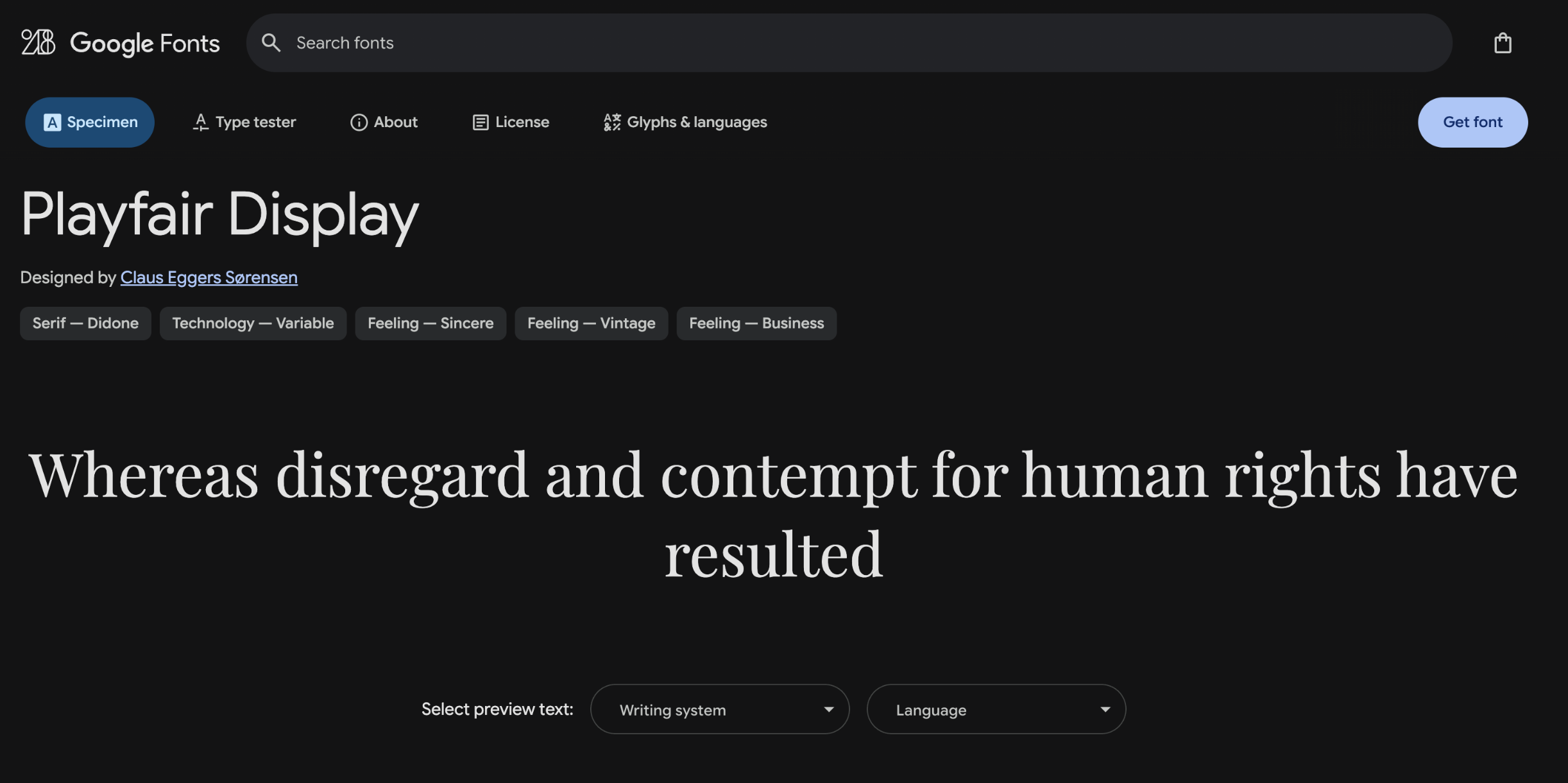
A high-contrast serif font perfect for titles and editorial content. Its classy look suits magazines, fashion brands, and stylish web pages.
7. Atkinson Hyperlegible
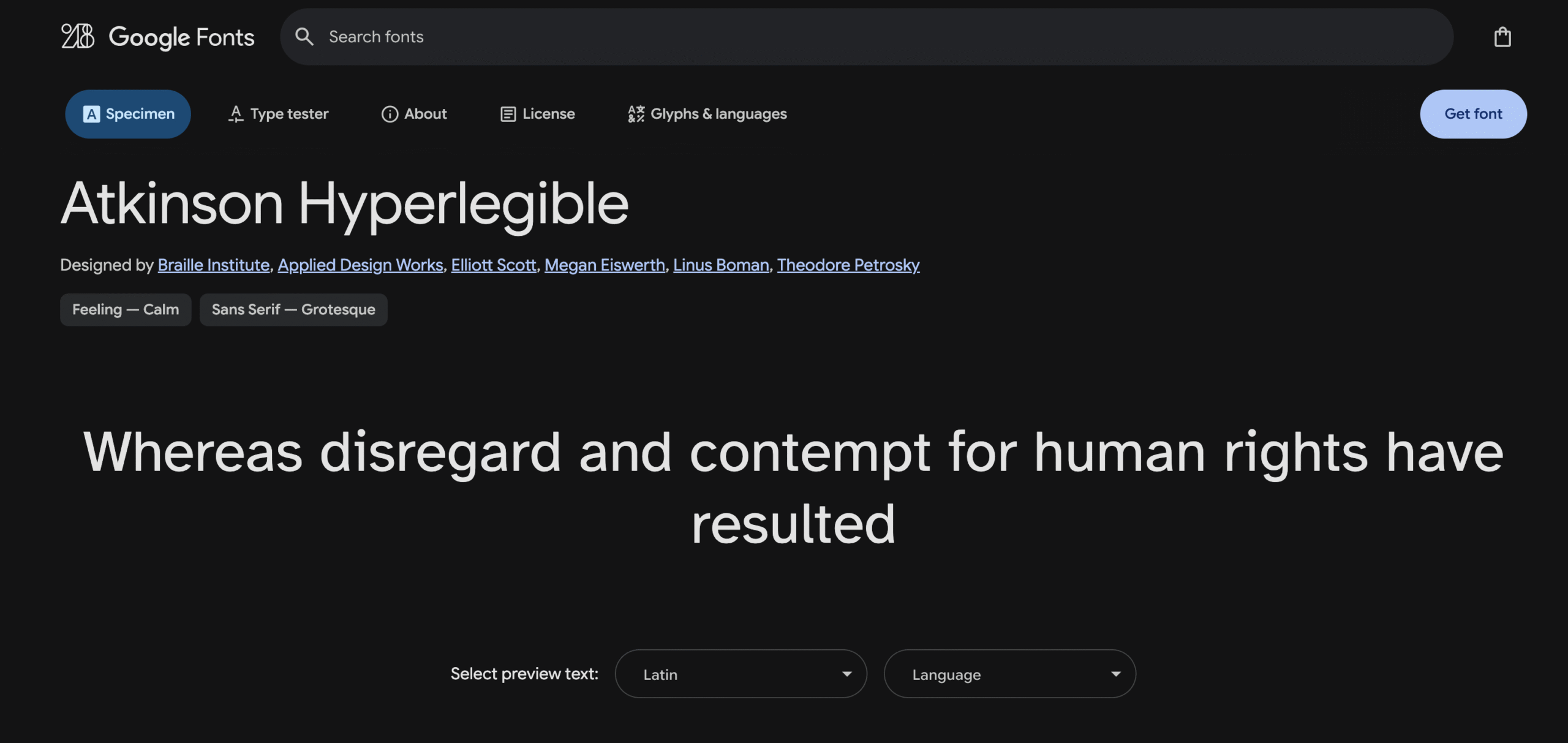
Created by the Braille Institute, this font is designed for maximum legibility, especially for people with visual impairments. It’s both functional and inclusive.
8. Special Gothic Expanded One
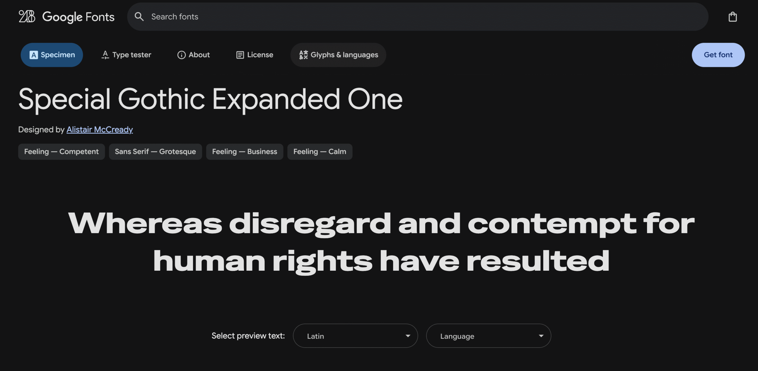
A bold, condensed display font with striking presence. Ideal for headlines that demand attention in posters, covers, or landing pages.
9. Caprasimo
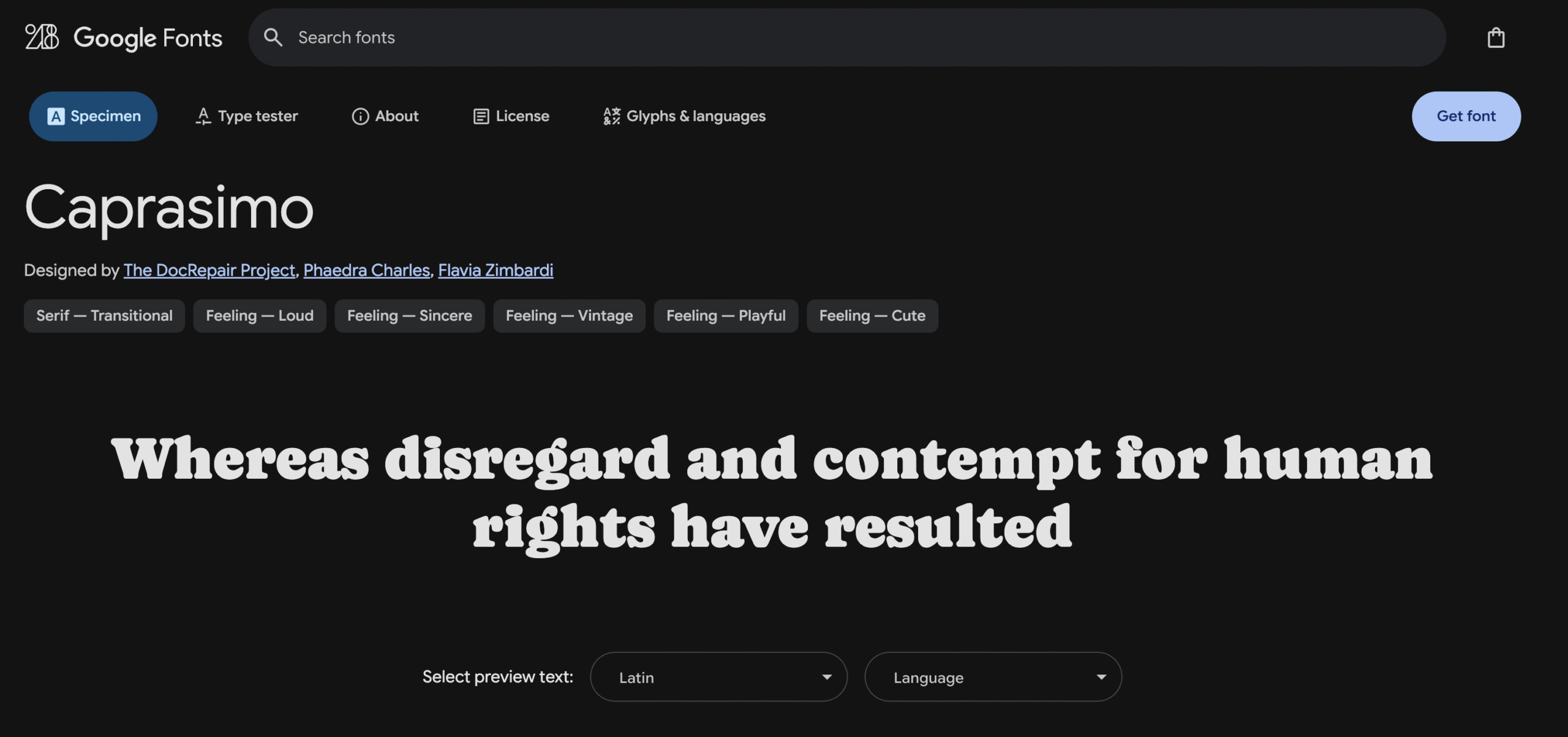
A fun and retro font with a bouncy baseline and friendly tone. Caprasimo is a perfect match for playful designs and creative branding.
https://fonts.google.com/specimen/Caprasimo“Download Here”
10. Instrument Serif
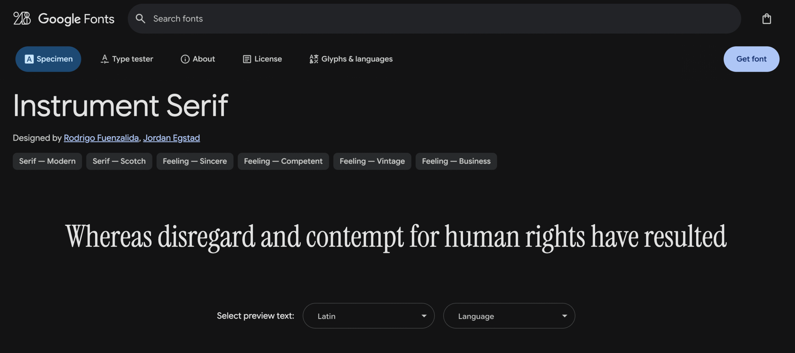
A minimalist serif font combining elegance and modernism. Great for refined text content, portfolios, or luxury product presentations.
11. Blunder
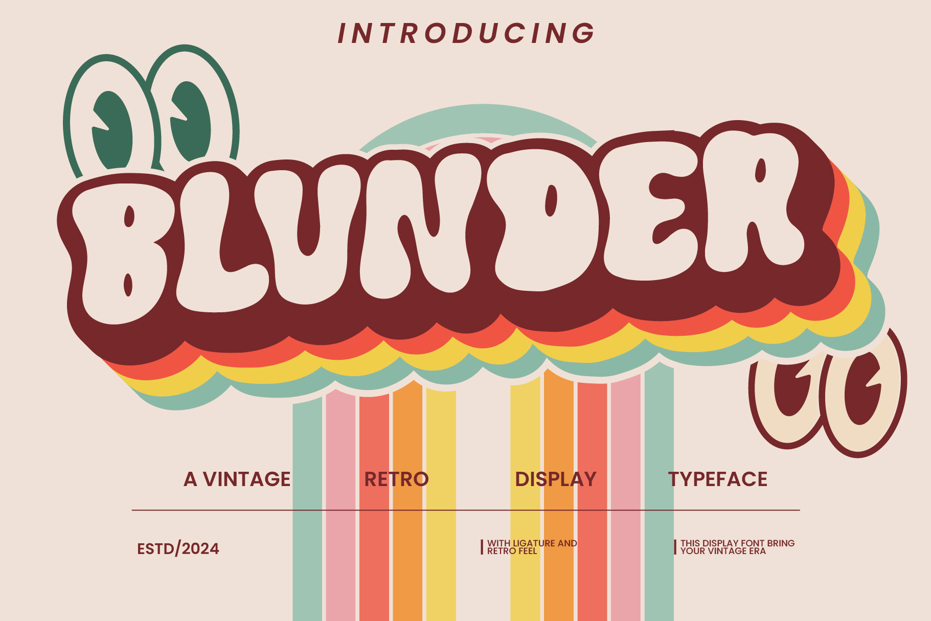
Blunder display font makes it suitable for projects with semi-vintage, vintage and retro nuances.
Why These Fonts Are Trending in 2025
- Legibility first: Fonts like Inter and Roboto are designed with screen readability and variable weights in mind — ideal for responsive UI design.
- Clean aesthetics: Montserrat and DM Sans balance modern geometry with versatility, making them go-to choices for brand consistency.
- Editorial excellence: Playfair Display and Instrument Serif give your content a premium and professional look.
- Inclusive design: Atkinson Hyperlegible supports accessibility, making typography more inclusive.
- Impactful style: Caprasimo and Special Gothic Expanded One deliver character and bold expression in creative projects.
Font Pairing Tips
- Modern Branding: Pair Inter (body) with Special Gothic Expanded One (headings).
- Editorial Design: Try Playfair Display for titles and Instrument Serif for body text.
- Creative Layouts: Combine Caprasimo (display) with DM Sans (body).
- Accessible Content: Use Atkinson Hyperlegible as your primary font.
Keep font combinations minimal — ideally 2 fonts — to maintain clarity and visual balance.
How to Use These Fonts
All these fonts are free and can be accessed on Google Fonts:
- Visit the Google Fonts site.
- Search for the font you want (e.g., “Inter”).
- Click “Download” or copy the embed code to use it on your website.
Or install them via plugins like Easy Google Fonts on WordPress.
Conclusion
Whether you’re designing an app, building a portfolio, or launching a product, choosing the right font is key to visual impact. The fonts listed above are not only trending but practical — combining style with readability, flexibility, and strong brand presence.
Explore, mix, and match — and let your typography speak with confidence in 2025.