No products in the cart.

Pick the wrong font pairing and even the best website design falls apart. Pick the right one, and your site suddenly looks more polished, more trustworthy, and easier to read ” without changing a single line of layout code.
Font pairing isn’t about picking two fonts you personally like. It’s about creating contrast and hierarchy so visitors instantly know what to read first. Here’s how to do it well.
Most visitors decide whether a website looks “professional” within seconds, often before they’ve read a single word. Typography plays a huge role in that first impression. Two fonts that clash ” similar weights, competing styles, mismatched moods ” create visual noise that makes a site feel amateurish, even if the content is excellent.
Good pairing does three things at once:
Two fonts that look almost identical create tension without purpose. The eye can’t tell if the difference is intentional. Instead, pair fonts that are clearly different in structure:
One font for headings, one for body text, and ” if absolutely necessary ” one accent font for buttons or small UI labels. Beyond that, a site starts to look like a ransom note. Most high-performing websites run on just two typefaces.
A law firm and a children’s toy brand should never share a font pairing strategy. Before choosing fonts, ask what the site needs to communicate:
A font can look stunning at 60px and become nearly unreadable at 16px. Always test your body font pairing in an actual paragraph, on an actual screen, before finalizing anything. Look for consistent letter spacing, an open x-height, and clear distinction between characters like “I”, “l”, and “1”.
The pairing rules above only matter if you’re starting with quality typefaces. A font with poor spacing, limited weights, or missing italics will fight against your layout no matter how well you pair it.
Browse our font library by category to find pairing-ready typefaces sorted by style, weight, and use case ” explore the collection here. And if you’re just getting started, check out our free font picks to test pairings before committing to a full license.
If you’re looking for clean, modern, and highly readable typefaces, the Sans Serif fonts collection on Kangfont.com is a perfect destination for designers, brands, and creatives. Sans serif fonts are known for their simple strokes without decorative serifs, making them ideal for digital interfaces, branding, editorial work, UI/UX projects, and more.
In this article, we’ll explore what makes these sans fonts unique, popular use cases, design tips, and how you can best use them across your creative work.
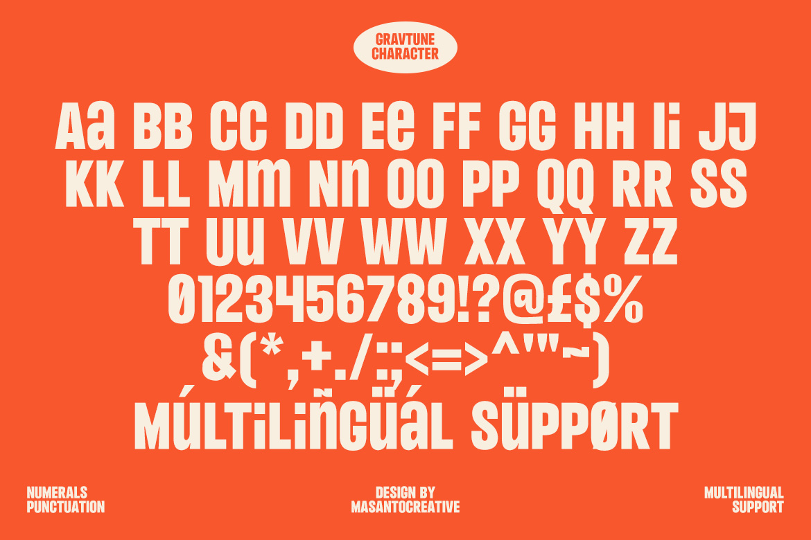
A sans serif font is a typeface category characterized by absence of serif details — the small strokes at the end of letterforms. This creates a modern, clean, and minimalist look that enhances readability, especially on digital screens.
Unlike serif fonts, which are traditionally used in print like books and magazines, sans serif fonts offer a more open and contemporary aesthetic that works well for a wide range of purposes — from web interfaces to bold branding.
The Sans category on Kangfont features a curated selection of sans serif fonts suitable for multiple design needs. Here you can find both display sans fonts and more neutral modern sans typefaces that balance style and functionality.
From sleek professional sans fonts to expressive geometric styles, this collection lets designers choose fonts that elevate their visual communication.
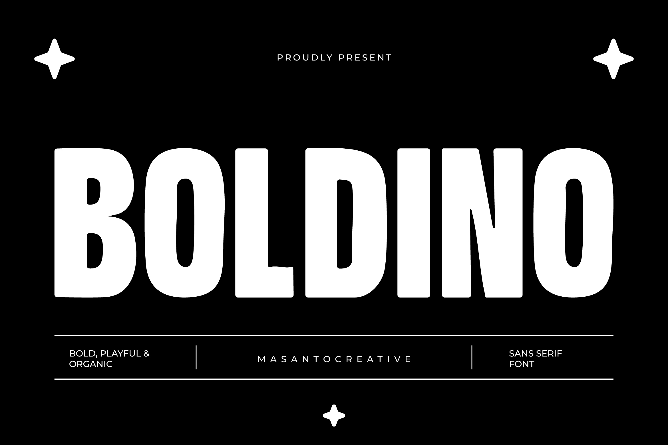
Here are some examples of sans fonts available on Kangfont:
You can explore all sans font products directly here: Kangfont Sans Fonts Collection.
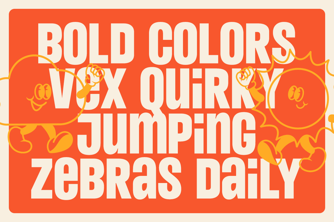
Sans serif fonts are free from ornamental features, which makes them appear clean, versatile, and modern. This simplicity gives designers flexibility — whether you’re crafting a tech brand or a minimalist editorial layout.
This is especially true in digital design, where sans fonts deliver crisp readability even at small sizes.
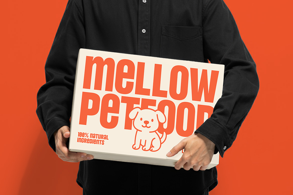
Studies and design standards show that sans serif fonts often provide superior legibility on screens. Their straightforward geometry makes them ideal for user interfaces, mobile apps, and responsive websites.
Because of this, many mobile and tech brands use sans serif fonts as a key part of their typography systems.
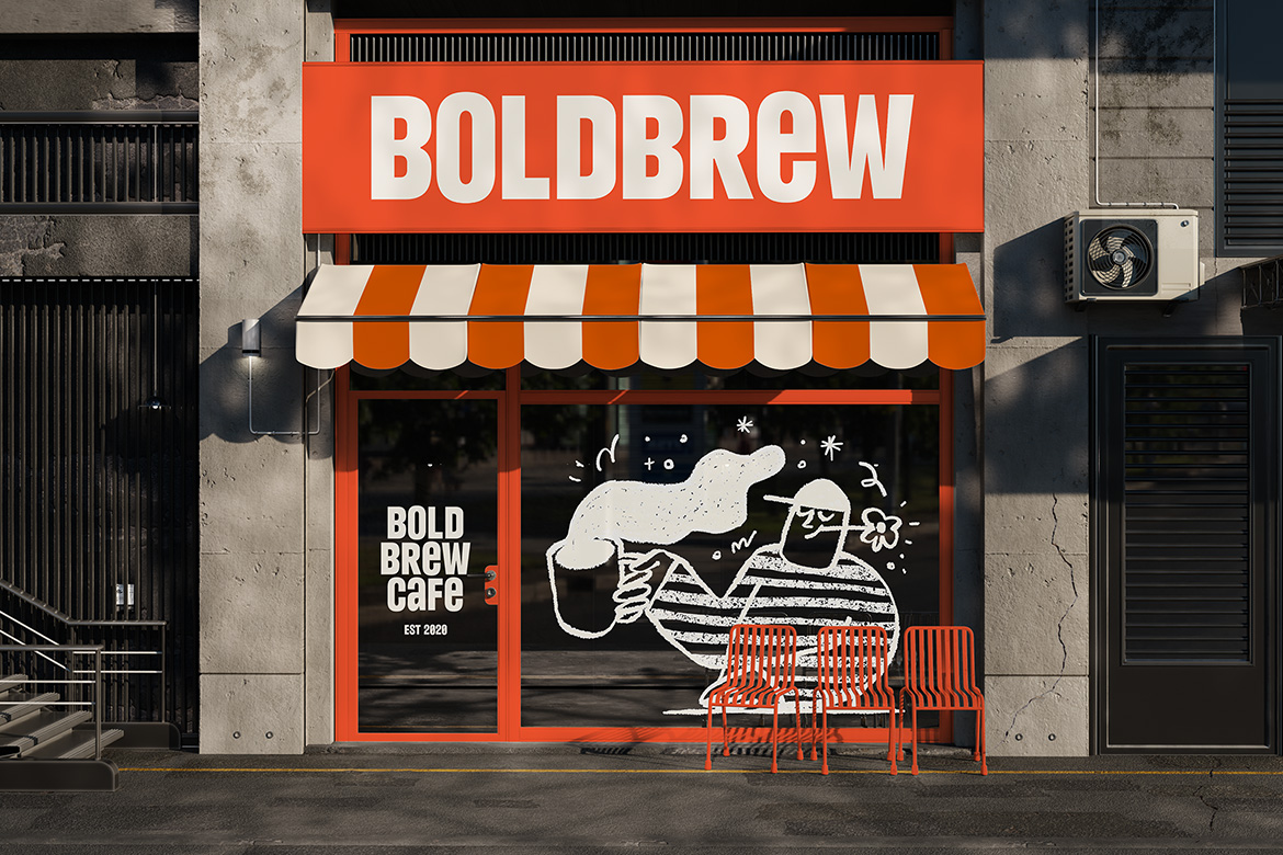
Whether you’re designing a logo, business card, or website interface, sans serif fonts are a designer’s go-to choice for neutral but confident typography. They pair beautifully with accent serif fonts too, like in our article on serif typography. (See: Serif Fonts on Kangfont)
In modern web and mobile designs, sans serif fonts such as those on Kangfont help deliver clean, responsive user experiences. Their legibility makes them ideal for body text, UI navigation, and interface labels.
Sans fonts like Boldino or Nebro bring an energetic or sleek tone — perfect for crafting memorable logos and brand systems with strong identity.
Because they maintain clarity even at large sizes, sans serif fonts are often used in editorial layouts, posters, and event materials, especially when paired with expressive serif or script fonts.
Choosing the right sans font depends on your design goals:
Pairing sans serif fonts with serif fonts or script fonts is one of the most effective typography strategies in modern design. For example:
Combine with our tips from Typography Tips for Designers to create more engaging typographic hierarchy.
Here are practical tips when using sans fonts:
Sans serif fonts remain a cornerstone of modern design because they:
And with the selection available at Kangfont’s Sans category, you have a curated range of quality typefaces ready for creative projects of all kinds.
📌 Want to expand your type design skills? Check out our guide on Font Pairing Techniques and make your next typography even more striking!