No products in the cart.

When it comes to creating packaging for food products, presentation is everything. You’re not just designing a box — you’re building a brand experience. And the best way to bring your design to life before production is through a realistic, high-quality mockup.
That’s where the Stacked Food Box Mockup comes in — a premium, editable mockup that helps designers and creatives showcase their food packaging ideas like a pro.
👉 Get it here: Stacked Food Box Mockup on Gumroad
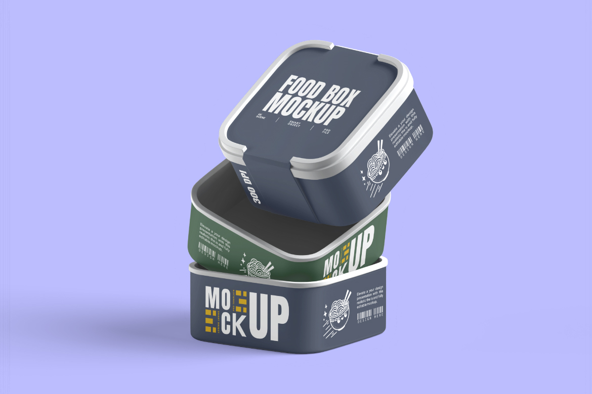
A great packaging mockup can transform how clients perceive your work. Instead of showing a flat design, mockups let you display your artwork in a realistic, three-dimensional scene.
This helps clients instantly visualize how their brand will look in real life — colors, shadows, textures, and logo placement all come together perfectly.
Beyond that, mockups:
In short, mockups are not just a bonus — they’re a must-have asset for every packaging designer.
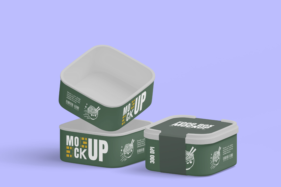
The Stacked Food Box Mockup from Masantocreative (via Gumroad) is specifically designed to help you present your food packaging in a clean, realistic, and high-resolution style.
Here’s what makes it worth every penny:
To make your presentation stand out, follow these quick tips:
If you want to impress clients, elevate your portfolio, and save time while delivering premium-looking results, the Stacked Food Box Mockup is the right choice.
It’s easy to use, affordable, and built for creatives who take their presentation seriously.
Your design deserves to be seen at its best — and this mockup gives you the realistic touch that makes all the difference.
👉 Download it now on Gumroad:
https://luxyvoo.gumroad.com/l/stackedfoodboxmockup
Start showcasing your food packaging design like a professional today — and watch how it transforms the way clients see your work.
When it comes to presenting outdoor or construction branding, context is everything. A flat design on a white background doesn’t show clients how your banner will truly look once printed and installed. That’s why realistic mockups are so important — they bridge the gap between imagination and real-world presentation.
The Construction Site Banner Mockup by LuxyVoo was created with that exact purpose in mind. Designed for professional designers, agencies, and visual artists, this mockup helps you showcase your banner designs as if they were already installed at an actual construction site. It’s clean, photo-realistic, and easy to use — a perfect blend of realism and efficiency.
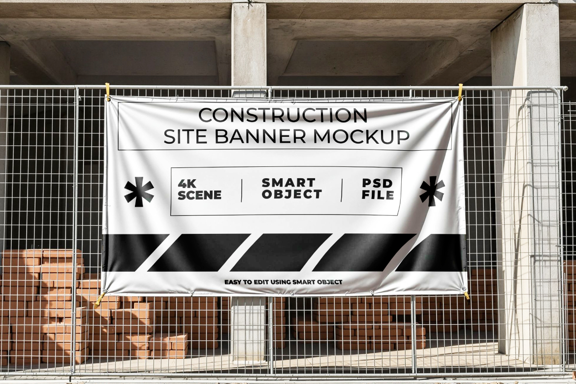
What makes this mockup stand out is its authenticity. The scene captures a genuine construction-site atmosphere — from the metal fences and dusty textures to the natural lighting and soft shadows. Your banner design blends seamlessly into this environment, giving it a sense of weight, scale, and realism that impresses clients immediately.
Instead of spending hours creating 3D renders or arranging on-site photoshoots, you can simply drop your artwork into the smart object, and the mockup automatically applies realistic lighting, perspective, and surface details. The end result looks like a professional product photo.
It’s ideal for:
The Construction Site Banner Mockup includes all the essential features professionals expect from a premium design asset:
Even if you’re not a Photoshop expert, this mockup is beginner-friendly:
.PSD file in Adobe Photoshop.Within minutes, you’ll have a realistic, professional banner visualization — without any extra rendering or photo editing.
Clients respond to visuals. When they see your design already “installed” in the real world, they instantly understand its potential. This mockup doesn’t just show your design — it sells your idea.
Imagine presenting a construction company’s branding or a safety campaign using a realistic banner photo instead of a flat design. It builds trust and helps the client picture the final product in their actual work environment.
This level of visual storytelling gives you a serious edge over other designers who rely only on flat previews. It communicates not just your technical skills, but also your ability to visualize how design interacts with space and materials.
The versatility of this mockup makes it useful across multiple design niches:
No matter what kind of project you’re working on, this mockup makes your design look professional, believable, and ready for real-world use.
The mockup gives you the technical framework; your creativity completes the story.
The Construction Site Banner Mockup isn’t just a design template — it’s a storytelling tool for professionals who care about quality presentation. It allows your ideas to live in a believable, real-world setting, helping clients see the full impact of your design.
Whether you’re creating a pitch for a construction firm, building a portfolio piece, or selling your own mockups, this file saves hours of work while maintaining a polished, high-end finish.
Realistic. Practical. Professional. That’s what makes this mockup a must-have for every modern designer’s toolkit.
In the world of graphic design, typography is often underestimated — yet it plays one of the most important roles in visual communication. The font you choose can completely change how your design feels and how your audience perceives it.
If you’re looking for a clean, modern, and versatile sans serif, there’s one that deserves your attention: Foobie Sans, a typeface designed by Kangfont Studio.
This typeface is made for designers who love simplicity, clarity, and a touch of elegance — a perfect mix between minimalism and professionalism.
Foobie Sans is a modern sans serif typeface featuring clean lines, balanced proportions, and excellent legibility across print and digital media.
It’s not just another “plain” sans serif font — Foobie Sans brings a sense of clarity, confidence, and sophistication, making it ideal for a wide range of design projects.
Imagine using it on a tech startup logo, a sleek website, or minimalist product packaging — Foobie Sans instantly adds a sense of order and style.
The charm of Foobie Sans lies in its simplicity.
Every curve and stroke feels intentional — not too rigid, not too decorative. The result is a font that looks professional yet friendly.
Its smooth shapes and consistent spacing make it perfect for both large titles and body text. It’s the kind of typeface that blends into your layout naturally, giving your design a balanced, polished look.
Whether you’re creating posters, brand visuals, or UI elements, Foobie Sans can adapt effortlessly.
Foobie Sans comes in multiple file formats — OTF, TTF, and WOFF — making it compatible with all major platforms and design software.
For web designers, the inclusion of the WOFF format means you can easily embed the font into websites without extra conversion steps. It’s truly a ready-to-use solution for both print and digital projects.
Because of its versatility and readability, Foobie Sans works beautifully in various design contexts. Here are some ideas:
Here’s what makes Foobie Sans special among modern sans serif fonts:
Before using Foobie Sans in a commercial project, make sure to review its license terms on the official product page.
Kangfont Studio provides both personal and commercial licenses, allowing flexibility for individual designers, freelancers, and agencies.
If you’re working on international projects, it’s also worth checking the font’s language support — Foobie Sans currently covers full Latin characters and essential symbols for modern use.
If you’re searching for a typeface that embodies clarity, modernity, and balance, Foobie Sans is a great choice.
It doesn’t shout for attention — instead, it brings a quiet confidence to any layout.
From branding to web design, Foobie Sans can make your project look effortlessly polished and professional.
Sometimes, the most minimal typefaces are the ones that leave the strongest impression.
💡 Try it now at kangfont.com/foobiesans
Experience how a simple, modern typeface can instantly make your design feel cleaner, smarter, and more contemporary.
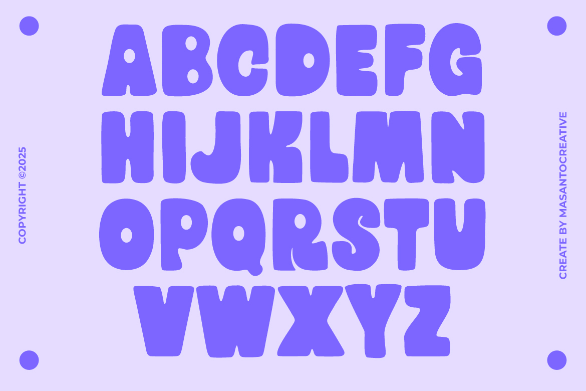
Boldino is a playful bold sans serif font created by masantocreative and published on Kangfont.com. Released on August 24, 2025, this unique typeface combines bold confidence with a friendly, handmade touch. Designed for creative display use, Boldino brings character, warmth, and modern style to posters, branding, packaging, advertising, retro-inspired graphics, and digital content.
If you are searching for a bold playful sans serif font that stands out, Boldino might be the perfect choice.
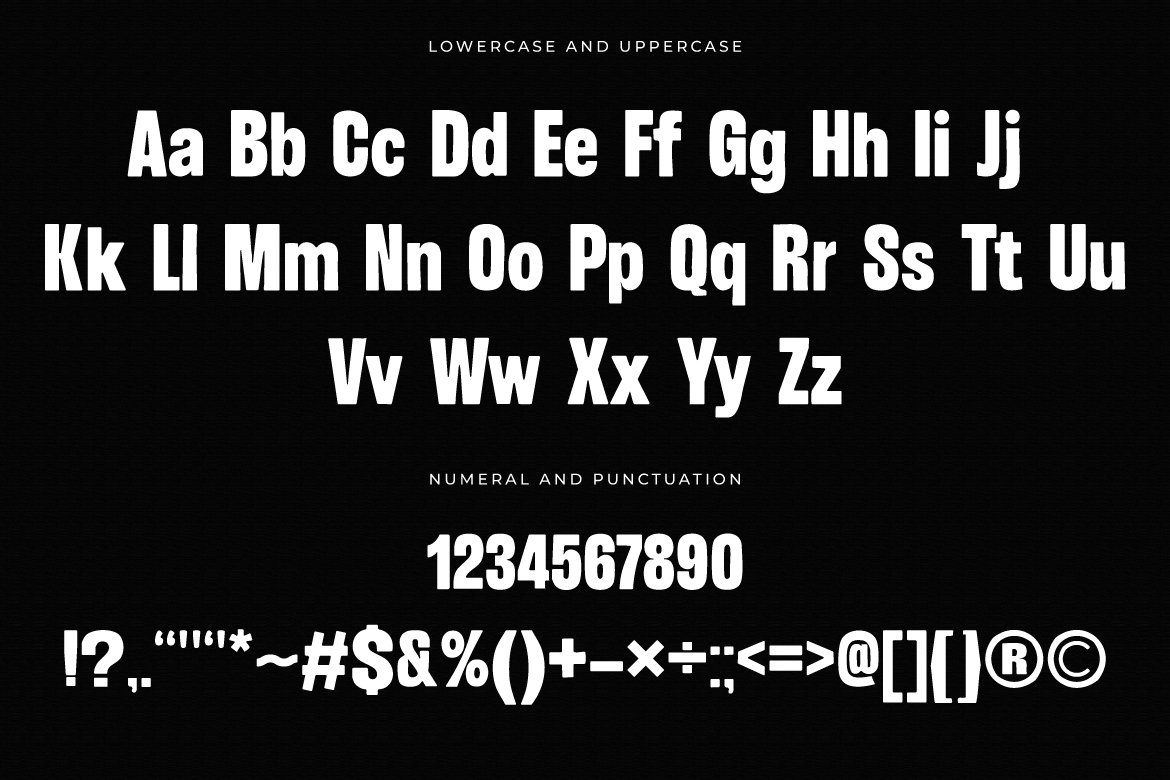
Boldino is designed as a display font with strong readability and a distinct personality. Its playful curves and handcrafted details make it versatile for multiple design fields. Here are the highlights:
With its complete character set, Boldino is suitable for everything from logos and posters to web banners and social media graphics.
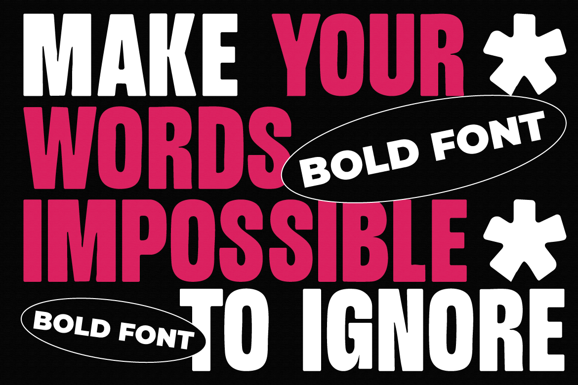
The popularity of Boldino font lies in its ability to grab attention while staying fun and approachable. Here are a few reasons designers choose Boldino:
When you download Boldino font, you can choose from different licenses depending on your project scale. This makes it accessible for freelancers, agencies, and corporations alike. The pricing (as listed on Kangfont) includes:
This flexible licensing structure ensures you pay only for what you need—whether it’s a small personal project, a large corporate campaign, or even TV broadcast.
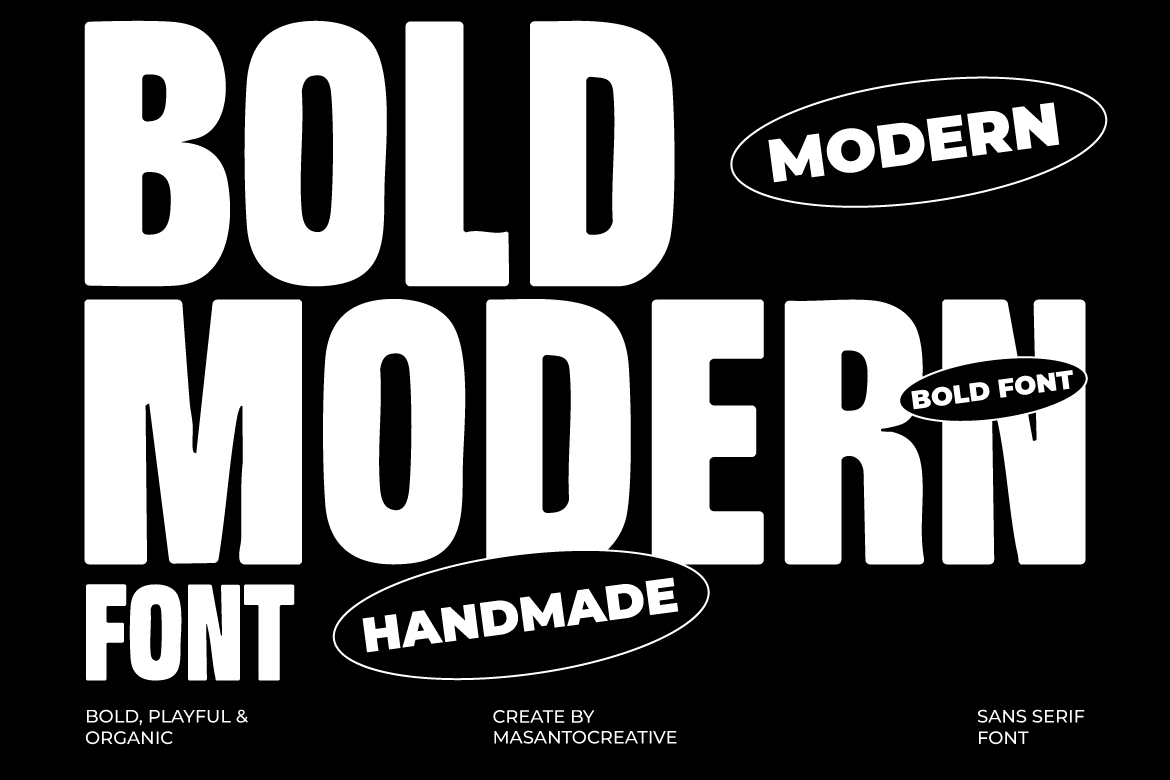
To get the most out of Boldino bold sans serif font, here are some design tips:
You might notice other fonts with similar names like Boldini or Boldina. While they sound alike, they serve different purposes:
Compared to them, Boldino is simpler, more playful, and perfect for designers looking for a bold display font with personality.
If your design project needs a bold, playful, and eye-catching font, then Boldino is an excellent choice. It combines modern sans serif structure with a friendly, handcrafted style that makes designs stand out in both print and digital media. With flexible licensing, complete formats (OTF/TTF/WOFF), and strong visual impact, Boldino is well-suited for branding, packaging, posters, social media content, and creative marketing campaigns.
👉 You can explore and download Boldino directly from Kangfont.com.
Bring your designs to life with a font that’s bold, fun, and versatile—Boldino.
Kangfont is known as a premium font provider, offering both exclusive paid fonts and free premium fonts for designers, content creators, and branding projects. Their collection includes a variety of typefaces suitable for logos, posters, packaging, and more. Among their Best Selling Fonts, Blunder – Display Font stands out as a customer favorite for its unique personality and versatility.
Blunder is a display font with a charming blend of semi-vintage and retro aesthetics. Its letterforms are bold, rounded, and slightly quirky, giving a friendly yet strong visual impression. This style works perfectly for projects aiming for a nostalgic touch while staying playful and eye-catching.
Blunder Display Font comes in OTF, TTF, and WOFF formats, with the WOFF version available as a web font.
The complete package is compatible with both PC and Mac and is easy to install. On marketplaces like Creative Market, the font is sold as a full set, making it convenient for both print and digital projects.
According to FontSpace, Blunder was first released on June 9, 2024 and last updated on November 21, 2024.
The font has been downloaded over 880 times, added to 50 user collections, and received multiple positive responses from designers. This shows a steady demand in the creative community.
Licensing information varies between platforms:
Because of these differences, it’s essential to check the license terms from the platform or seller you obtain the font from—especially if you plan to use it for commercial purposes.
Why Blunder Stands Out:
Perfect for:
| Feature | Details |
|---|---|
| Category | Display Font – Semi-vintage, Retro, Playful |
| Formats | OTF, TTF, WOFF (Web Font) |
| Compatibility | PC, Mac, Web |
| Release Date | June 9, 2024 (Updated Nov 21, 2024) |
| Downloads | 880+ |
| License | Freeware (personal use) or Commercial (check source) |
| Best For | Posters, Branding, Retro-themed Projects |
| Notable Points | Bold, eye-catching, nostalgic yet modern |
The Blunder Display Font is a standout choice for designers who want a bold, playful, and retro-inspired typeface. Its well-crafted shapes and nostalgic vibe make it perfect for both digital and print projects, from posters to packaging. The availability in multiple formats ensures smooth compatibility across design platforms and websites.
However, due to varying license terms across platforms, always double-check the usage rights before using it for commercial work. If you’re aiming for a design that captures attention while radiating charm, Blunder might just be the perfect fit.
Are you a graphic designer, restaurant owner, or branding agency looking for high-quality food packaging mockups? This Realistic Fast Food Packaging Mockups bundle by MasantoCreative offers everything you need to present your packaging designs professionally and realistically.
Below is a detailed list of mockups included in the bundle, with download links and usage suggestions.
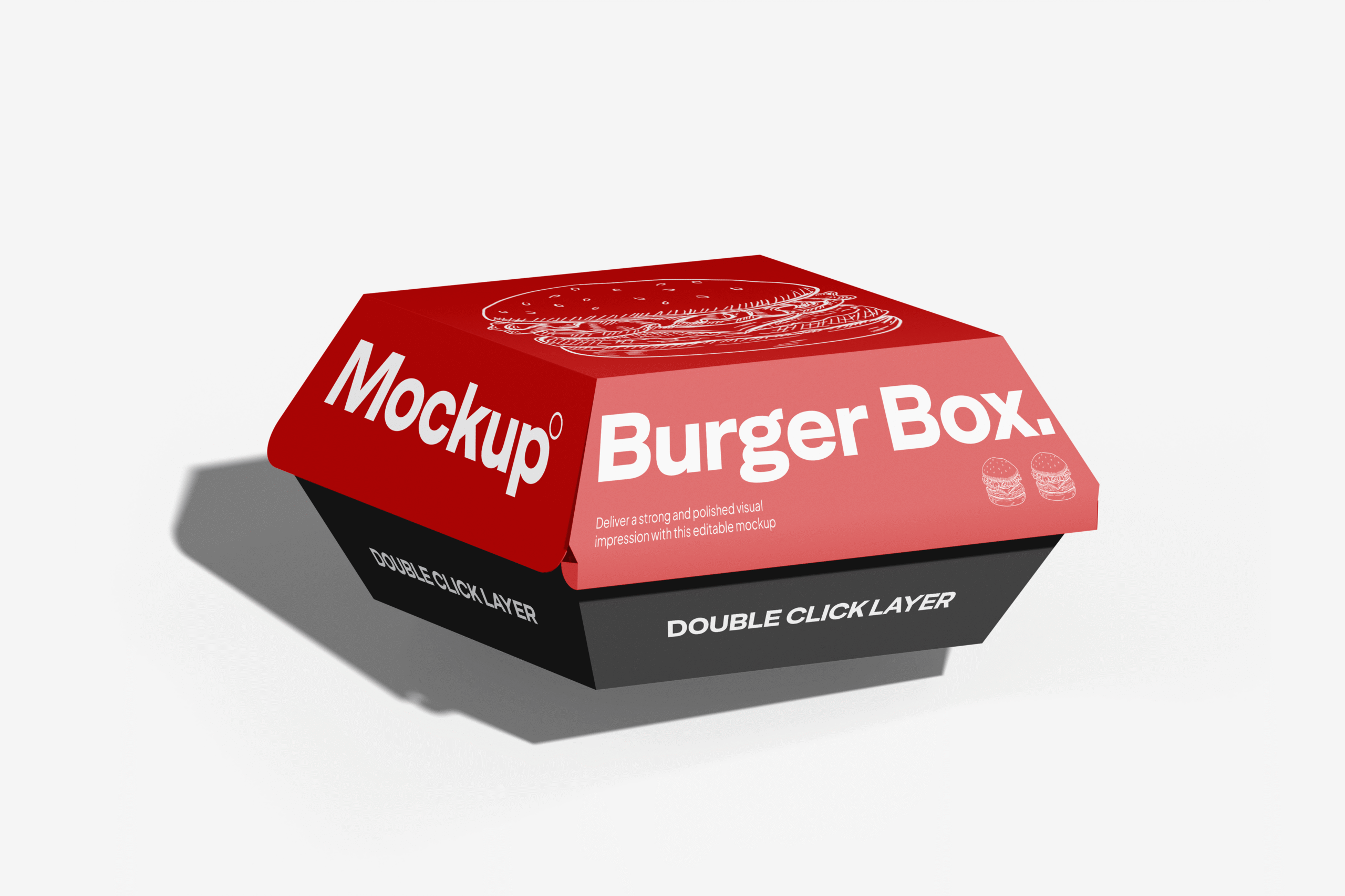
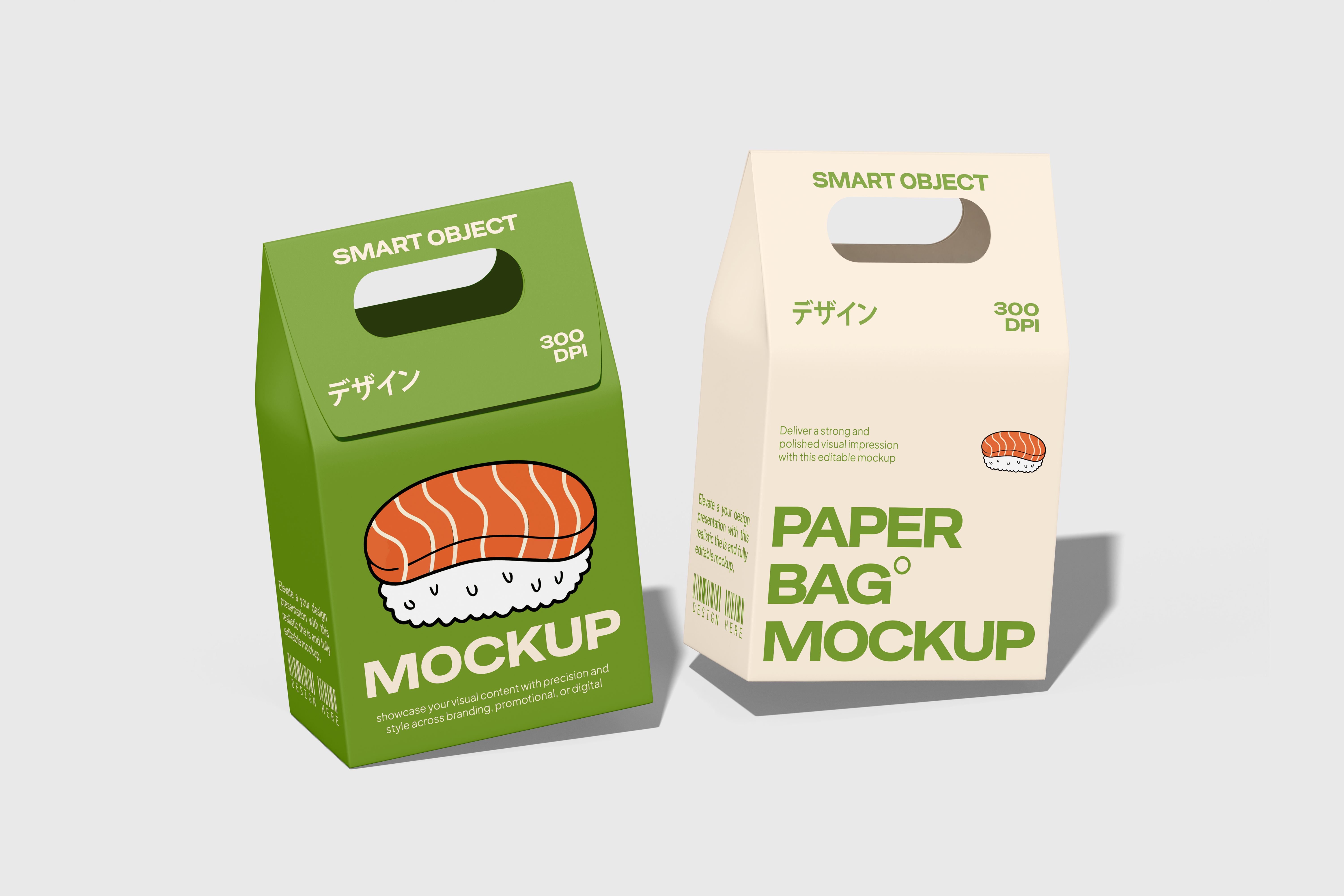
A classic burger box mockup with natural lighting and shadows.
✅ Features: Fully editable Smart Object, changeable background, photo-realistic texture.
🎯 Best For: Branding fast food main items like burgers, chicken boxes, or sandwiches.
🔗 Download Now
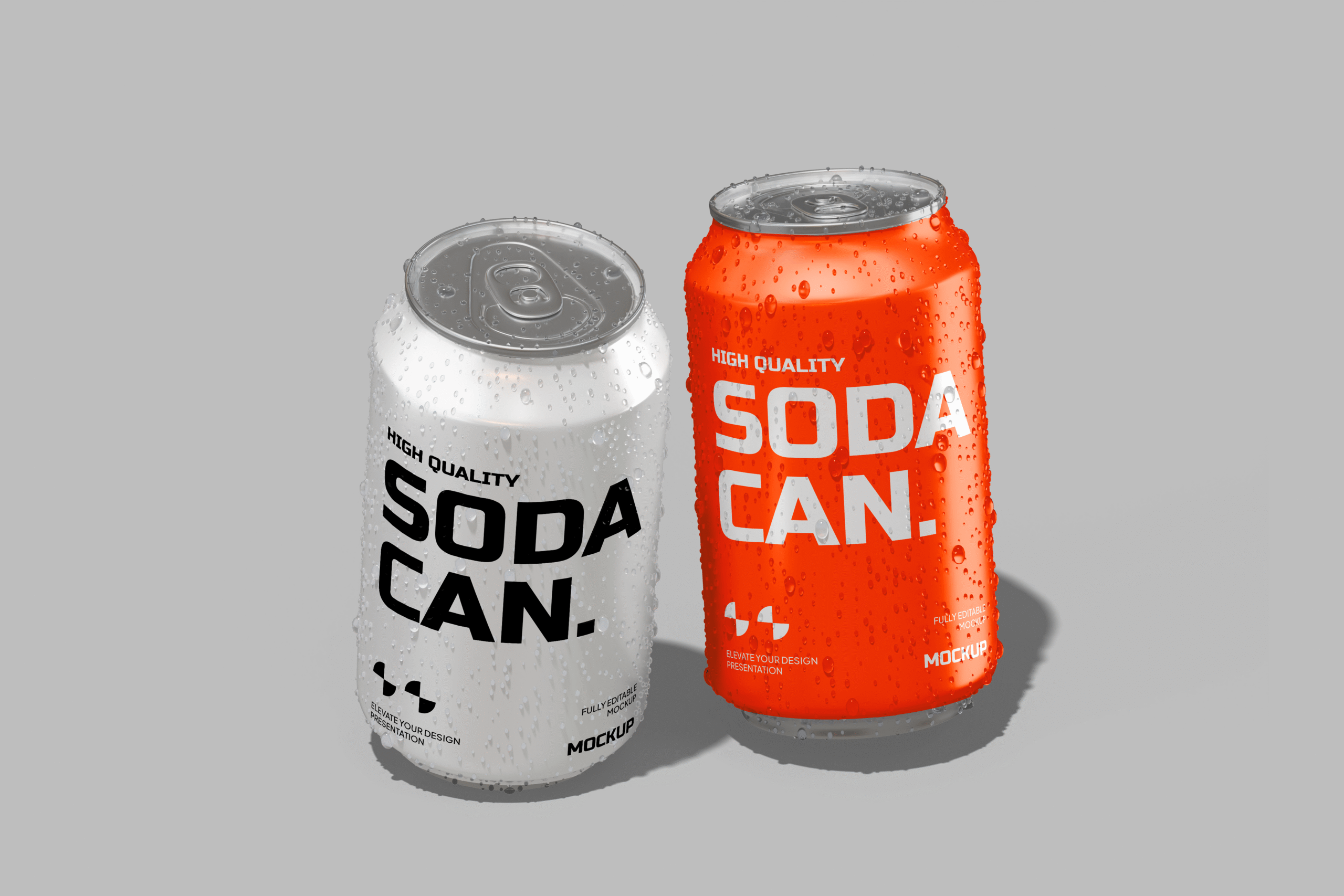
Perfect for soft drinks, coffee, iced tea, or milkshakes.
✅ Features: Easy-to-edit label and cup color.
🎯 Best For: Cafes, food stalls, or beverage branding.
🔗 Get This Mockup
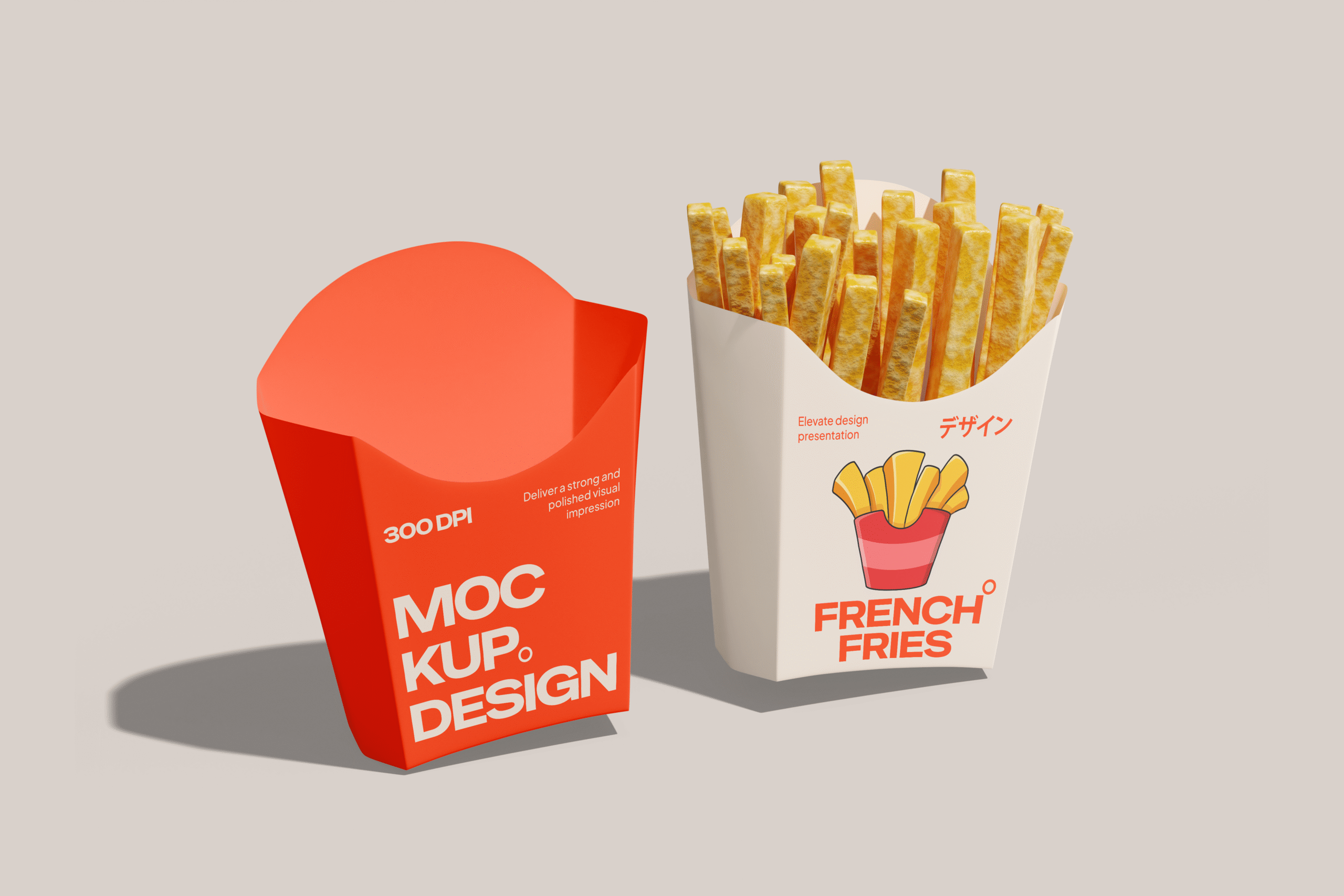
Mockup of a fries box that looks just like a product photoshoot.
✅ Features: Real shadows, editable label, and background.
🎯 Best For: Sides menu presentation, kids meals, or combo set design.
🔗 Download the PSD
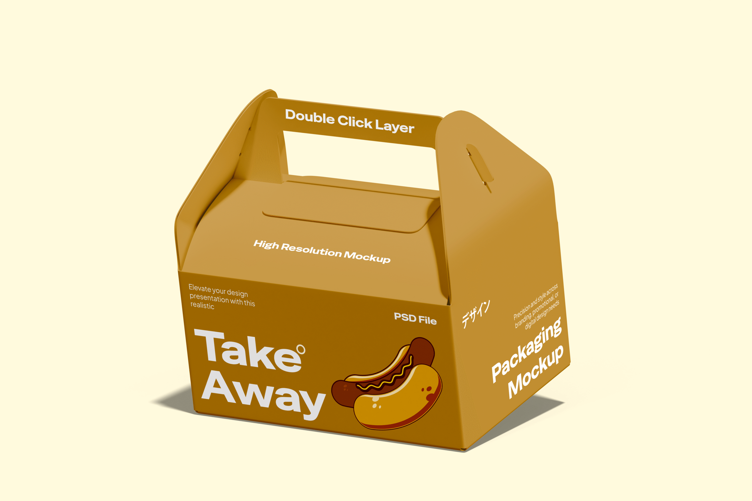
Takeaway paper bag mockup with clean and simple design.
✅ Features: Fully customizable logo, print, and background.
🎯 Best For: Take-out branding or delivery presentation.
🔗 Download Here
Tray setup with various food packaging items and props.
✅ Features: Styled photography composition, editable label and layout.
🎯 Best For: Social media visuals or restaurant pitch decks.
🔗 Download Full Tray Scene
This mockup bundle is ideal for:
🎁 Product link:
👉 https://masantocreative.gumroad.com/l/Realisticfastfoodpackagingmockups
💬 Found it useful? Leave a review and share your designs with the creative community!
In the world of graphic design and digital marketing, how you present your work is just as important as the design itself. A clean, professional mockup can instantly elevate your design and make it look polished and trustworthy. If you’re looking for a modern, realistic, and easy-to-use mockup, this iPad Screen Mockup on Wooden Table is an excellent choice.
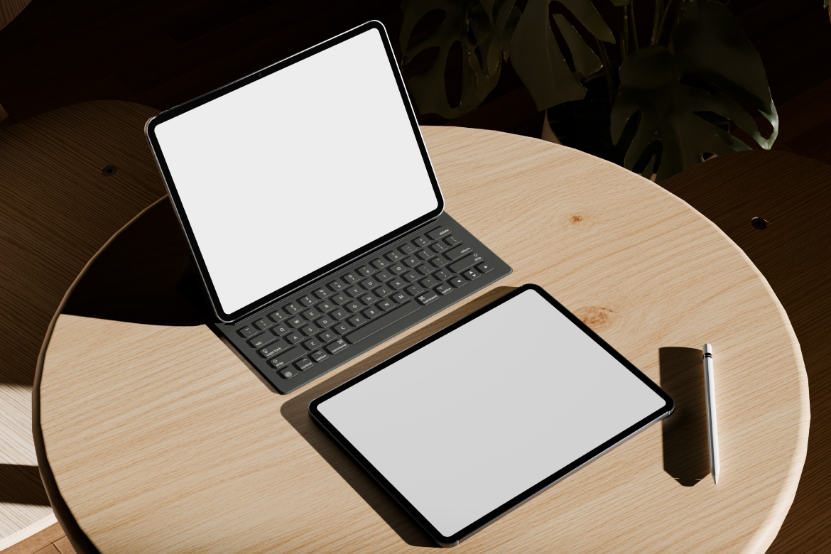
This mockup features an iPad placed on a wooden table with soft, natural lighting. The entire composition feels clean, realistic, and professional — making it perfect for app showcases, website previews, digital portfolios, and more.
The warm wooden texture adds a cozy and trustworthy touch, creating a balance between technical professionalism and a relaxed, human-centered atmosphere.
This mockup includes two layout variations:
With both versions included, you can select the most suitable style to match your project’s tone and purpose.
This mockup is designed at 4000 × 3000 px resolution, ensuring your work looks sharp on any display — whether viewed on-screen or in print. Every pixel is crisp and clear, giving your design the professional edge it deserves.
Thanks to the built-in Smart Object in the PSD file, inserting your own design is fast and effortless:
Even if you’re new to Photoshop, this process is intuitive and quick.
Whether you’re a designer, marketer, or content creator, this iPad mockup suits a variety of use cases:
The clean, clutter-free background ensures that your design takes center stage.
To get the most out of this mockup, consider the following:
High-quality visuals like this don’t just improve aesthetics — they help with SEO too:
The iPad Screen Mockup on Wooden Table is a must-have asset for designers, creatives, and marketers who want to present their work in the best light. With high resolution, a realistic look, and easy editing features, it’s a powerful tool to elevate your project presentation — whether you’re showcasing apps, websites, or promotional designs.
Don’t settle for flat presentations. Show your design in context, with style and professionalism.
Click the button below to download this mockup from Envato Elements:
Handwriting fonts add a personal, warm, and creative touch to your design projects. Whether you’re designing a logo, social media post, wedding invitation, or packaging, premium-quality handwritten fonts can elevate the look and feel of your work. The good news is — some of them are available for free!
Here are 30 free handwriting fonts from trusted sources like Google Fonts, DaFont, Fontesk, and KangFont, complete with valid download links:
Explore more premium-quality free fonts at KangFont.com — the ultimate destination for designers and content creators!
Want to take your Instagram content to the next level? The right aesthetic font can make your feed look polished, trendy, and professional. Whether you’re designing quotes, reels covers, story highlights, or carousel posts, typography plays a key role in grabbing attention and building visual identity.
Here are 10 trending aesthetic fonts you can download for free from DaFont and Google Fonts. All download links are valid, and most fonts are free for personal use—check the license for commercial usage.
.ttf or .otf file on your device.ttf or .otf file and clicking “Install”Use in apps like Photoshop, Illustrator, Figma, or Canva.
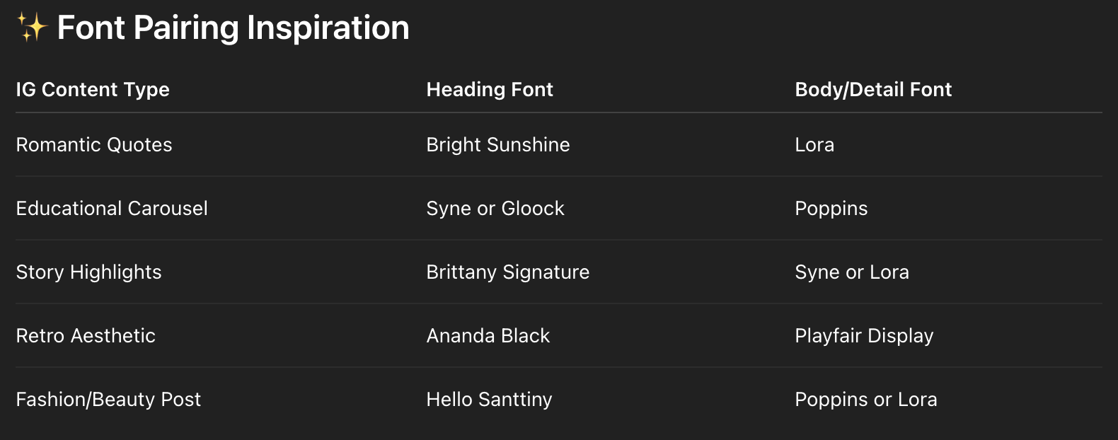
With the right aesthetic fonts, your Instagram content will stand out with professional polish and emotional appeal. Whether you love serifs, scripts, or modern sans, these free fonts from DaFont and Google Fonts give you endless creative options:
Download now and bring your IG content to life with fonts that feel like your brand.
If you’re a graphic designer, content creator, or small business owner, choosing the right font is essential to create professional and eye-catching visuals. However, not all fonts are free for commercial use. Some are free only for personal projects and using them for business purposes may lead to copyright issues.
Luckily, there are many free fonts for commercial use that you can use safely and legally—no need to worry about licenses or hidden fees. In this article, we’ve curated a list of stylish, ready-to-use fonts from trusted sources.
Licensing matters. Using a font without the correct permissions can lead to legal problems, delayed projects, or worse—copyright claims.
By using fonts that are free for commercial use, you can:
Here are some of the best free fonts you can use commercially. All are available from reputable websites and include links for instant download:
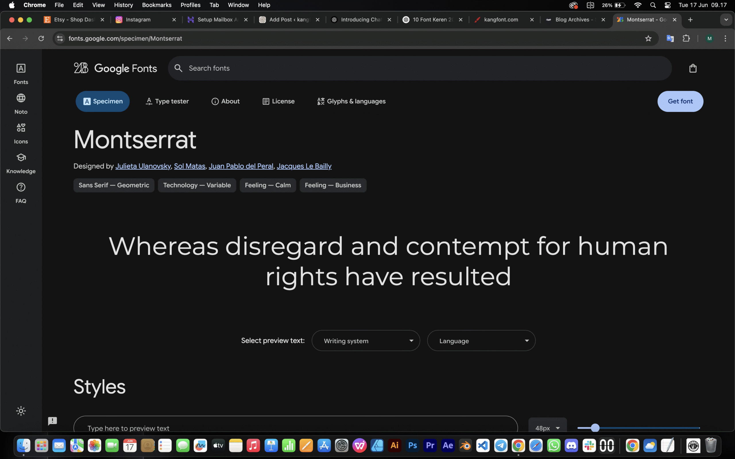
📁 Style: Modern sans-serif
🔗 Download via Google Fonts
Clean, professional, and widely used—Montserrat is perfect for branding, websites, and editorial designs.
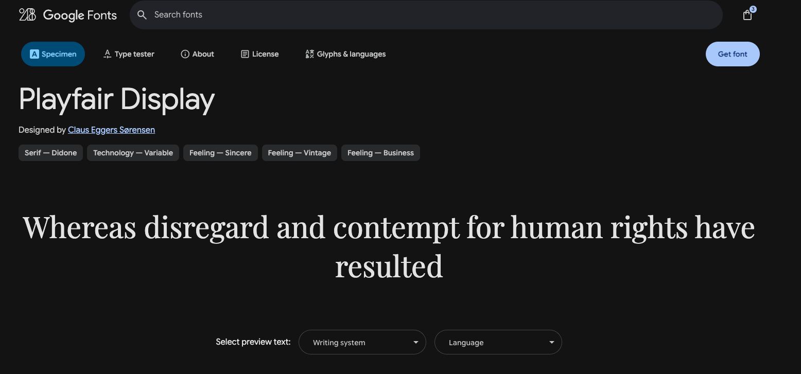
📁 Style: Elegant serif
🔗 Download via Google Fonts
This serif font brings a classic, upscale feel to invitations, product packaging, or magazine titles.
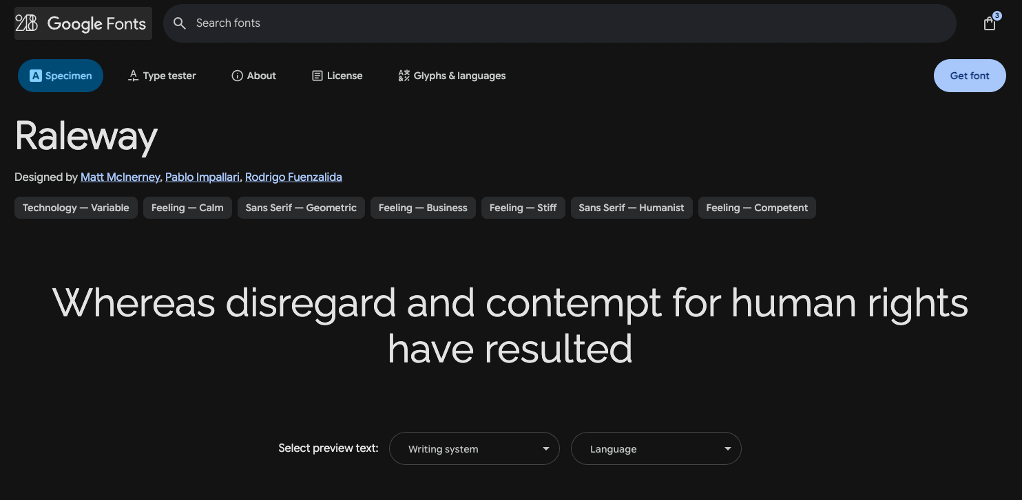
📁 Style: Lightweight sans-serif
🔗 Download via Google Fonts
Minimal and sleek—Raleway is great for modern portfolios, startup branding, and app interfaces.
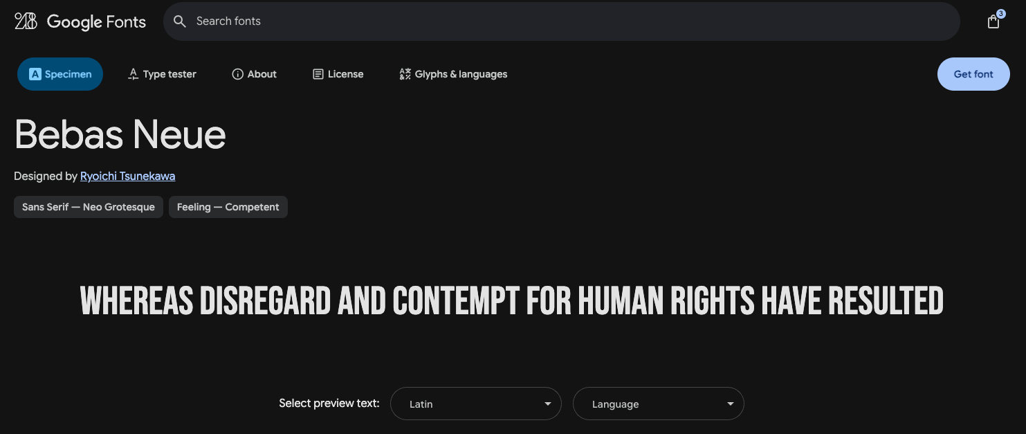
📁 Style: Bold sans-serif
🔗 Download via Google Font
A favorite for posters and banners—Bebas Neue is bold, uppercase, and ready to make a statement.
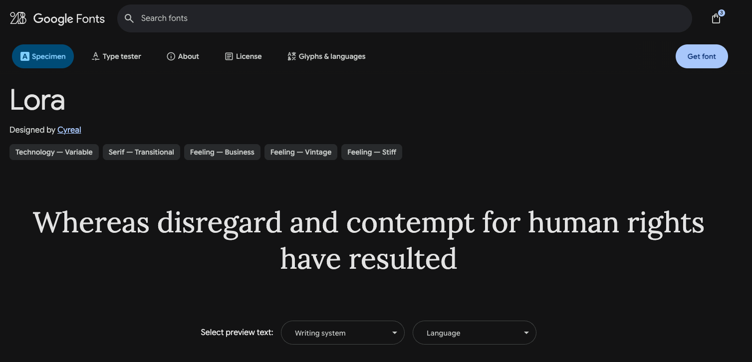
📁 Style: Classic serif
🔗 Download via Google Fonts
Elegant yet readable—Lora works well for long-form content like blogs, ebooks, and articles.
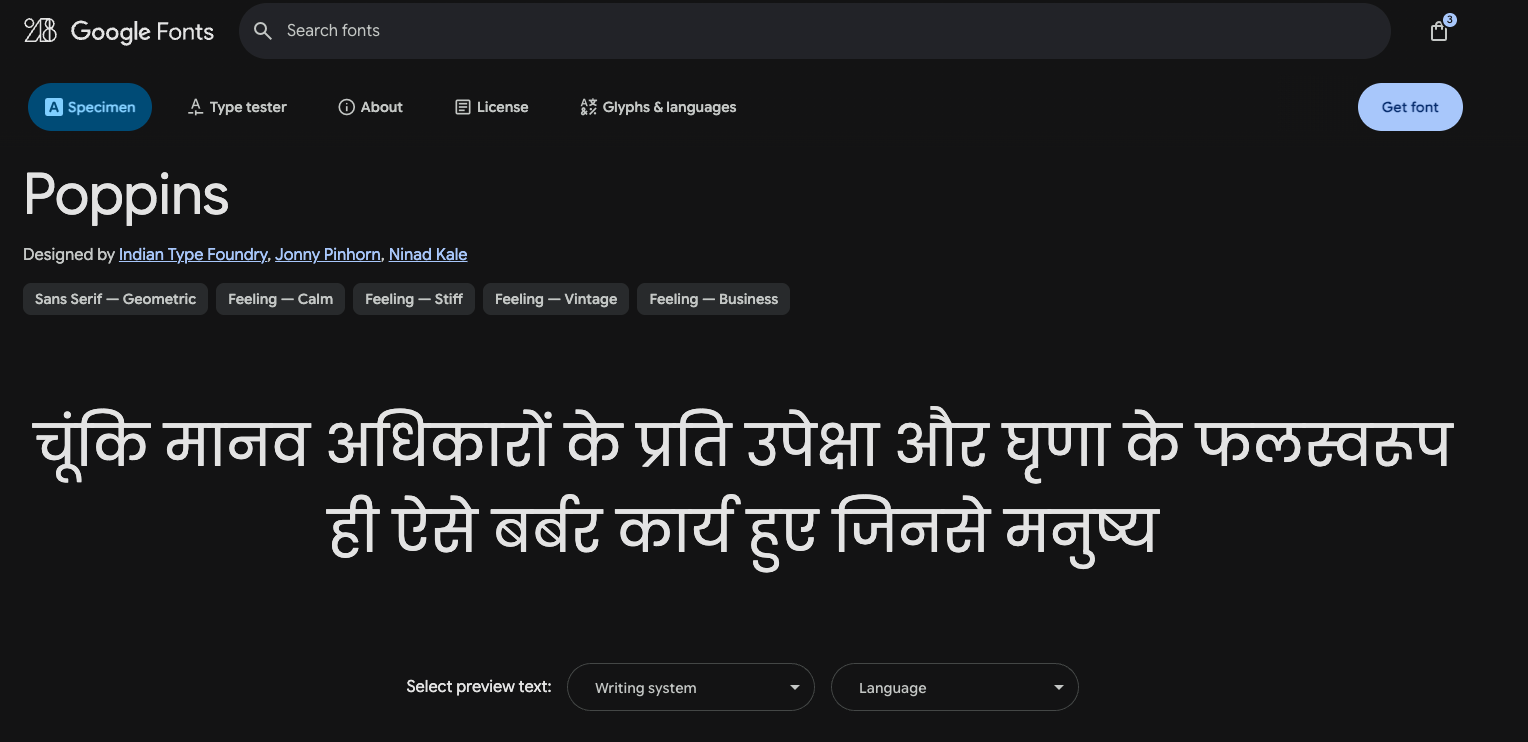
📁 Style: Geometric sans-serif
🔗 Download via Google Fonts
Rounded and friendly, Poppins adds a clean and modern touch to any project, digital or print.
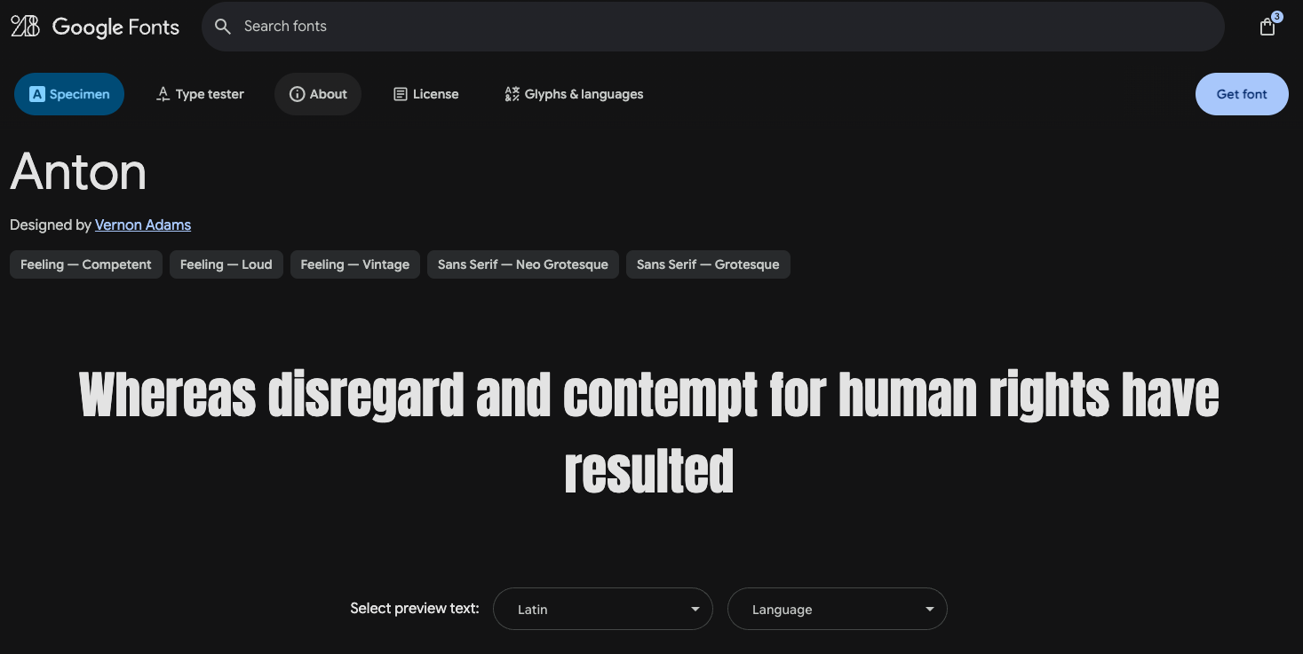
📁 Style: Bold display
🔗 Download via Google Fonts
Need to grab attention fast? Anton is made for headlines, event posters, and eye-catching ads.

📁 Style: Condensed sans-serif
🔗 Download via Google Fonts
Tall, sharp, and refined—Oswald is ideal for editorials, web headlines, and landing pages.
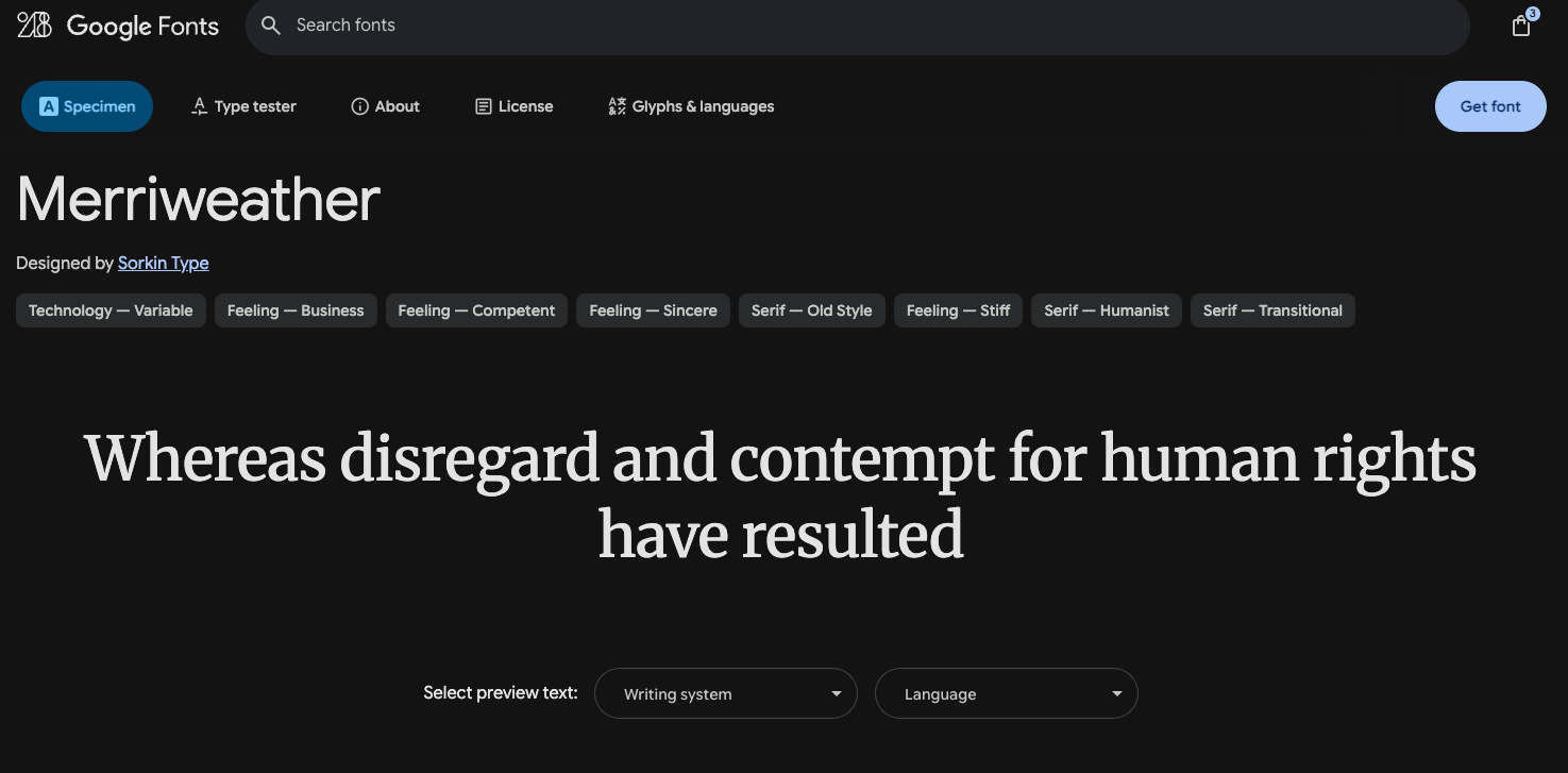
📁 Style: Readable serif
🔗 Download via Google Fonts
Merriweather was designed for digital screens and is perfect for blogs, reports, and ebooks.
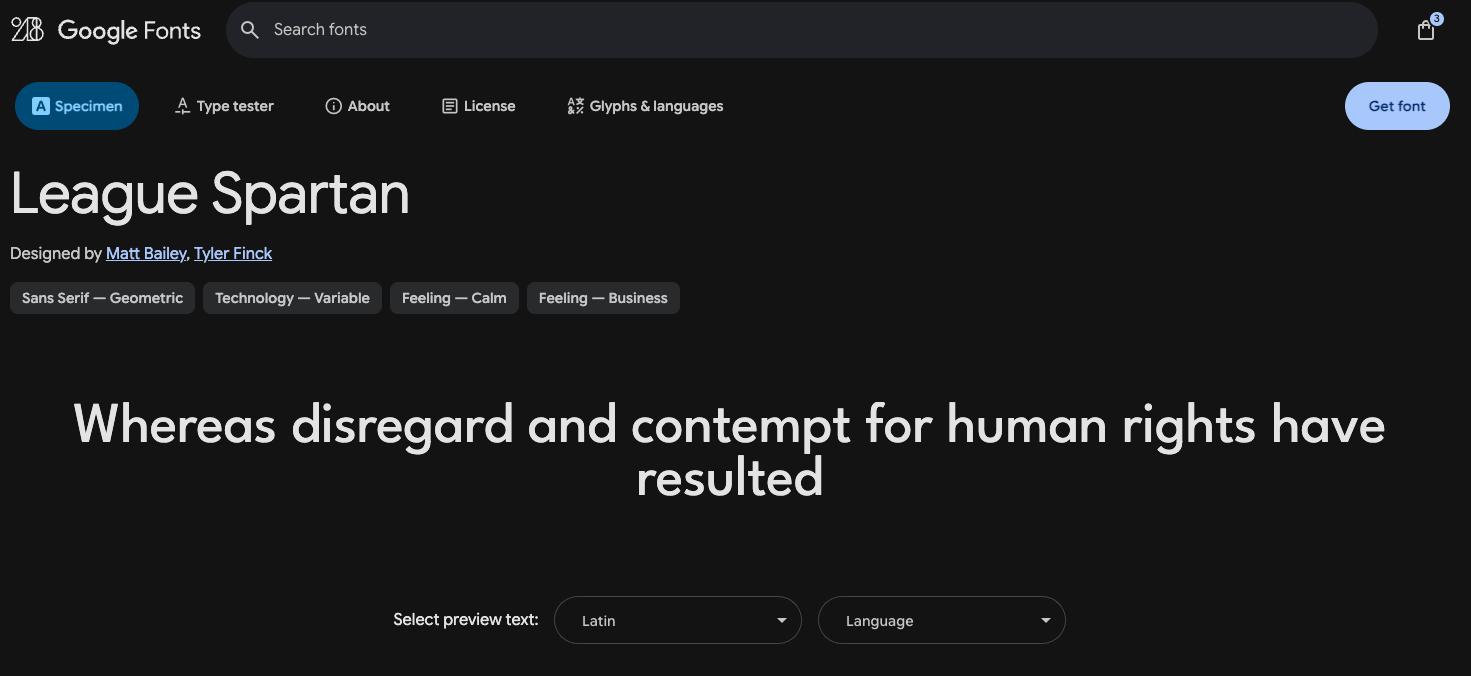
📁 Style: Bold geometric sans-serif
🔗 Download via Google Font
Strong and modern, this font is ideal for logos, product labels, and bold marketing materials.
The right font can elevate your design—but so can the right license. With so many high-quality fonts available for free commercial use, there’s no reason to take risks with unlicensed typefaces.
Use the recommendations above to give your brand or creative project a legal and professional edge. Whether you’re designing a logo, website, flyer, or digital product, these fonts are safe, stylish, and ready to go.