No products in the cart.

Bold fonts have always been a go-to choice for designers who want visuals that feel strong and confident. They are easy to spot from far away. For logos, posters, product packaging, social media headlines, or merchandise, heavy, thick letter-forms grab attention. There are eight popular bold fonts on KangFont worth adding to your collection.
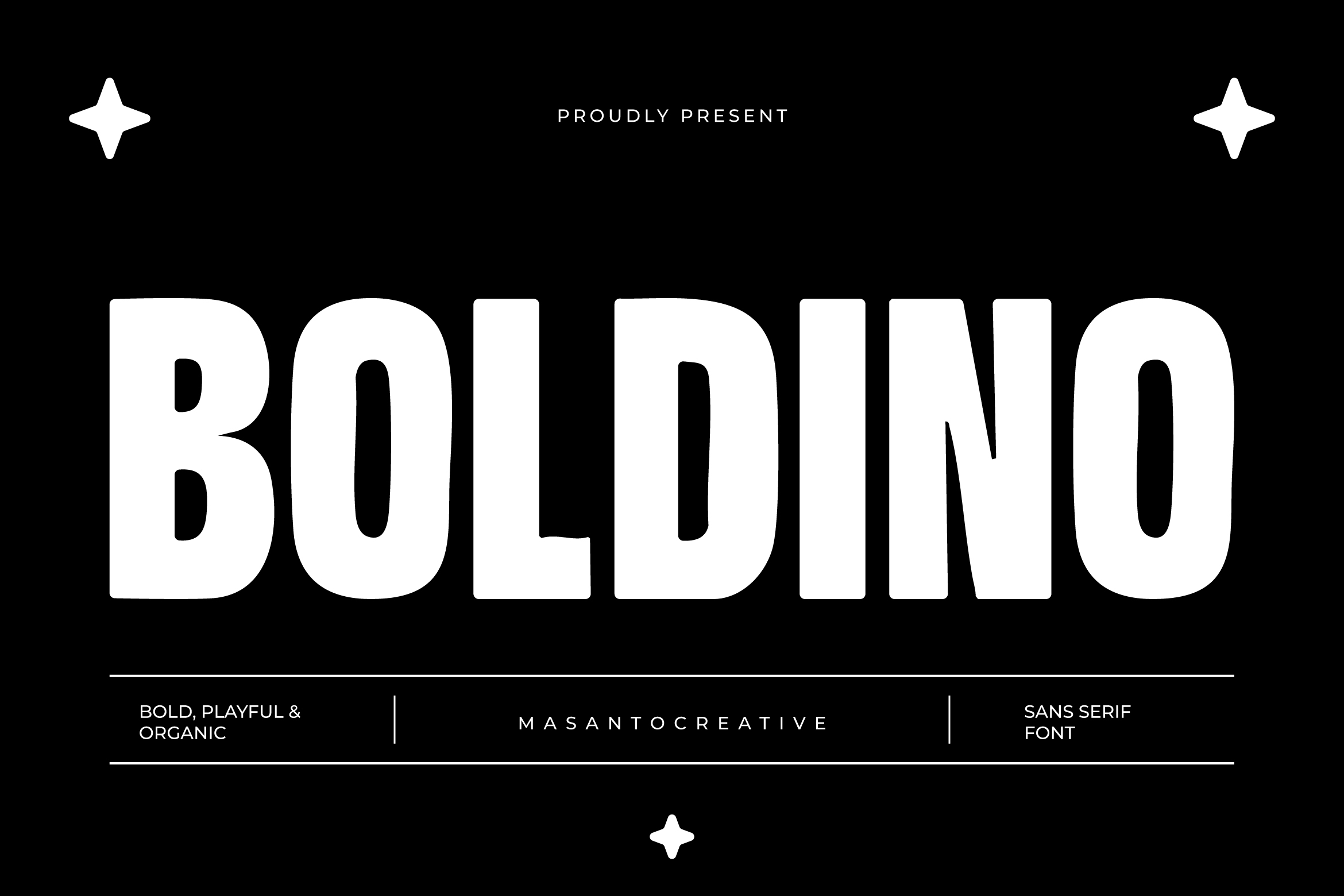
Boldino is one of KangFont’s standout bold display fonts. The name alone hints at its main character: thick, solid, and confident. Fonts like this are typically best suited for large headlines, brand logos, or front-page titles. The heavy strokes keep the text legible even at small sizes, making it flexible for both digital and print use.
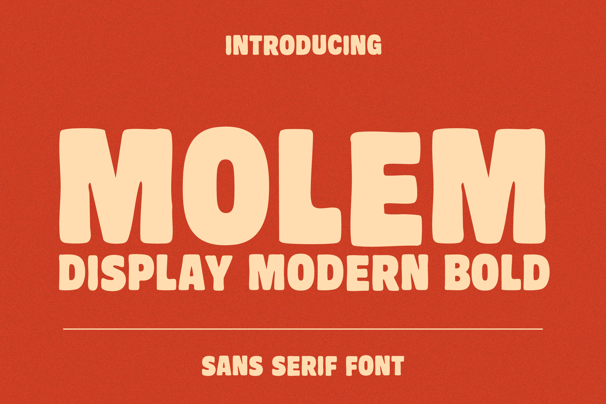
Molem offers a bold style with a slightly more relaxed feel compared to typical display fonts. Its letter-forms tend to carry a playful touch while still maintaining strong visual weight. This type of font is often chosen for designs that want to feel assertive without being overly formal — think promotional content, youth-oriented product packaging, or t-shirt designs.
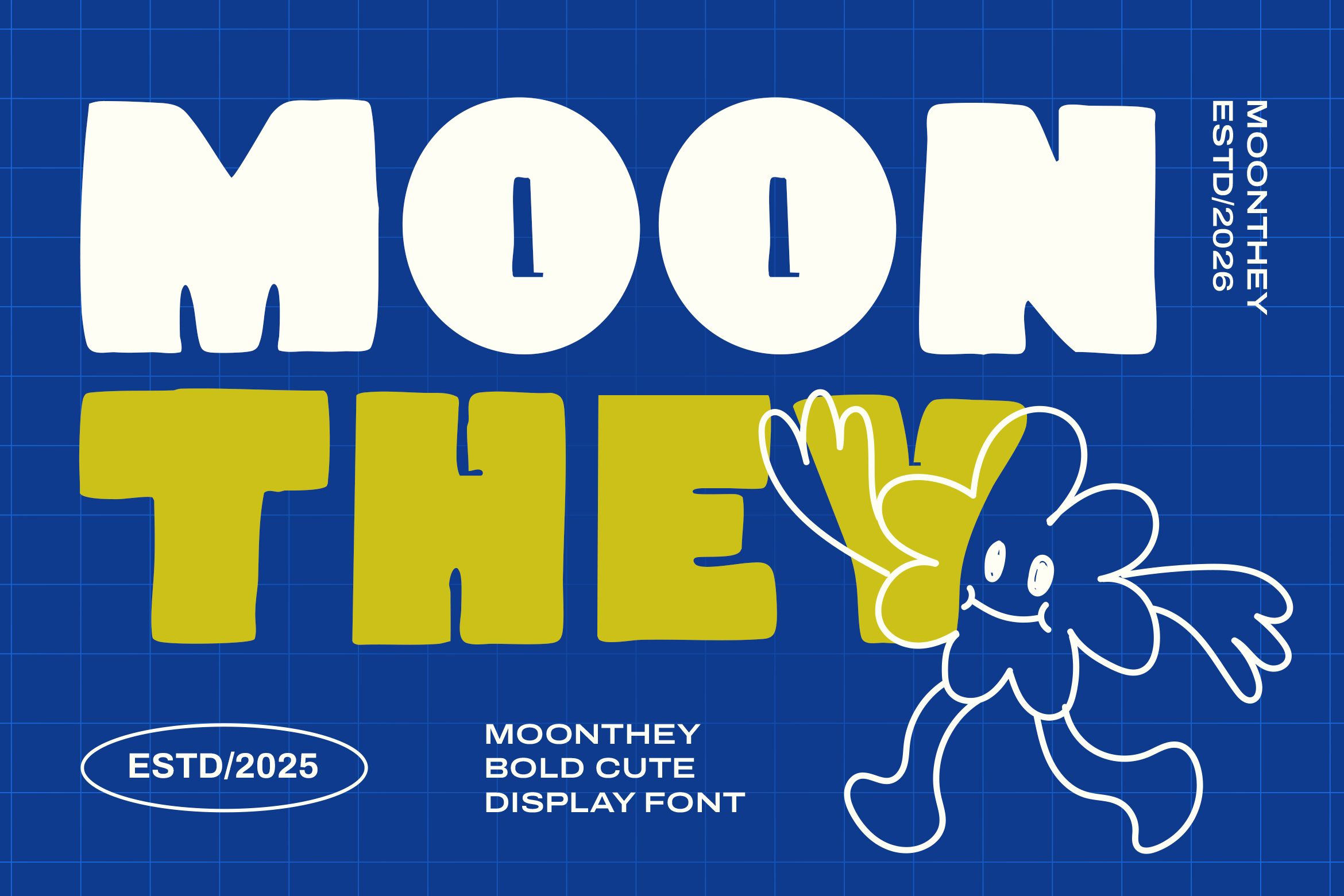
Mooney is an appealing choice for designers looking for a bold font with a modern aesthetic touch. Fonts with names like this usually carry a contemporary display style, blending heavy letter-forms with unique curves or details on certain characters, giving it a more artistic look than a classic bold font. It’s well suited for branding that wants to stand out from the competition.
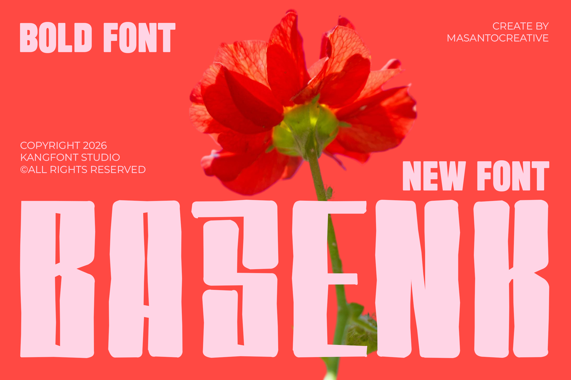
Baseness carries a strong urban, energetic vibe. Bold fonts with this kind of character are commonly used for designs targeting younger audiences — event posters, street-style content, or creative community branding. The heavy strokes keep the type eye-catching even within busy design compositions.
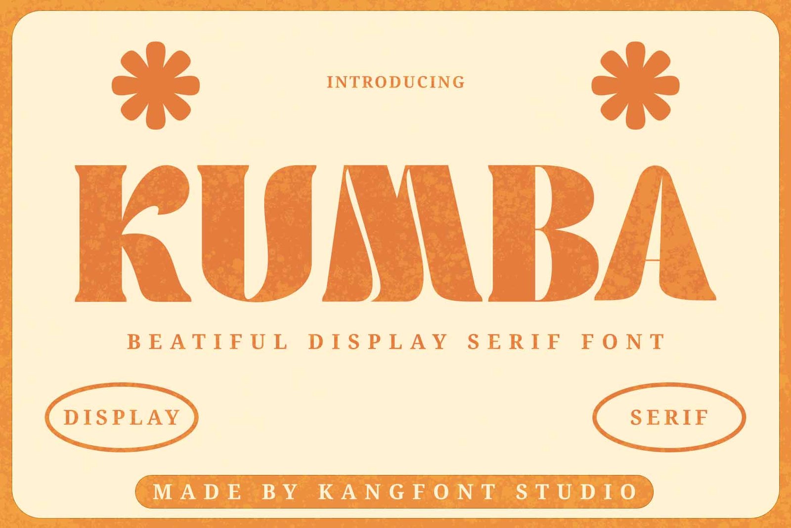
Unlike most bold sans-serif fonts, Kumba brings a bold, elegant serif style to the table. The combination of classic serif details with heavy letter weight creates a luxurious, premium, slightly vintage feel. This kind of font works especially well for fashion branding, cosmetics, editorial magazines, or upscale packaging designs that want to emphasize exclusivity.
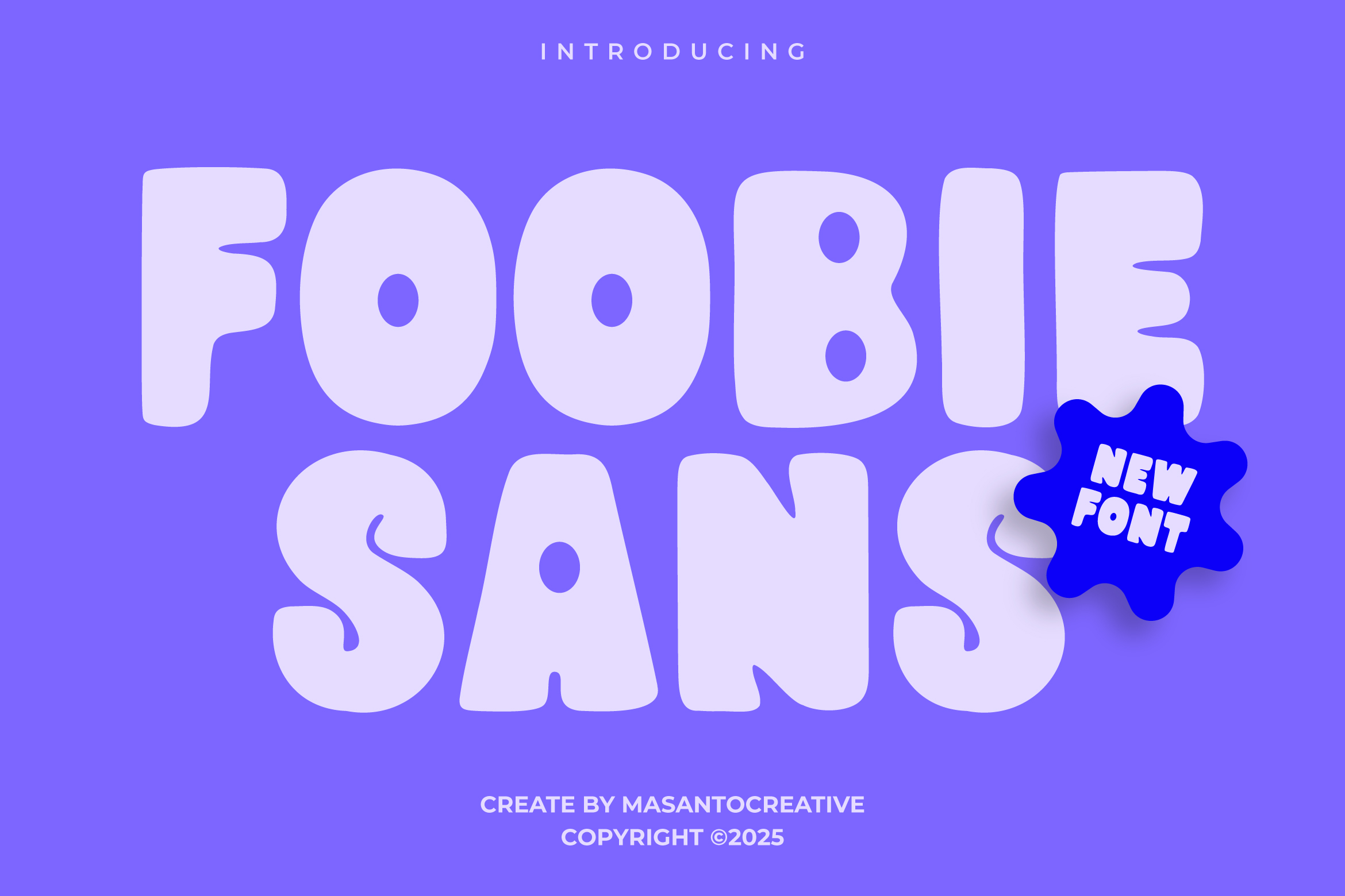
Foobiesans is a bold sans-serif font designed with modern branding needs in mind. Bold sans-serif styles like this tend to be highly versatile, pairing easily with a variety of other visual elements. It’s a solid fit for startup logos, UI/UX app design, or business presentation materials that want a clean look with strong character.
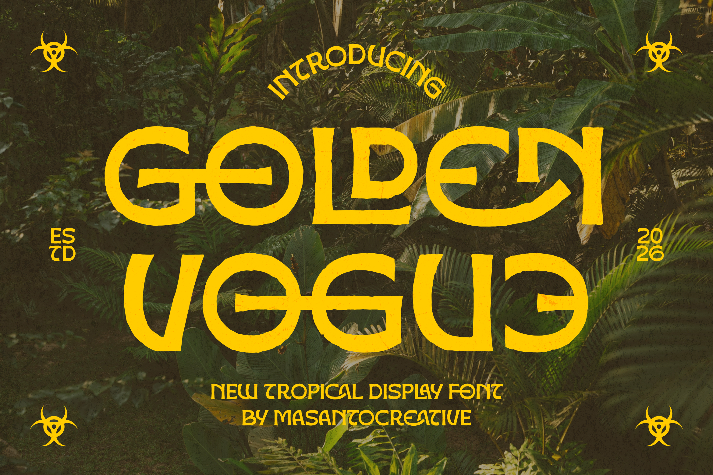
True to its name, Golden Vogue leans into a bold, glamorous, stylish look. Display fonts with a “vogue” feel are usually associated with fashion, beauty, and premium lifestyle branding. The luxurious impression of its letter-forms makes this font a great choice for elegant invitation designs, perfume labels, or fashion brand social media content.
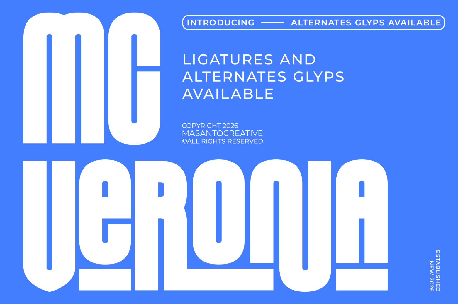
Mc Verona rounds out the list with a bold style that feels classic yet visually strong. Fonts with European-sounding names like this are often used for designs aiming for an elegant, timeless impression — perfect for restaurant or cafe logos, or heritage brands that want to emphasize a refined identity.
Bold fonts aren’t just about thick strokes — they play a key role in building visual hierarchy within a design. A bold headline immediately draws the reader’s eye before moving on to lighter, supporting text. Bold fonts also improve legibility on smaller media, such as social media thumbnails or compact digital banners.
In branding, choosing the right bold font can significantly strengthen a brand’s visual identity. Modern bold fonts like Foobiesans or Boldino suit brands that want to feel assertive and contemporary, while serif-style bold fonts like Kumba or Golden Vogue are better suited for brands emphasizing luxury and elegance.
Before deciding which font to use, here are a few things worth considering:
These eight fonts — Boldino, Molem, Mooney, Baseness, Kumba, Foobiesans, Golden Vogue, and Mc Verona — show just how diverse bold font styles on KangFont can be. From urban and playful to elegant and luxurious, there’s an option to fit nearly any design project. Check out each font’s product page on KangFont for full details, usage examples, and licensing options before making a purchase.
Most creative agencies don’t think about font licensing until it becomes a problem -” a client asks for proof of rights, a new hire flags an inconsistency, or a rebrand reveals that half the team has been using different, unlicensed versions of the “same” font. This case study looks at how one agency turned that exact situation into a stronger, more consistent brand.
The agency, a mid-sized studio working across branding and digital campaigns, had grown quickly over three years. Their visual identity relied on a distinctive sans-serif typeface that had originally been licensed under a single-seat desktop license, purchased years earlier by one designer for one project.
As the team grew, that single license quietly became the default font across:
None of this was intentional misuse. It was simply what happens when a font becomes part of daily workflow without anyone revisiting the original license terms.
The turning point came when a new enterprise client’s legal team requested documentation proving that all fonts used in deliverables were properly licensed for commercial, multi-user, and client-facing use. The agency’s design lead couldn’t produce that documentation -” because the license they had didn’t actually cover it.
This wasn’t a case of a foundry issuing a takedown notice. It was something more common and, in some ways, more disruptive: a growth-stage business realizing its own compliance gap before anyone else pointed it out.
Rather than restrict font usage back down to a single seat, the agency worked with a licensing team to move to a corporate license that covered:
The extended license also included broader distribution rights, which mattered for a studio that regularly produced large print runs and multi-platform campaign assets for clients.
After switching to a corporate license, the agency reported three concrete changes:
The design lead later noted that the licensing conversation, which the team had been putting off for years, ended up being far simpler and less costly than the compliance risk it replaced.
Font licensing problems rarely show up all at once. They accumulate quietly as a team grows, as templates get reused, and as one designer’s original license becomes “the font everyone uses.” A corporate or extended license isn’t just a legal formality -” it’s what allows a growing creative team to scale its brand without dragging along years of undocumented risk.
If your team has grown past what your current font license was originally purchased for, now is the moment to fix it, not after a client asks first.
Ready to move to a corporate or extended license? Contact our licensing team now to review your current usage and get a license that actually matches how your agency works today.
Downloaded a new font and can’t find it in Photoshop’s font dropdown? This happens to almost everyone at some point, and it’s usually a quick fix. Here’s exactly how to install and activate fonts correctly, plus what to do when Photoshop just won’t cooperate.
Photoshop pulls its font list from your operating system, so installing a font system-wide is the most reliable method.
Once installed this way, the font will also be available in other applications, not just Photoshop.
If you’re using fonts synced through Adobe Fonts (included with most Creative Cloud plans), activation works differently:
This method keeps fonts synced across all your Adobe apps automatically, without manually managing font files.
If you’ve installed the font but it’s still not appearing, check these common causes:
Before troubleshooting Photoshop specifically, check whether the font shows up in a simple app like Notes (Mac) or WordPad (Windows). If it’s missing there too, the issue is with the system-level installation, not Photoshop itself.
Once you’re regularly downloading and testing new fonts, it helps to keep them organized by project or license type, especially if you’re mixing free and commercially licensed fonts across different client work.
Browse our full font shop to find your next typeface ” check out the collection here ” including several free, ready-to-install options if you just want to test a style before committing to a full license.
Your logo is probably the single most-used asset your company owns. It’s on your website, your invoices, your social media, your packaging, maybe even a storefront sign. So if the font behind it isn’t properly licensed, that risk doesn’t stay small ” it multiplies everywhere your brand appears.
Here’s what “free font” actually means in practice, and why it’s worth double-checking before your logo goes any further.
Most free font sites let you download a font with no payment required. That’s not the same as granting you the right to embed that font into a company logo and use it commercially, indefinitely, across every channel your brand touches.
Font licenses generally fall into a few buckets:
A logo is treated differently from other commercial uses because it often becomes part of a trademark, and font foundries frequently carve out separate terms for that specific use case.
Unlike a font used in a single blog post or social graphic, a logo:
If you’re building a logo that’s meant to last, it’s worth starting with a font that comes with clear, documented commercial and logo-use rights, rather than discovering a licensing gap after the logo is already printed, trademarked, or recognized by customers.
Not sure if your current logo font is properly licensed? Reach out to our custom licensing team and we’ll help you check your rights or find a properly licensed font that fits your brand.
Clients decide whether to trust a law firm or consulting brand before they’ve read a single sentence of your website or proposal. Typography is doing that work silently, in the background, every single time someone looks at your logo, letterhead, or pitch deck.
In an industry built on credibility, the wrong font can undercut months of relationship-building. Here’s what’s actually working for law firm and consultant branding in 2026.
Trust-building typography tends to share a few traits, regardless of exact style:
Serif typefaces remain the strongest choice for law firms specifically. The small strokes at the end of each letter (serifs) carry strong associations with tradition, print heritage, and institutional authority ” think newspapers, legal documents, and academic publishing.
Best used for:
Consulting firms ” especially those positioning themselves as modern, agile, or tech-adjacent ” often lean toward clean sans-serif typefaces. These read as more approachable and digital-native, without sacrificing professionalism.
Best used for:
A common and effective approach: a confident serif for the firm name and major headlines, paired with a highly legible sans-serif for body text, forms, and UI elements. This combination signals “established, but not outdated ” which is exactly the balance most firms in this space are trying to strike.
Avoid:
Each of these needs to look consistent, which means the font you choose has to hold up across print, screen, and presentation formats equally well.
Once you’ve settled on a style direction, the next step is making sure the specific font file is properly licensed for business branding ” not just downloaded from a free font site with unclear terms.
Browse fonts built for professional branding in our curated category for law firms and consultants ” explore the collection here, including free options you can test in your own mockups before committing to a full brand license.
You found a beautiful free font, dropped it into your catering business logo, printed it on menus, business cards, and delivery boxes ” and now you’re wondering if that was actually allowed. It’s a fair question, and the honest answer is: it depends entirely on the license, not the price tag.
“Free” doesn’t automatically mean “free for business use.” Here’s what catering business owners specifically need to check before that font goes any further.
Free fonts generally fall into a few categories:
A catering business touches a surprising number of touchpoints: logos, menus, packaging, social media graphics, delivery vehicle signage, and printed contracts. Each of these can count as a separate “use,” and some free licenses only cover a subset of them.
Catering is a highly visual, brand-driven industry. Your logo appears on everything from Instagram posts to physical packaging that travels to a client’s wedding or corporate event. That means:
If there’s any doubt about your current font’s license, the safest move is switching to a typeface with a clear, documented commercial license before your branding goes any further ” especially before you invest in new packaging, signage, or a bigger print run.
Not sure if your logo font is properly licensed? Contact our custom licensing team and we’ll help you check your current font, or find a properly licensed alternative that fits your catering brand.
Pick the wrong font pairing and even the best website design falls apart. Pick the right one, and your site suddenly looks more polished, more trustworthy, and easier to read ” without changing a single line of layout code.
Font pairing isn’t about picking two fonts you personally like. It’s about creating contrast and hierarchy so visitors instantly know what to read first. Here’s how to do it well.
Most visitors decide whether a website looks “professional” within seconds, often before they’ve read a single word. Typography plays a huge role in that first impression. Two fonts that clash ” similar weights, competing styles, mismatched moods ” create visual noise that makes a site feel amateurish, even if the content is excellent.
Good pairing does three things at once:
Two fonts that look almost identical create tension without purpose. The eye can’t tell if the difference is intentional. Instead, pair fonts that are clearly different in structure:
One font for headings, one for body text, and ” if absolutely necessary ” one accent font for buttons or small UI labels. Beyond that, a site starts to look like a ransom note. Most high-performing websites run on just two typefaces.
A law firm and a children’s toy brand should never share a font pairing strategy. Before choosing fonts, ask what the site needs to communicate:
A font can look stunning at 60px and become nearly unreadable at 16px. Always test your body font pairing in an actual paragraph, on an actual screen, before finalizing anything. Look for consistent letter spacing, an open x-height, and clear distinction between characters like “I”, “l”, and “1”.
The pairing rules above only matter if you’re starting with quality typefaces. A font with poor spacing, limited weights, or missing italics will fight against your layout no matter how well you pair it.
Browse our font library by category to find pairing-ready typefaces sorted by style, weight, and use case ” explore the collection here. And if you’re just getting started, check out our free font picks to test pairings before committing to a full license.
If you’re building a mobile or web application, chances are the font sitting in your design file wasn’t cleared for that use. Font licensing is one of the most overlooked legal risks in app development ” and it’s also one of the easiest to fix once you know what to look for.
This guide breaks down what app developers and their legal teams actually need to check before a font ships inside a live product.
A font is intellectual property, just like a photo or a piece of code. The moment you embed a typeface into an application ” whether that’s a native iOS app, a React web app, or a SaaS dashboard ” you’re using that font in a way most standard licenses were never written for.
Desktop licenses (the kind bundled with your OS or design software) typically cover printed materials, static images, and personal design work. They rarely extend to:
This is where legal teams get caught off guard. A font that looks “free” or “already licensed” for the company’s website might be in breach the second it’s compiled into an APK or an IPA file.
Covers installing and using a font on a computer for design work. Not valid for app embedding or web font distribution.
Allows a font to be served via CSS (@font-face) on a website, usually with pageview or domain limits. Still not automatically valid for native apps.
Specifically permits a font to be packaged inside application files and distributed to end users. This is the license type most companies actually need but rarely purchase.
If your team can’t point to a signed agreement that explicitly mentions app or software embedding, assume you’re not covered.
Before your next release goes out, have your legal or design lead confirm:
Font foundries and licensing agencies do actively monitor unauthorized use, and enforcement has become more common as apps make font files easier to extract and trace. Consequences can include cease-and-desist letters, retroactive licensing fees calculated on your user base, or in some cases, legal action. For a company with a large install base, the retroactive cost of an uncleared font can be far higher than a proper license would have cost upfront.
The safest path is to work with fonts that come with clear, documented commercial and app-embedding rights from the start ” rather than trying to retrofit licensing after a product has already launched. If your legal or product team is unsure whether your current fonts are cleared for app use, it’s worth getting a direct answer before your next release.
Not sure if your current font license covers your app? Get in touch with our custom licensing team and we’ll help you review your current setup and find a licensing option that actually fits how your product is built and distributed.
In a world saturated with typefaces, standing out is everything. Whether you are a seasoned graphic designer, a branding professional, or a creative entrepreneur, the fonts you choose tell the story of your work before a single word is even read. That is exactly why Golden Vogue was created — a bold, expressive, and deeply characterful tropical display font that brings raw energy and unmistakable personality to any design it touches.
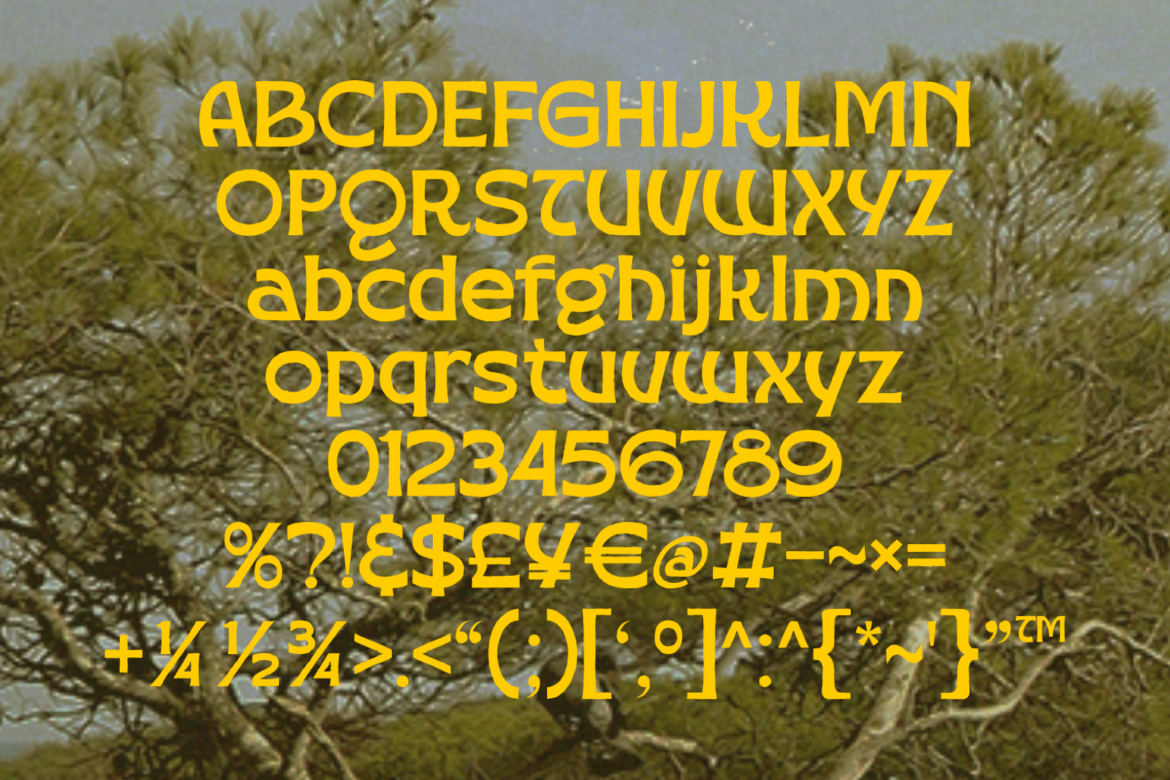
Golden Vogue is a new tropical display font designed and crafted by masantocreative. It merges the boldness of retro typography with the organic, free-spirited energy of tropical design culture. The result is a typeface that feels simultaneously nostalgic and fresh — equally at home on a 1970s-inspired festival poster and a cutting-edge streetwear brand campaign.
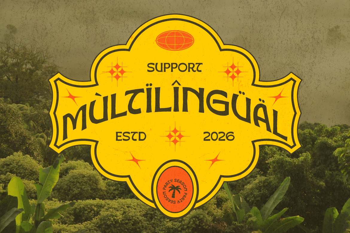
The font ships in two weights — Regular and Bold — giving designers the flexibility to create visual hierarchy, contrast, and depth within a single cohesive typographic system. Both weights carry the same signature DNA: rounded forms, expressive curves, and a hand-crafted texture that feels intentional rather than mechanical.
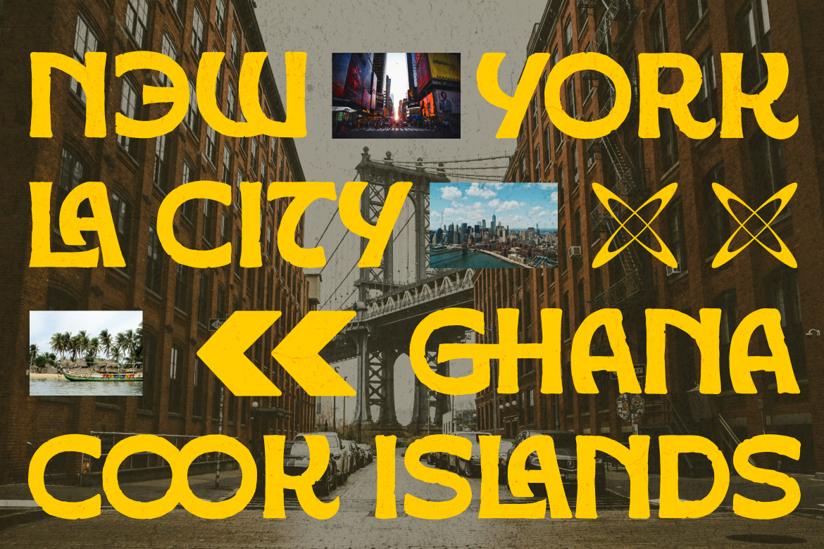
Every great typeface has a story, and Golden Vogue is no exception. The design draws inspiration from the intersection of tropical visual culture, retro-modern aesthetics, and global pop art. Letters are constructed with thick, confident strokes that command attention, while subtle organic irregularities give the font a handmade warmth that purely digital typefaces often lack.
The circular letterforms — particularly in characters like O, G, C, and D — are a defining signature of Golden Vogue. These shapes create visual rhythm across headlines and short copy, making text feel dynamic even when set in all capitals. The font rewards designers who use it at large sizes, where every detail in its construction becomes visible and intentional.
Golden Vogue is not just a pretty face — it is a fully functional, professional-grade typeface built with the practical needs of designers in mind. The complete character set includes full uppercase and lowercase letters, numerals 0 through 9, and an extensive range of punctuation marks, symbols, and currency signs covering dollar, pound, yen, and euro.
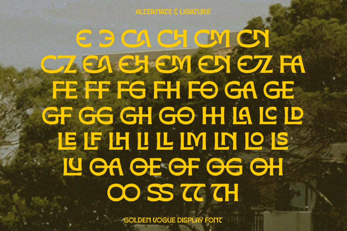
One of the most powerful features of Golden Vogue is its extensive collection of ligatures and alternate characters. With dozens of unique letter combinations — from CA, CH, and CM through to TH, SS, and OO — designers have access to a rich library of stylistic options that make every layout feel custom and considered. These OpenType features allow the same font to behave differently across different projects, giving Golden Vogue a versatility that far exceeds its single-family presentation.
Multilingual support is another area where Golden Vogue delivers beyond expectations. The font covers an extensive range of Latin-based languages with full diacritic support — including accented characters for French, German, Spanish, Portuguese, and many other European languages. This makes Golden Vogue a genuinely global typeface, suitable for international campaigns, multilingual branding, and culturally diverse creative projects.
The versatility of Golden Vogue makes it an ideal choice across a broad spectrum of design disciplines. Here are just some of the areas where this font truly excels:
Festival & Event Posters: The bold weight and high visual impact of Golden Vogue make it perfect for music festivals, cultural events, and nightlife promotions where energy and personality need to jump off the page.
Streetwear & Fashion Branding: The font’s retro-tropical edge aligns naturally with contemporary streetwear aesthetics, making it a go-to choice for labels, lookbooks, hang tags, and brand identity work in the fashion space.
Product Packaging: From artisanal food and beverage brands to cosmetics and lifestyle products, Golden Vogue delivers premium shelf presence with its distinctive character and confident letterforms.
Social Media & Digital Content: In an era where thumb-stopping visuals are currency, Golden Vogue gives content creators and social media designers an immediate visual advantage. It reads clearly at small sizes while commanding full attention at large display sizes.
Logo Design & Brand Identity: The strong letterforms and distinctive alternate characters make Golden Vogue an excellent starting point for custom logo treatments, wordmarks, and brand identity systems.
Why Designers Choose Golden Vogue
Beyond its visual appeal, Golden Vogue represents a thoughtful investment for any designer’s font library. It is delivered in both OTF and TTF formats, ensuring compatibility across all major design applications including Adobe Illustrator, Photoshop, InDesign, Figma, Canva Pro, and Procreate. The inclusion of both Regular and Bold weights means that a single purchase unlocks a complete typographic system rather than a single tool.
The OpenType features — ligatures, contextual alternates, and stylistic sets — mean that the more you use Golden Vogue, the more of its personality you will discover. It is a font designed to reward exploration and creative experimentation.
Ready to Elevate Your Creative Work?

Golden Vogue is more than a font — it is a creative statement. It carries the warmth of tropical culture, the confidence of bold design, and the versatility of a professional typeface built for real-world application. Whether you are designing your next festival poster, launching a new brand, or simply looking for a typeface that makes people stop and look twice, Golden Vogue delivers.
Add Golden Vogue to your design toolkit today and discover what it means to design with true personality.
Luxury serif font bundles have become a favorite choice for designers, entrepreneurs, and creatives who want premium-looking typography without buying fonts one by one. Whether you are building a fashion logo, designing cosmetic packaging, or creating social media templates, a well-curated serif bundle can instantly elevate your work.
Unlike single fonts, bundles give you more flexibility to experiment with different moods—from classic editorial elegance to modern luxury branding.
If you are looking for the best luxury serif font bundle for your next project, this guide will help you understand what to look for and why bundles offer exceptional value.
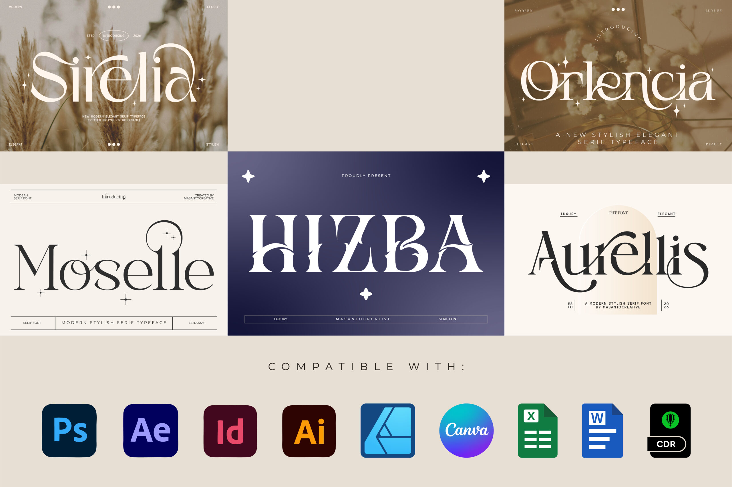
Buying a font bundle is often a smarter investment than purchasing individual fonts.
With a bundle, you get access to multiple styles for a fraction of the price.
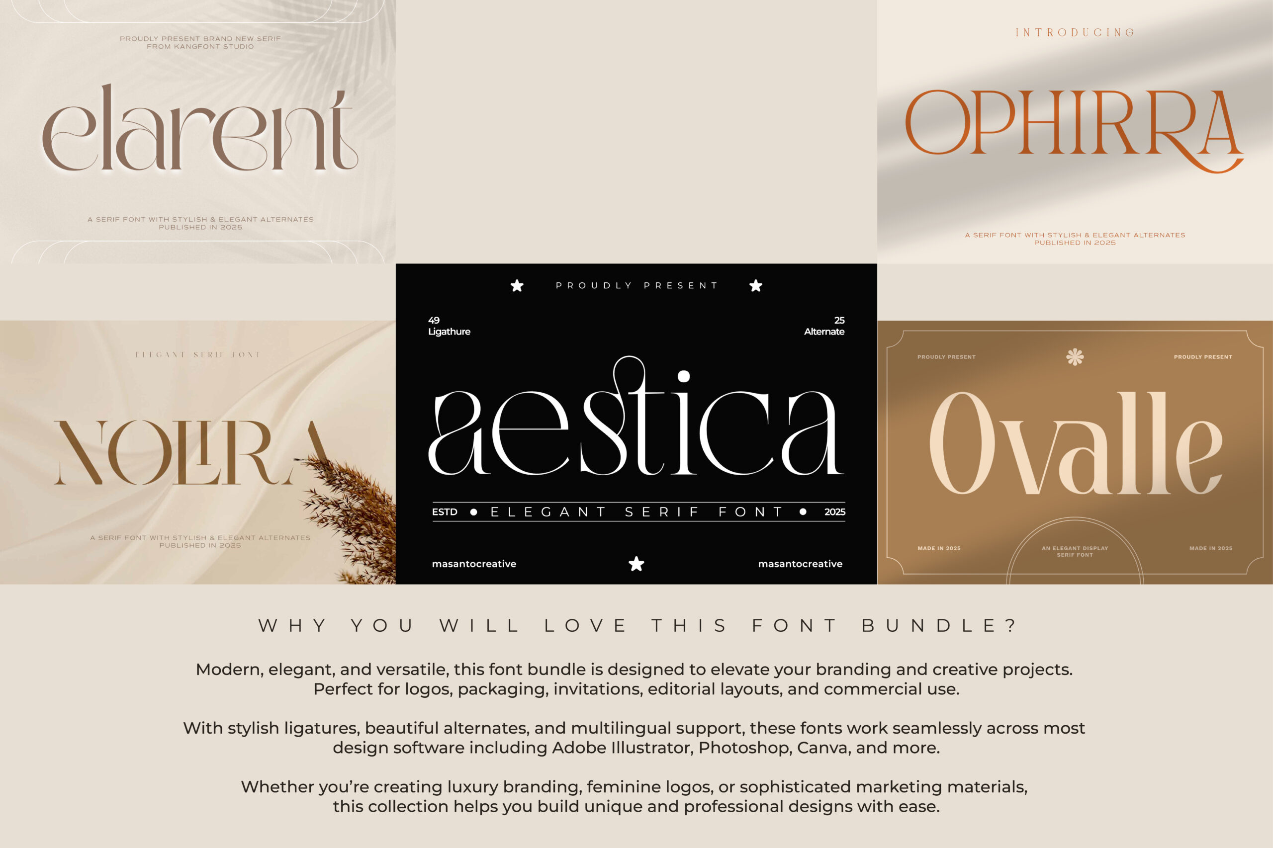
A quality luxury serif bundle can include fonts suitable for:
Having multiple typefaces allows you to test pairings and create a stronger visual identity.
Instead of buying ten fonts separately, a bundle gives you a complete typography toolkit at a much lower cost.
This makes it ideal for freelancers, small businesses, and design studios.
Many bundles are curated so the fonts work together.
This makes pairing easier for logos, headers, and body text.
Not all font bundles are created equal.
Before buying, look for these features.
Elegant serif fonts often have dramatic thick and thin strokes inspired by editorial typography.
This creates a sophisticated luxury look.
Ligatures add personality and make branding feel custom-made.
Look for bundles that include decorative letter combinations.
A great bundle should include variety such as:
This gives you more design possibilities.
If you use fonts for client work or products, always check the license.
Commercial usage is essential.
If you want a versatile bundle that works for multiple branding styles, this 10 Luxury Serif Fonts Bundle is worth considering.
It is designed for designers who need elegant typography for premium projects.
You can explore the full bundle here:
Using the right font is only half the equation.
How you apply it matters too.
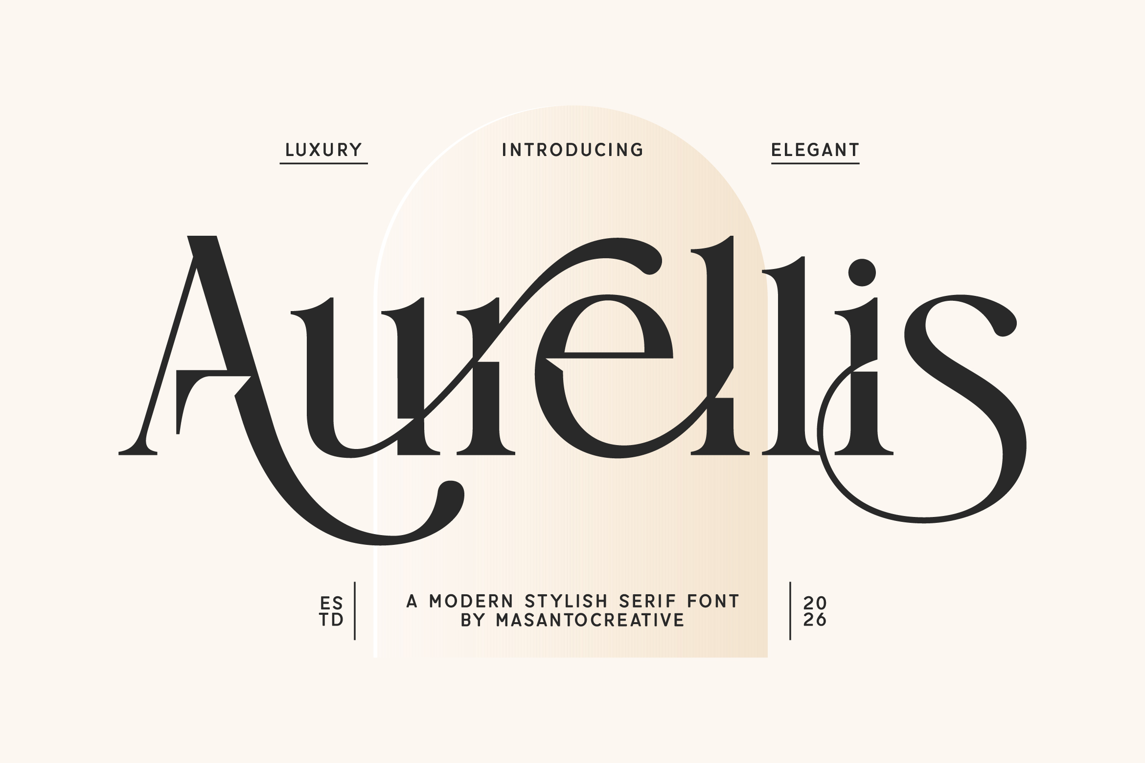
Use serif fonts for:
Use clean sans serif fonts for:
This creates balance.
Luxury brands often use slightly increased tracking.
This makes typography feel refined and editorial.
Luxury typography works beautifully with:
Simple colors let the type shine.
These bundles are ideal for many creative professionals.
Build stronger identities for client projects.
Use premium typography for product branding and packaging.
Upgrade Instagram graphics, Pinterest designs, and digital products.
Create polished branding without hiring a full design studio.
More creators are moving toward bundled digital assets because they save time and money.
Instead of hunting for fonts individually, designers want ready-made collections.
Luxury serif bundles are especially popular because they fit growing trends in:
This trend is expected to continue growing.
If you want typography that looks expensive and professional, a luxury serif font bundle is one of the best investments you can make.
It gives you multiple elegant typefaces, more creative freedom, and better value than buying fonts separately.
For branding, packaging, logos, or editorial design, this 10 Luxury Serif Fonts Bundle offers a flexible collection worth exploring.
Check the bundle here:
Yes. Luxury serif fonts are often used for premium logos, especially in fashion, beauty, and editorial branding.
Many font bundles can be uploaded to Canva Pro for branding projects.
Check product compatibility before purchase.
If you regularly design logos, social media graphics, or brand assets, bundles are usually much more cost-effective than buying fonts one at a time.